Categories
What does a gauge on a dashboard tell you? Think about a car’s dashboard. It has gauges that show essential information. It shows your speed. It shows your fuel level. It warns you if something is wrong. It tracks how far you’ve traveled. It shows if your engine is too hot. In summary, it helps you drive safely and make smart decisions.


Now, imagine bringing that same clarity to a web analytics dashboard. A gauge on the dashboard instantly shows you where you stand—no endless scrolling through numbers or second-guessing.
A gauge on the dashboard delivers critical information in seconds. One glance can steer a whole team in the right direction. Most importantly, a clean dashboard user interface design helps avoid miscommunication and lost opportunities.
Track sales goals, monitor website traffic, or measure customer satisfaction. A well-placed gauge removes the guesswork. It tells you if you’re winning — or need a course correction.
Innovative businesses know dashboards aren’t extras. They are essentials. A dashboard gauge is often the centerpiece that makes or breaks fast decisions. Today’s leaders don’t have time for endless reports. They want speed, clarity, and insight.
A gauge does what long meetings and thick binders can’t. It tells the truth — fast. Ready to see how one powerful visual can drive smarter actions?
Let’s get into it.
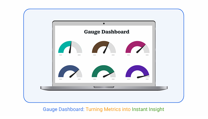
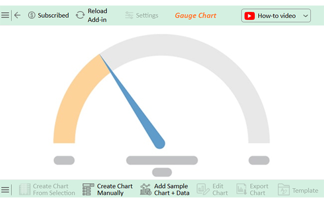
Definition: A gauge dashboard shows key metrics using visual dials or meters. It highlights performance against a target in real-time. A digital dashboard often includes several gauges for quick updates. Each indicator measures one crucial value, like sales or website speed.
Gauge dashboards are perfect for tracking goals, as they turn complex data into simple, actionable insights. Good dashboard user interface design makes gauges easy to read, and clear visuals help teams spot problems quickly.
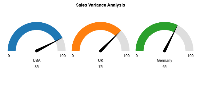
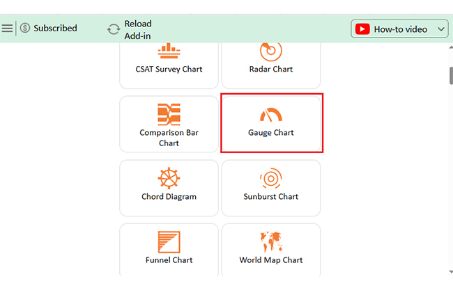
Explore the top charts for analyzing your Gauge on Dashboard, all built using ChartExpo:


Imagine trying to drive with no speedometer. You’d feel lost. That’s what running a business without clear visuals feels like. A gauge on the dashboard pulls you out of spreadsheets and drops you into instant clarity. No guesswork. No delays.
How?
Have you ever stared at a massive spreadsheet and felt stuck? Gauges clear the fog in seconds. They show what you need to know without distraction. Fast insights mean faster, more brilliant moves.
Have you ever tried making sense of a mountain of data in Excel? It’s like trying to fit a square peg into a round hole. Excel is excellent for crunching numbers, but it often falls short when visualizing that data.
That’s where a gauge dashboard comes in. This sleek, easy-to-read tool turns raw numbers into instant insights. And if Excel’s charts aren’t cutting it, ChartExpo can help. It takes your data visualization to the next level, making it intuitive and straightforward. Ready to make your data shine?
Let’s dive in.
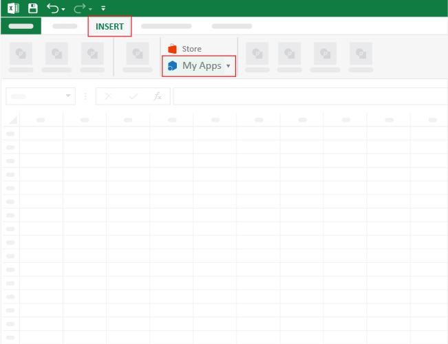
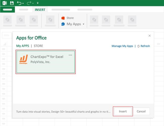
How to Install ChartExpo in Excel?
ChartExpo charts are available both in Google Sheets and Microsoft Excel. Please use the following CTAs to install the tool of your choice and create beautiful visualizations with a few clicks in your favorite tool.
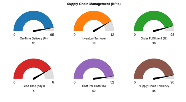
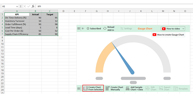
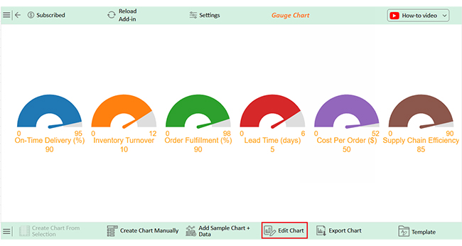
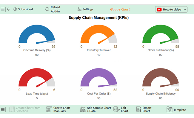
Let’s learn how to create and analyze a gauge dashboard in Excel using ChartExpo.
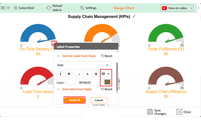
| KPI | Actual | Target |
| On-Time Delivery (%) | 90 | 95 |
| Inventory Turnover | 10 | 12 |
| Order Fulfillment (%) | 90 | 98 |
| Lead Time (days) | 5 | 6 |
| Cost Per Order ($) | 50 | 52 |
| Supply Chain Efficiency | 85 | 90 |
How do some businesses always seem a step ahead? They don’t wait for monthly reports. They move with live insights. A speedometer dashboard makes that possible. It turns slow reporting into real-time power.
How:
Have you ever wanted a dashboard that works precisely as you need it to? Custom dashboard gauges can be powerful, but they have their own set of pros and cons.
Let’s break it down.
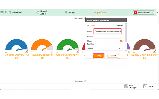
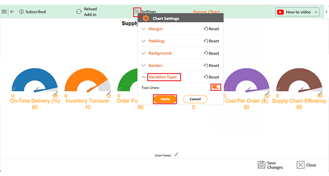
Creating an Excel dashboard with a gauge can bring your data to life. But how do you ensure it’s effective? Follow these key tips to design a clear, useful, and easy-to-interpret dashboard.


A gauge on the dashboard is a visual tool that shows performance against a goal. It looks like a speedometer. Gauges make data easy to understand. They help you track progress quickly.
Two gauges on a dashboard usually show two key metrics side by side. Each gauge highlights a different goal and offers quick comparisons. You can instantly see where they are doing well and where improvement is needed.
A gauge dashboard turns raw numbers into clear visuals. It shows performance against a target using a simple dial. No more guessing. No more confusion.
Gauge dashboards give you quick insights. They highlight what’s working and what needs attention. It tells you everything you need to know.
If you’re wondering how to create a dashboard using Excel, you’ll find basic options to build simple gauges. However, many businesses seek advanced tools for better flexibility and engaging visuals.
Good gauges use clever color coding. Green, yellow, and red zones show your status instantly. You don’t need to study long reports to see the story behind your data.
Gauge dashboards also boost decision-making. Some of the best sales dashboard examples feature powerful gauges that help leaders act quickly when performance shifts. Fast moves come from fast insights.
Across many data dashboard examples, gauges stand out for their simplicity and impact. In a fast-moving business world, precise data wins. A gauge dashboard keeps teams aligned, sharp, and ready to act.
Do not hesitate.
Install ChartExpo to bring your dashboards to life and build powerful gauges.
How much did you enjoy this article?


Calculate accounts receivable turnover ratio to measure credit collection speed, improve cash flow, and strengthen your financial strategy. Read on!

Change Management KPIs are the key to tracking adoption, performance, and ROI during transitions. Find out which metrics matter. Read on!

Data collection methods and techniques determine the quality of every insight you act on. Explore key approaches for gathering reliable data. Read on!


