Categories
Cryptocurrency is increasingly changing the way we do business by decentralizing all transactions.

Besides, digital currencies have increased in value tremendously against the US dollar in the last decade. And this implies investing in Cryptocurrencies is one of the most profitable decisions you can make. But before investing in Cryptocurrencies you have to carry out its analysis using Crypto Charts.
The blockchain-based currency was first outlined in a 2008 white paper published by Satoshi Nakamoto, a pseudonymous person or group. In early 2009, the first Cryptocurrency (Bitcoin) came to the market, and a group of enthusiastic supporters began exchanging and mining it.
Crypto charts are the visualizations used to present historical prices and volumes at different time intervals to find the best investment opportunity. In Cryptocurrency you have to make a decision on whether to go short or long when trading and for that, you need to do Crypto Chart Analysis that provides you with insights timely and quickly.
You cannot find ready-made Crypto charts for analysis in Google Sheets.
You actually don’t have to do away with Google Sheets. You can supercharge its usability by installing a particular third-party application into your Google Sheets to access ready-to-use and visually appealing Crypto Charts.
In this blog, you’ll discover the following:
Before jumping right into the how-to guide, we’ll address the following question: what is technical analysis?
Technical analysis in trading is used to forecast future prices to find the best investment opportunity by analyzing the past trend of a product or Cryptocurrency e.g. changes in Price and volume.
The most important part of technical analysis is to accurately interpret charts so that you can understand the people investing in the observed opportunities. By understanding the market attitude you can easily identify the bullish and bearish trends.
For Example, if you see a strong upward movement in the price of a Cryptocurrency then it means that people are excited and optimistic about it, and that’s why they are investing more in it.
The opposite is also true. A Cryptocurrency with a downward trend reflects a pessimistic perception and puts pressure on sellers.
As long as there’s no change in attitude, the trend should not reverse.
The Crypto chart analysis-based methodology uses mathematical and statistical modeling to understand market and price behavior. One approach involves creating a Chord diagram to visualize the relationships between various factors. Three main tenets apply to Crypto chart analysis:
Armed with these beliefs, you can easily draw on a variety of influences, including behavioral and traditional economic principles, to make predictions about market movements.
Technical analysis looks solely at price movements.
To leverage the Crypto chart analysis methodology, focus on factors like:
In theory, technical price trends give clues about market sentiment.
Fundamental analysis (FA) is another widely employed technique for gauging the value of Cryptocurrencies. And it focuses mostly on the “fundamentals” that support or undermine a digital currency, such as:
We all know that companies do not disclose a lot of information in their reports which is needed for outside investors. While you can evaluate every project in the Crypto industry based on real-time data and metrics, which may include:
Fundamental and technical analyses are not mutually exclusive.
The Crypto chart analysis is based on the premise that fundamentals are already reflected in the prices.
On the other hand, fundamental analysts think the price doesn’t always reflect true fundamentals.
For instance, not everything about a project is widely known by traders. And when that piece of information is publicized, it may impact the price.
Both methodologies have limitations, such as unexpected and sudden regulatory moves targeting Cryptocurrencies.
Some of the visualization designs you can use during Crypto chart analysis are as follows:

Visualization Source: ChartExpo
A Radar Graph is a two-dimensional diagram that is used for conducting Crypto chart analysis. It can display insights into two or more metrics during active trading sessions. The chart is very easy to understand and customize.

Visualization Source: ChartExpo
A Comparison Bar Chart is a visualization design that uses composite-colored bars to show comparison insights in a specified period. The graph is ideal if your goal is to compare more than two key Crypto data points, such as daily price and volume.
One of the significant advantages of the chart is it’s incredibly easy to read and interpret.

Visualization Source: ChartExpo
A Progress Bar Chart is a visualization design that displays the progress made on a task or project.
You can use the Crypto chart analysis diagram to monitor and prioritize your objectives, providing critical data for strategic decision-making. The visualization design uses filled bars to display how much of the planned activity or goal has been completed.
Keep reading because, in the coming section, we’ll cover how to create Crypto charts for better analysis. Also, we’ll cover more about the best Crypto charting software you need to increase the number of your winning trades.
Google Sheets is a trusted data visualization tool because it’s familiar to many.
But the spreadsheet application lacks ready-made Crypto charts.
We understand switching tools is not an easy task. And this is why we’re not advocating you ditch Google Sheets.
There’s an easy-to-use and amazingly affordable visualization tool that comes as an add-in you can easily install in your Google Sheets ready-made Crypto charts. The tool is called ChartExpo.
So, what is ChartExpo?
ChartExpo is an incredibly intuitive add-on you can easily install in your Google Sheets without watching hours of YouTube tutorials.
With many ready-to-go visualizations, the Crypto Chart analysis generator turns your complex, raw data into compelling, easy-to-digest, visual renderings that tell the performance review stories in real-time.
In the coming section, we’ll take you through how to use ChartExpo in your Google Sheets to conduct Crypto Chart Analysis.
You don’t want to miss this!
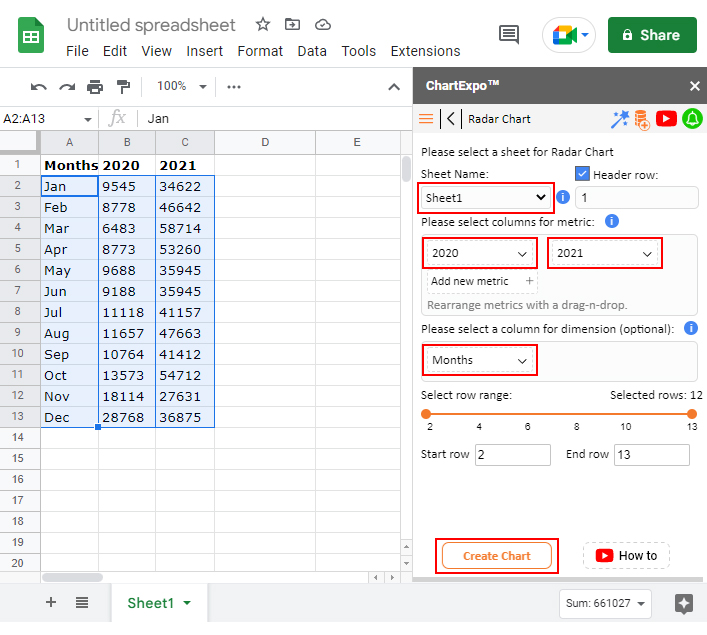
Imagine you have Bitcoin price data for the 2020 and 2021 financial years. You want to determine the profitability of the Cryptocurrency in question.
We’ll use a Radar Chart for our scenario.
| Months | 2020 | 2021 |
| Jan | 9545 | 34622 |
| Feb | 8778 | 46642 |
| Mar | 6483 | 58714 |
| Apr | 8773 | 53260 |
| May | 9688 | 35945 |
| Jun | 9188 | 35945 |
| Jul | 11118 | 41157 |
| Aug | 11657 | 47663 |
| Sep | 10764 | 41412 |
| Oct | 13573 | 54712 |
| Nov | 18114 | 27631 |
| Dec | 28768 | 36875 |
To get started with our Crypto Charting Software (ChartExpo), install the ChartExpo add-in for Google Sheets from this link.


Imagine you own a substantial amount of Litecoin. You want to compare the performance of this currency against its close peers in terms of transactions.
Remember, it’s the number of transactions that drive liquidity in Cryptocurrency markets.
In this scenario, we’ll use a Comparison Bar Chart to display insights into the table below.
| Years | Cryptocurrency | Transactions |
| 2018 | Dogecoin | 29859 |
| 2018 | Litecoin | 20461 |
| 2018 | Monero | 5078 |
| 2018 | DASH | 13716 |
| 2018 | Cardano | 1204 |
| 2019 | Dogecoin | 27758 |
| 2019 | Litecoin | 18896 |
| 2019 | Monero | 6407 |
| 2019 | DASH | 17577 |
| 2019 | Cardano | 1410 |
| 2020 | Dogecoin | 34963 |
| 2020 | Lite coin | 60065 |
| 2020 | Monero | 14062 |
| 2020 | DASH | 29474 |
| 2020 | Cardano | 8232 |
| 2021 | Dogecoin | 52470 |
| 2021 | Litecoin | 110135 |
| 2021 | Monero | 20134 |
| 2021 | DASH | 32143 |
| 2021 | Cardano | 32291 |
To get started with the Crypto Charting Software, follow the steps below.


In the coming section, we’ll address the benefits of Crypto chart analysis.
The key to trading Cryptocurrencies is knowing when to buy/sell and when to exit a trade.
And for you to identify trading opportunities, you have to sift through past price action data to predict an opportunity or loss. Visualization is really crucial in analyzing price action data as it saves time.
How?
Charts and graphs (highlighted earlier) distill signals from noise faster than tables. So, you can easily pick out potentially profitable trends using ready-made and visually appealing charts.
With the surge in Crypto data daily, making sense of the quintillion bytes of data is impossible without reliable Crypto charting software.
You need charts that are easy to interpret and insightful to forecast opportunities and risks when trading Cryptocurrencies.
Some of the tested and proven charts for displaying Crypto data insights include:
The charts mentioned above are straightforward to read and interpret. Besides, they’re easy to plot if you use third-party add-ins, such as ChartExpo.
Yes, technical analysis is one of the two methodologies that traders use to analyze market behavior. And it uses patterns in market data to identify trends and make predictions.
The appeal of technical analysis lies in how users can interpret charts to better understand ‘herd psychology’.
Cryptocurrency is increasingly changing the way we do business by decentralizing all transactions.
Besides, digital currencies, such as Bitcoin, have increased in value tremendously against the US dollar in the last decade. And this implies investing in Cryptocurrencies is one of the most profitable decisions you can make.
To know whether to go short or long when trading Cryptocurrency, you need charts that provide you with insights timely and quickly.
You cannot find ready-made Crypto charts for analysis in Google Sheets.
Google Sheets has pretty basic charts that need more time and effort in editing. You actually don’t have to do away with Google Sheets.
So, what’s the solution?
We recommend you install third-party apps, such as ChartExpo, to access ready-to-use diagrams for Crypto chart analysis.
ChartExpo is an add-on for Google Sheets that’s loaded with insightful and ready-to-go Crypto Charts for easy analysis. You don’t need programming or coding skills to use ChartExpo.
Sign up for a 7-day free trial today to access ready-made Crypto Charts that are easy to interpret.
How much did you enjoy this article?


SUMPRODUCT in Google Sheets handles multi-condition calculations without extra columns. Master its syntax, uses, and errors. Read on!

An annual budget template in Google Sheets organizes your yearly finances, tracks every dollar, and reveals spending patterns. Read on!

Learn the best graph to show profit and loss with practical examples and use cases. Discover how to visualize your business data, track trends, and make smarter financial decisions.


