Categories
Comparing daily blood sugar readings can quickly become overwhelming, especially when the goal is to understand long-term progress rather than isolated numbers.
A Hemoglobin A1C chart simplifies this by showing the average blood sugar level over time in a single, easy-to-read view.
Instead of tracking daily fluctuations, it helps you focus on trends, stability, and overall control.
Consider a simple scenario. A patient tracking quarterly A1C results begins to visualize their data using a chart.
By organizing results over time and applying color-coded ranges, patterns become easier to spot.
Improvements linked to lifestyle changes, such as increased activity or dietary adjustments, are no longer hidden in raw data.
This is where a Hemoglobin A1C chart becomes valuable. It turns complex medical data into a visual format that supports better understanding, clearer tracking, and more informed discussions with healthcare providers.
In this guide, you’ll learn what a Hemoglobin A1C chart is, when to use it, how to create it, and how to turn it into a practical tool for tracking long-term blood sugar trends.
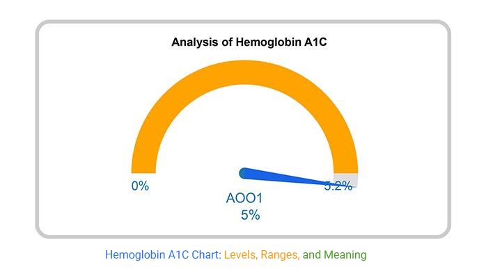
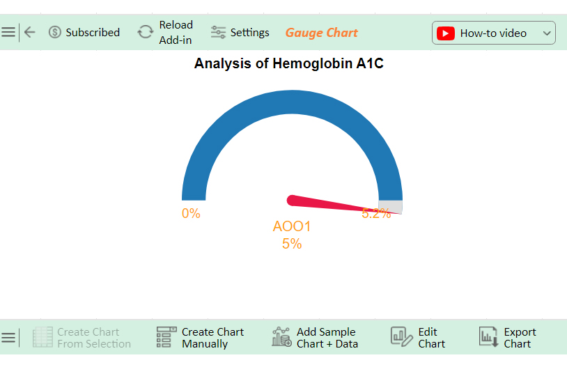
Definition: A Hemoglobin A1C chart is a visual tool used to track and interpret long-term blood sugar levels over time.
It displays A1C values as percentages, helping users understand overall glucose control across a two to three-month period.
Unlike daily glucose readings, which show short-term fluctuations, an A1C chart highlights broader trends.
This makes it easier to evaluate stability, identify patterns, and monitor progress over multiple testing periods.
Each data point on the chart represents the percentage of glycated hemoglobin, which reflects how much glucose is attached to red blood cells.
When plotted over time, these values provide a clear view of whether blood sugar levels are improving, stable, or increasing.
These ranges are typically used as reference points when interpreting the chart. In practice, target levels may vary depending on individual health conditions and medical guidance.
Raw A1C numbers show where you stand. A chart shows where you’re heading.
Visualizing A1C data turns periodic test results into a clear timeline, making it easier to understand progress, patterns, and potential risks.
Creating an HbA1c chart in Excel helps you track long-term blood sugar trends clearly instead of relying on scattered test results.
Follow these steps to build a clean and insight-focused chart.
Organize your data in a simple table format:
Make sure:
This helps Excel correctly map your data.
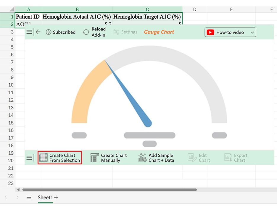
A line chart works best here because it shows trends over time, which is the main goal of an HbA1c chart.
This keeps your chart consistent and easy to interpret.
To make your chart more meaningful:
You can do this by adding helper columns or manually inserting lines.
This improves readability without needing extra explanation.
If you want a more structured and visually refined chart with built-in indicators and better presentation, you can use tools like ChartExpo within Excel.
An HbA1c chart is useful for tracking long-term blood sugar patterns, but it’s not suitable for every situation.
Knowing when to use it and when to avoid it helps you choose the right approach for accurate understanding.
A Hemoglobin A1C chart does more than display numbers. It turns periodic test results into a visual timeline, making it easier to understand long-term patterns and progress.
Even a simple HbA1c chart can lose its value if it’s not set up correctly. These are the most common mistakes that reduce clarity and make the chart harder to interpret.
A meaningful chart requires multiple readings over time. Without that, the visual won’t show any real pattern.
A1C charts are meant for long-term tracking. Inconsistent intervals make trends misleading or harder to follow.
Without reference ranges, users cannot tell whether results are within target or moving into risk zones.
A cluttered chart makes it harder to focus on what matters: the direction of A1C levels over time.
An HbA1c chart is only useful when it reflects ongoing data. Regular updates are essential for accurate tracking.
These ranges are used as reference points to understand long-term blood sugar control.
A Hemoglobin A1C chart helps turn periodic test results into a clear visual trend, making it easier to understand long-term blood sugar patterns rather than relying on isolated numbers.
Instead of focusing on individual readings, the chart highlights direction over time. This makes it easier to see whether levels are improving, staying stable, or moving into higher ranges.
It also helps connect changes in routine, such as diet or activity, with actual outcomes.
When used consistently, an HbA1c chart becomes more than a record. It supports better tracking, clearer communication, and more informed decisions based on visible trends.
For a more structured and visually refined chart, tools like ChartExpo can simplify the process and improve how insights are presented.
How much did you enjoy this article?


Pay equity analysis uncovers hidden salary gaps. Learn how to measure compensation fairness, close pay disparities, and build trust. Read on!

What are sales KPIs, and why should every business track them? Learn the top indicators, how to measure them, and improve results. Read on!
Calculating revenue growth reveals where your business stands. Learn the formula, types, and steps to track performance accurately. Read on!