• Home
  • Tools dropdown img
    • Spreadsheet Charts

      • ChartExpo for Google Sheets
      • ChartExpo for Microsoft Excel
    • Power BI Charts

      • Power BI Custom Visuals by ChartExpo
    • Word Cloud

  • Charts dropdown img
    • Chart Category

      • Bar Charts
      • Circle Graphs
      • Column Charts
      • Combo Charts
      • Comparison Charts
      • Line Graphs
      • PPC Charts
      • Sentiment Analysis Charts
      • Survey Charts
    • Chart Type

      • Box and Whisker Plot
      • Clustered Bar Chart
      • Clustered Column Chart
      • Comparison Bar Chart
      • Control Chart
      • CSAT Survey Bar Chart
      • CSAT Survey Chart
      • Dot Plot Chart
      • Double Bar Graph
      • Funnel Chart
      • Gauge Chart
      • Likert Scale Chart
      • Matrix Chart
      • Multi Axis Line Chart
      • Overlapping Bar Chart
      • Pareto Chart
      • Radar Chart
      • Radial Bar Chart
      • Sankey Diagram
      • Scatter Plot Chart
      • Slope Chart
      • Sunburst Chart
      • Tornado Chart
      • Waterfall Chart
      • Word Cloud
    • Google Sheets
      Microsoft Excel
  • Services
  • Pricing
  • Contact us
  • Blog
  • Support dropdown img
      • Gallery
      • Videos
      • Contact us
      • FAQs
      • Resources
    • Please feel free to contact us

      atsupport@chartexpo.com

Categories
All Data Visualizations Data Analytics Surveys
Add-ons/
  • Google Sheets
  • Microsoft Excel
  • Power BI
All Data Visualizations Data Analytics Surveys
Add-ons
  • Google Sheets
  • Microsoft Excel
  • Power BI

We use cookies

This website uses cookies to provide better user experience and user's session management.
By continuing visiting this website you consent the use of these cookies.

Ok

ChartExpo Survey


Home > Blog > Microsoft Excel

How to Split Data in Excel for Clear and Engaging Charts

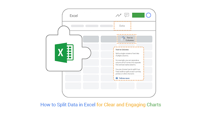
How to split data in Excel? This question arises in countless workplaces, classrooms, and homes. Why? Splitting data transforms messy spreadsheets into organized, actionable information. Whether separating names, breaking down product codes, or dividing dates, Excel offers powerful tools to handle the job.

Excel’s versatility and wide adoption make it the go-to software for managing data. Handling large datasets can feel overwhelming without the proper techniques. That’s where knowing how to split data in Excel becomes essential.

How to Split Data in Excel

For instance, imagine a list with full names in one column. Manually separating first and last names would take hours. But with Excel’s “Text to Columns” feature, the task takes seconds. This tool and others like Flash Fill simplify repetitive tasks, saving time and reducing errors.

Data splitting isn’t just about convenience; it impacts productivity. A report from McKinsey highlights that effective data management boosts business efficiency by up to 25%. Learning to split data in Excel helps businesses stay competitive, and individuals work more brilliantly.

That’s not all; these tools require practice. Without guidance, it’s easy to miss their full potential. But mastering these features doesn’t have to be complicated. A few steps can make the process intuitive and quick.

So, let’s learn how to split data in Excel. This blog will help you streamline workflows, improve accuracy, and gain more control over your data.

Table of Contents:

  1. What is Split Data in Excel?
  2. Why is Separating Data in Excel Useful?
  3. How to Separate Data in Excel with Flash Fill?
  4. How to Parse Data in Excel Using the Function?
  5. How to Split Data in Excel?
  6. How to Analyze Splitted Data in Excel?
  7. Wrap Up

First…

What is Split Data in Excel?

Definition: Split data in Excel refers to dividing a single information column into multiple columns. It helps organize and separate data for better readability and analysis. For example, you can split full names into first and last names or divide dates into day, month, and year.

Excel provides tools like “Text to Columns” and “Flash Fill” to simplify this process. It improves clarity, saves time, and ensures data is structured for efficient use.

Why is Separating Data in Excel Useful?

Separating data is a smart way to make your work cleaner and faster. Imagine staring at a cluttered spreadsheet, trying to make sense of messy information. It’s an uphill task!

Splitting data into meaningful pieces transforms chaos into clarity, giving you control over your data. Here’s why it matters:

  • Improved organization and clarity: Dividing data makes spreadsheets easier to read and navigate. Clean columns and structured rows save time and reduce confusion. A well-organized sheet, whether it’s names, dates, or numbers, is key.
  • Facilitates data analysis: Split data simplifies calculations and filters. For instance, separating product codes allows quicker sorting or grouping. Breaking data into smaller parts unlocks deeper insights and sharper data-driven decisions.
  • Enables automation and advanced functions: VLOOKUP in Excel, CONCATENATE, or PivotTables thrive on clean, separated data. Automation becomes more accurate, and advanced features work seamlessly.
  • Enhances data sharing and collaboration: Organized data is more straightforward to share with teams or clients. Clear formatting ensures everyone understands the information without extra explanations.

How to Separate Data in Excel with Flash Fill?

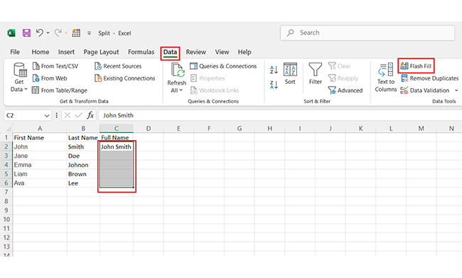
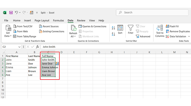
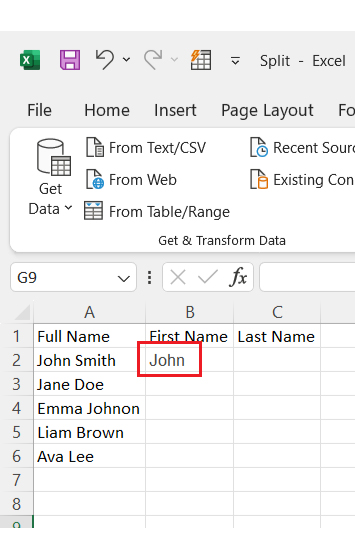
Flash Fill is your secret weapon for quickly splitting, combining, or formatting data in Excel. No formulas, no fuss—just pure efficiency:

  1. Enter your data: Type in data and ensure it’s consistent. For example, if you split full names into first and last names, ensure all names follow the same format.
  2. Give Excel a hint: In the cell where you want the new data, please type the first example of how it looks.
  3. Activate Flash Fill
    • Select the column or cells where you want Excel to work its magic.
    • Go to the “Data” tab in the ribbon.
    • Click on “Flash Fill”.
Click on Flash Fill for Learning How to Split Data in Excel
  1. Watch the transformation: Excel will fill in the rest of the data. It’s like having a personal data assistant.
Watch Tranformation for Learning How to Split Data in Excel

How to Parse Data in Excel Using the Function?

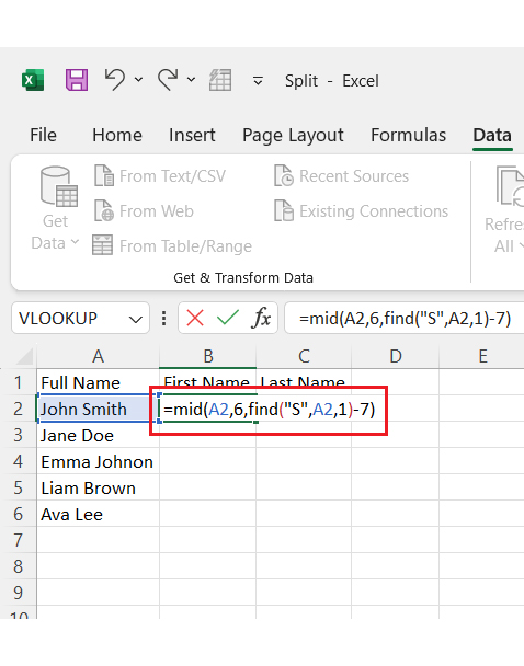
Parsing data in Excel with functions is easier than you think. It’s a great way to break down information into smaller, meaningful parts. Excel functions get the job done quickly, and here’s how you can do it step by step:

  1. Add your data: Enter your data into an Excel sheet. Ensure it’s in a structured column for better results.
  2. Apply the formula: In the target cell, use a formula like LEFT, RIGHT, MID, or TEXT. For example, to extract the first name from “John Smith”, use =LEFT(A1, FIND(” “, A1)-1).
Apply Formula Target Cell for Learning How to Split Data in Excel
  1. View the result: Excel will display the parsed data in the selected cell. For instance, the first name “John” will appear.
Display Parsed Data in Selected Cell for Learning How to Split Data in Excel
  1. Drag the formula: Click on the cell with the formula, then drag the fill handle downward to apply it to other rows. Excel will parse the rest of the data automatically.
Click on Cell With Formula for Learning How to Split Data in Excel

How to Split Data in Excel?

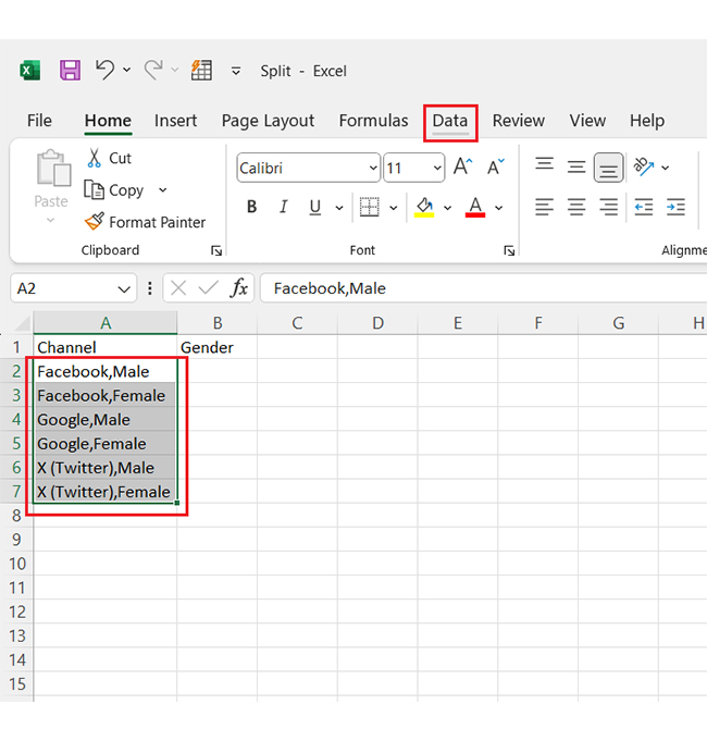
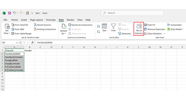
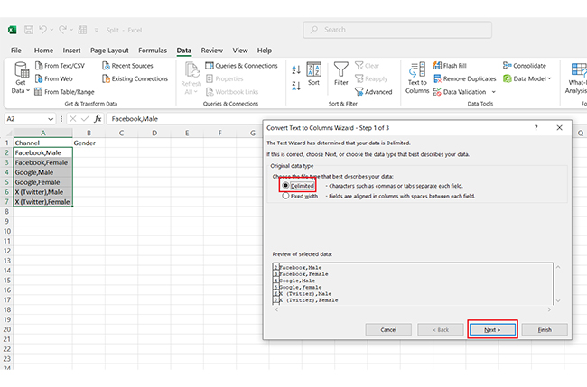
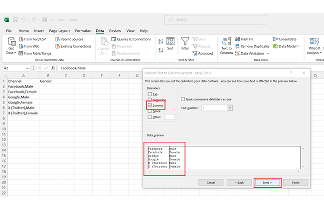
Got data crammed into one column? No problem! Excel’s Text to Columns feature can split it into two (or more) in no time. Ready to learn? Let’s do this.

  1. Add your data: Type or paste your data into an Excel sheet. For example, you might have names or values separated by commas or spaces.
Paste Data into an Excel Sheet for Learning How to Split Data in Excel
  1. Highlight your data: Select the column that contains the data you want to split.
  2. Go to “Text to Columns”.
    • Click the “Data” tab at the top of Excel.
    • Choose “Text to Columns”.
Choose Text to Columns for Learning How to Split Data in Excel
  1. Choose “Delimited”: In the window that pops up, select “Delimited” (for data separated by commas, spaces, etc.).
  2. Click Next.
Click Next for Learning How to Split Data in Excel
  1. Pick your separator
    • Check the box for the delimiter that fits your data, like Comma or
    • Preview the split in the sample window, then click Next.
Split in Sample Window for Learning How to Split Data in Excel
  1. Choose a destination: Select where the split data should go. (Choose a column or leave it as-is to overwrite the original.)
  2. Click Finish.
Click Finish for Learning How to Split Data in Excel

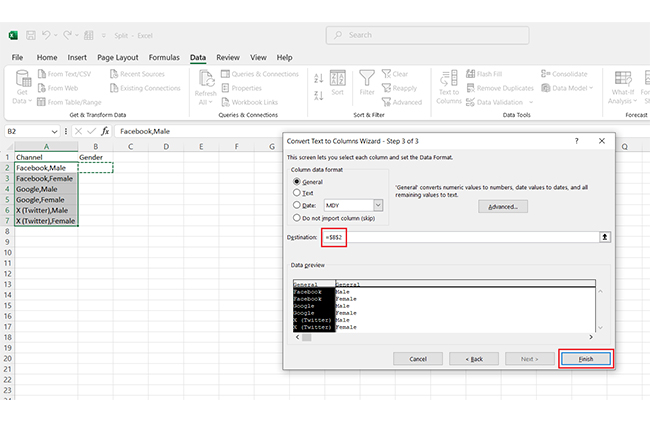
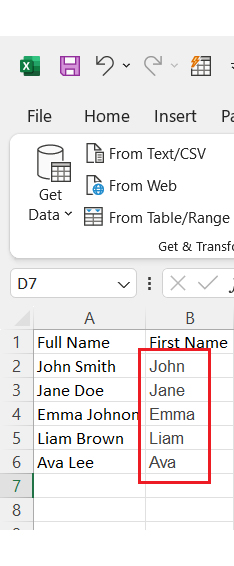
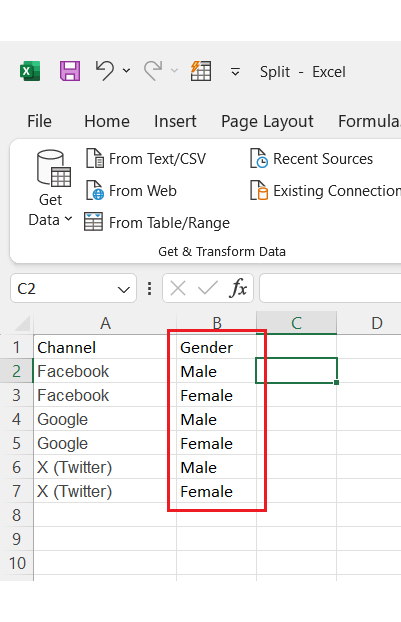
Your data after the split will appear as below:

Data After Split will Appear for Learning How to Split Data in Excel

How to Analyze Splitted Data in Excel?

Have you tried splitting data in Excel? It’s a lifesaver for organizing chaos and making data analysis easier.

But here’s the twist—analyzing that data is only half the battle. Without effective data visualization, the insights stay hidden.

Can we use Excel’s built-in charts? Yes, but they’re basic at best.

That’s where ChartExpo steps in. It turns your raw Excel data into dynamic, engaging visuals in just a few clicks.

Ready to split, analyze, and visualize like an expert? Install ChartExpo.

Let’s learn how to install ChartExpo in Excel.

  1. Open your Excel application.
  2. Open the worksheet and click the “Insert” menu.
  3. You’ll see the “My Apps” option.
  4. In the Office Add-ins window, click “Store” and search for ChartExpo on my Apps Store.
  5. Click the “Add” button to install ChartExpo in your Excel.

ChartExpo charts are available both in Google Sheets and Microsoft Excel. Please use the following CTAs to install the tool of your choice and create beautiful visualizations with a few clicks in your favorite tool.

Example

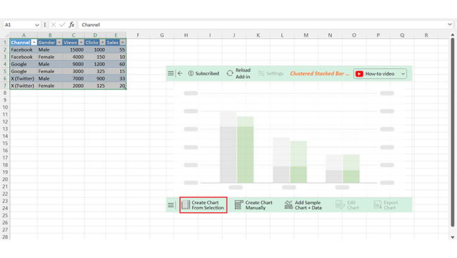
Let’s dive into analyzing and interpreting data with this sample data in Excel using ChartExpo to uncover meaningful insights.

Channel Gender Views Clicks Sales
Facebook Male 15000 1000 55
Facebook Female 4000 150 10
Google Male 9000 1200 60
Google Female 3000 325 15
X (Twitter) Male 7000 900 33
X (Twitter) Female 2000 125 20
  • To get started with ChartExpo, install ChartExpo in Excel.
  • Now Click on My Apps from the INSERT menu.
insert chartexpo in excel
  • Choose ChartExpo from My Apps, then click Insert.
open chartexpo in excel
  • Once it loads, scroll through the charts list to locate and choose the “Clustered Stacked Bar Chart”. This chart is best suited to this scenario.
search clustered stacked bar chart in excel
  • You will see a Clustered Stacked Bar Chart on the screen.
See Clustered Stacked Bar Chart After Learning How to Split Data in Excel
  • Click the “Create Chart From Selection” button after selecting the data from the sheet, as shown.
Click Create Chart From Selection After Learning How to Split Data in Excel
  • ChartExpo will generate the visualization below for you.
Initial Visual After Learning How to Split Data in Excel
  • If you want to have the chart’s title, click Edit Chart, as shown in the above image.
  • Click the pencil icon next to the Chart Header to change the title.
  • It will open the properties dialog. Under the Text section, you can add a heading in Line 1 and enable Show.
  • Give the appropriate title of your chart and click the Apply button.
Add Chart Header After Learning How to Split Data in Excel
  • You can change the color of the Male section by clicking on the Legend small pencil icon:
Change Color of Male Section by Clicking on Legend After Learning How to Split Data in Excel
  • You can change the color of the Female section by clicking on the Legend small pencil icon:
Change Color of Female Section by Clicking on Legend After Learning How to Split Data in Excel
  • Click the “Save Changes” button to persist the changes.
Click Save Changes After Learning How to Split Data in Excel
  • Your Clustered Stacked Bar Chart will appear as below.
Final How to Split Data in Excel

Insights

  • Male users dominate: Male users outperform female users in views, clicks, and sales across all channels.
  • Google leads in sales: Google drives the highest sales among male users.
  • Facebook tops views: Facebook generates the most views but is less efficient at converting them into sales.

Enhance Chart Insights Using Split Data Techniques in Microsoft Excel:

  1. Open your Excel Application.
  2. Install ChartExpo Add-in for Excel from Microsoft AppSource to create interactive visualizations.
  3. Select the Clustered Stacked Bar Chart from the list of charts.
  4. Select your data
  5. Click on the “Create Chart from Selection” button.
  6. Customize your chart properties to add header, axis, legends, and other required information.

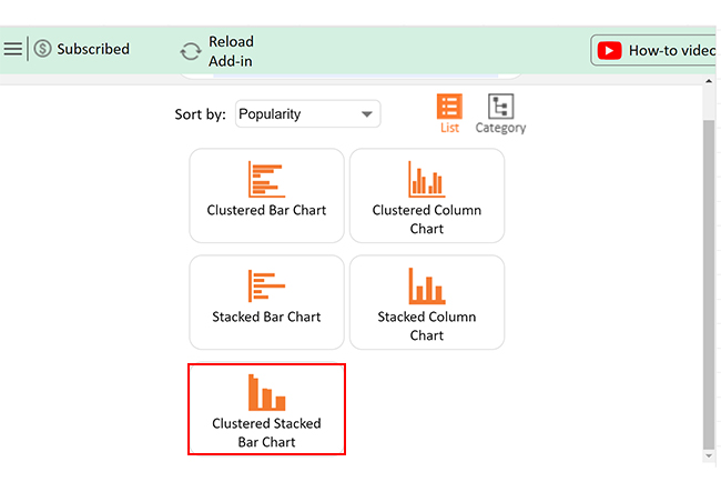
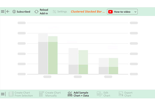
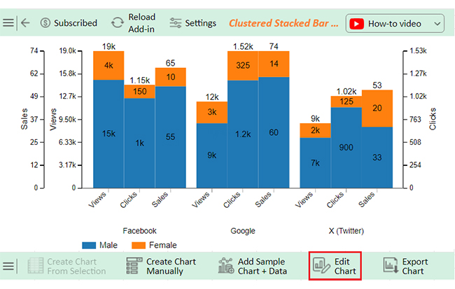
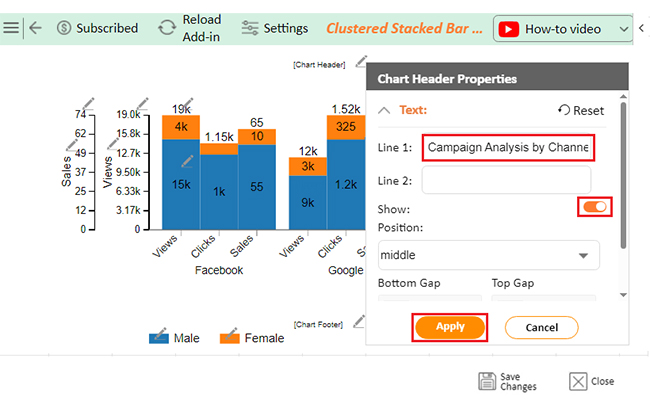
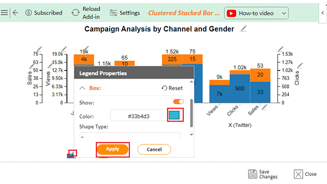
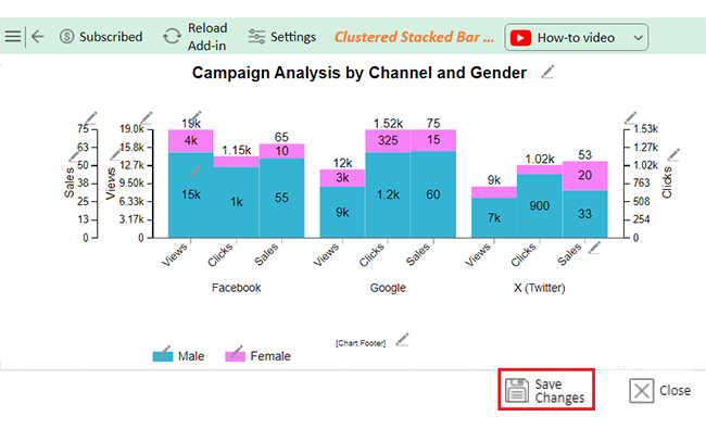
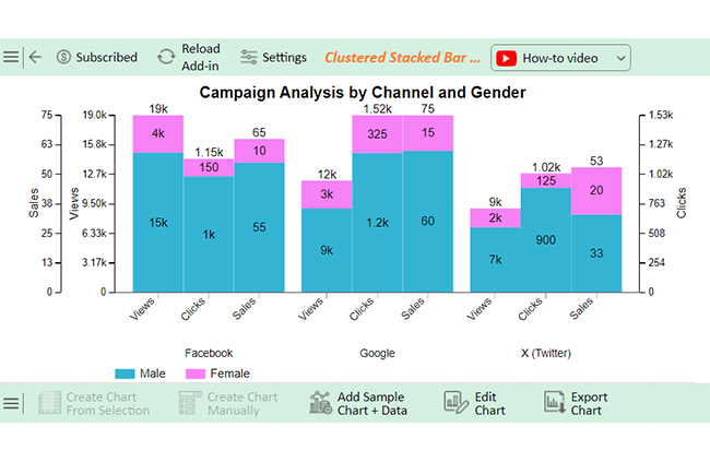
The following video will help you to create a Clustered Stacked Bar Chart in Microsoft Excel.

FAQs

How do I split data from one sheet to multiple in Excel?

To split data into multiple sheets in Excel:

  1. Organize your data in one sheet.
  2. Use filters or formulas to separate data by criteria.
  3. Copy filtered data into new sheets.
  4. Automation? Use VBA or Power Query.

How do I split certain cells in Excel?

To split certain cells in Excel:

  1. Select the cells to split.
  2. Go to the Data tab and click Text to Columns.
  3. Choose a delimiter (e.g., comma, space).
  4. Click Finish to split the data.

Is there a split function in Excel?

Excel doesn’t have a direct SPLIT function. However, you can use Text to Columns (in the Data tab). Or use functions like LEFT, RIGHT, MID, and TEXTSPLIT (Excel 365/2021) to split data effectively.

Wrap Up

Splitting data in Excel is a simple and powerful skill. It helps you organize, analyze, and present information effectively. The proper techniques make a big difference in handling small lists or large datasets.

Excel offers tools like “Text to Columns” and “Flash Fill”. These features save time and eliminate manual errors. They allow you to separate data with precision and speed.

Knowing how to split data in Excel improves efficiency. It makes data more manageable and easier to understand. Structured information is essential for accurate analysis and reporting.

Splitting data also enhances collaboration. Clean spreadsheets are easier to share and use across teams. You benefit from a more transparent, more organized view of the data.

Practice is the key to mastering these tools. Start with simple tasks and build your confidence. Over time, you’ll handle complex datasets with ease.

Learning how to split data in Excel is a valuable investment. It boosts productivity, saves effort, and ensures better results in your work.

How much did you enjoy this article?

ExcelAd2
Start Free Trial!
146068

Related articles

next previous
Microsoft Excel12 min read

Key Performance Indicators in Healthcare for Better Insights

Key Performance Indicators in healthcare track patient care and efficiency. Learn about these KPIs, top examples, and how to use them to improve outcomes.

Microsoft Excel10 min read

BMI Calculation Formula in Excel for Better Fitness Insights

The BMI calculation formula in Excel helps track and analyze body mass index. Explore step-by-step instructions and tips to simplify BMI tracking in Excel.

Microsoft Excel29 min read

How to Create a Tornado Chart in Excel? A Complete Guide

Click to learn how to plot a Tornado Chart in Excel using easy-to-follow steps. Also, we’ll address the following question: what is a Tornado Diagram?

Microsoft Excel14 min read

How to Create a Scatter Plot in Excel with 3 Variables?

Click to discover how to create a Scatter Plot in Excel with 3 variables. We’ll also address the following question: why do we use Scatter Plot Graph?

Microsoft Excel12 min read

Construction Budget Spreadsheet for Better Planning

A construction budget spreadsheet helps track expenses and control costs. This blog explores benefits, top templates, and tips for better budgeting in Excel.

ChartExpo logo

Turn Data into Visual
Stories

CHARTEXPO

  • Home
  • Gallery
  • Videos
  • Services
  • Pricing
  • Contact us
  • FAQs
  • Privacy policy
  • Terms of Service
  • Sitemap

TOOLS

  • ChartExpo for Google Sheets
  • ChartExpo for Microsoft Excel
  • Power BI Custom Visuals by ChartExpo
  • Word Cloud

CATEGORIES

  • Bar Charts
  • Circle Graphs
  • Column Charts
  • Combo Charts
  • Comparison Charts
  • Line Graphs
  • PPC Charts
  • Sentiment Analysis Charts
  • Survey Charts

TOP CHARTS

  • Sankey Diagram
  • Likert Scale Chart
  • Comparison Bar Chart
  • Pareto Chart
  • Funnel Chart
  • Gauge Chart
  • Radar Chart
  • Radial Bar Chart
  • Sunburst Chart
  • see more
  • Scatter Plot Chart
  • CSAT Survey Bar Chart
  • CSAT Survey Chart
  • Dot Plot Chart
  • Double Bar Graph
  • Matrix Chart
  • Multi Axis Line Chart
  • Overlapping Bar Chart
  • Control Chart
  • Slope Chart
  • Clustered Bar Chart
  • Clustered Column Chart
  • Box and Whisker Plot
  • Tornado Chart
  • Waterfall Chart
  • Word Cloud
  • see less

RESOURCES

  • Blog
  • Resources
  • YouTube
SIGN UP FOR UPDATES

We wouldn't dream of spamming you or selling your info.

© 2025 ChartExpo, all rights reserved.