Categories
Every time you visualize your data with a chart or graph, it all boils down to analytical skills in how you interpret your visualization.

Why?
In visualizing your data story, you aim to be clear and precise in your findings. You want a compelling data story that your audience can also understand. Clarity and relevance go a long way in focusing on what your audience will gain from your data visualization.
The visualization you choose determines the ease with which to interpret graphs and charts. Still, you need to eliminate less insightful information in your visualization.
This blog will help you learn the basics of chart and graph interpretation.
Let’s get started.
Definition: The interpretation of charts and graphs involves understanding and explaining the information they visually present. It means examining elements like titles, axes, labels, and legends to grasp what the data shows, then analyzing patterns, trends, and anomalies.
By putting these insights in context, interpretation turns raw visuals into meaningful conclusions that support clear communication and informed decisions.
In this section, you will put yourself in the presenter’s and the audience’s shoes. It will help you in a significant way in how you interpret graphs and charts.
It would be best to consider these factors to serve your audience effectively.
Look for the chart’s title and write it in your own words. The topic must be short and precise. This gives your audience a clue about what you want to communicate in your graph.
For example, if you’re using a Sunburst Chart, ensure that the title reflects the hierarchical data structure clearly and succinctly.
An example of a topic can be “Online Sales in 2020.” From such a topic, the audience will understand that you will communicate about the number of items you sell online.
Look for labels in your graphs and charts to familiarize yourself with what the visualization is saying. Still, labels show you the parameters and variables it displays.
For instance, in a Bar Graph of ‘Number of Shirts sold in June,’ the y-axis will show you the number of shirts sold, and the x-axis will show you the order of weeks in June.
You can use color coding in your chart or graph without taking up any extra space. Different colors have different meanings, and your audience reacts to various colors.
For instance, you can use green to show positive values and red to show negative values in a Waterfall chart. Colors can help you see the agreement and disagreement levels in a Likert Scale Chart.
Let’s use an example of the chart below to help you interpret it.

Here’s one fact you need to know. Your eye will start reading the chart from the left as you move toward the right. That is why it is vital to place your scale on the left.
The following are the essentials you can see in the chart above:
Chart title: The title reads “Sales Order by Quarter 1 Previous) vs. Quarter 2 (Current).” The title provides clear context to your audience about the visualization.
Scale: on the y-axis, the scale reads salespersons, while the x-axis shows the sales.
Color coding: you can easily identify the difference between the current and previous financial year with different colorings. The small legend on the bottom left of the chart helps you differentiate between the two financial years.
These are some of the insights the chart reveals:
To create easy-to-interpret charts and graphs, you need a data visualization tool. The common spreadsheet applications you use, such as Google Sheets and Excel, are the best in the world.
This tool is a third-party application called ChartExpo. You can download it easily and customize your charts and graphs.
ChartExpo offers a wide variety of chart templates, including Scatter plots, so you can choose the best visual for your data story. It’s an easy-to-use, budget-friendly tool that makes creating and interpreting charts and graphs a breeze.
Begin by reading the title carefully to understand what question the graph or chart answers. Check any subtitles or notes to grasp the context or time period covered.
Look at both the x-axis and y-axis to see what variables are being measured and the units used. Pay attention to the scale—whether it’s linear, logarithmic, or starts at zero—since this can affect interpretation.
Study the labels, legends, and data keys to decode what colors, lines, bars, or markers represent. Properly understanding these elements avoids misreading the data.
Scan the visual for overall patterns, such as upward or downward trends, cycles, clusters, or correlations. Recognizing these helps you pinpoint the main message of the chart or graph.
Spot any data points that stand out from the general pattern. Compare different groups, categories, or time periods to find significant differences, similarities, or unexpected results.
Combine your observations to explain what the data shows in simple terms. Think about what factors might influence the results and what actions or decisions the insights support. Consider sharing your interpretation clearly if presenting to others.
Let’s use the table below to create a Sankey graph.
| Income Sources | Income | Spending Sources | Taxes & Savings | Spending |
| Distributions | Income | Taxes | Federal | 914820 |
| Distributions | Income | Taxes | State | 223879 |
| Distributions | Income | Savings | Stock | 2691669 |
| Distributions | Income | Savings | Bonds | 256029 |
| Distributions | Income | Savings | Cash | 727717 |
| Salaries | Income | Food & Dining | 23266 | |
| Salaries | Income | Office | 9189 | |
| Salaries | Income | Travel | 8944 | |
| Dividends | Income | Health Insurance | 4283 | |
| Dividends | Income | Shopping | 5769 | |
| Interest | Income | Bills & Utilities | 5194 | |
| Interest | Income | Other Expenses | 8490 |
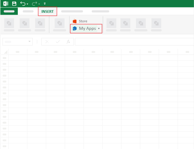
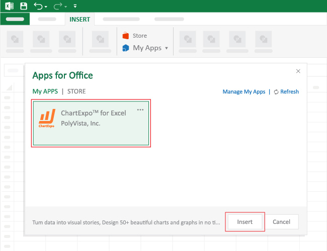
To get started with ChartExpo in Excel, follow the steps below:


Your final chart will appear as shown below.

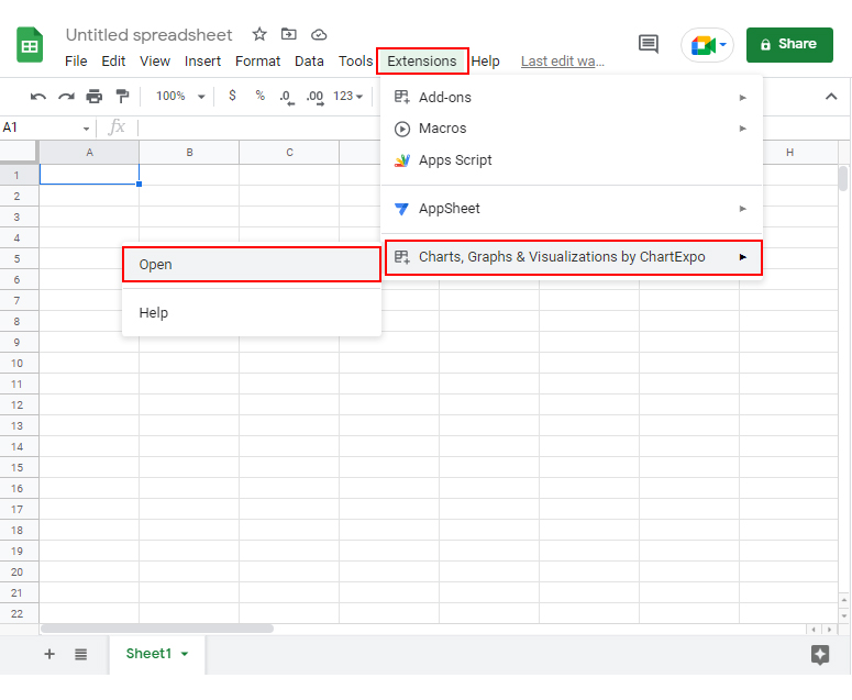
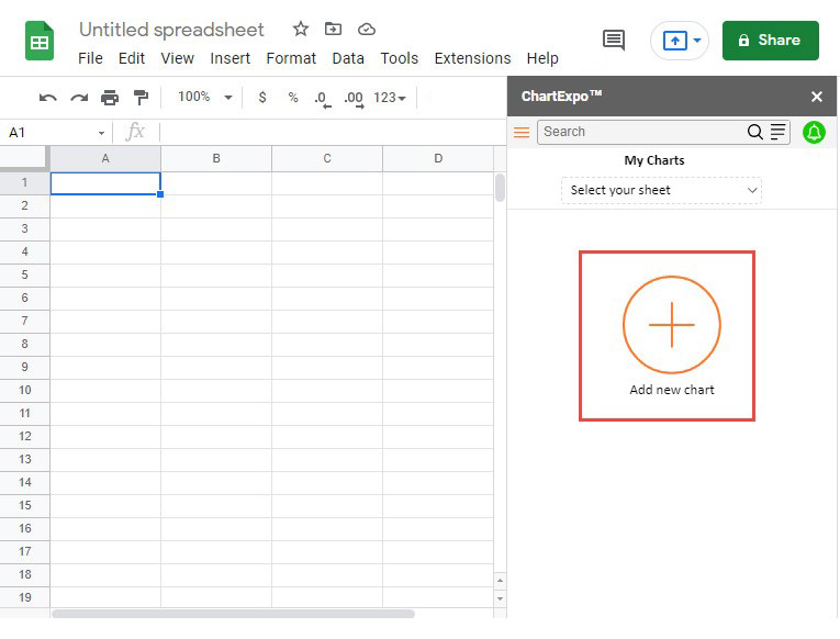
Let’s use the data below to create a Likert Scale Chart in Google Sheets.
| Questions | Scale | Responses |
| Was the product a good purchase? | 1 | 138 |
| Was the product a good purchase? | 2 | 186 |
| Was the product a good purchase? | 3 | 176 |
| Was the product a good purchase? | 4 | 230 |
| Was the product a good purchase? | 5 | 270 |
| Is the product affordable? | 1 | 50 |
| Is the product affordable? | 2 | 138 |
| Is the product affordable? | 3 | 186 |
| Is the product affordable? | 4 | 176 |
| Is the product affordable? | 5 | 500 |
| How likely are you to recommend this product to others? | 1 | 330 |
| How likely are you to recommend this product to others? | 2 | 160 |
| How likely are you to recommend this product to others? | 3 | 200 |
| How likely are you to recommend this product to others? | 4 | 238 |
| How likely are you to recommend this product to others? | 5 | 286 |


Your Likert Scale will appear as shown below.

Let’s use the table below to create a Comparison Bar Chart in Excel or Google Sheets.
| Quarterly | Product | Sales Order |
| Quarter-1 | Board Marker Box | 700 |
| Quarter-1 | White Board | 600 |
| Quarter-1 | A4-Size Sheets/ream | 1000 |
| Quarter-1 | Blue Ball Points Box | 500 |
| Quarter-1 | Pointer Box | 800 |
| Quarter-1 | Glue Stick Box | 1000 |
| Quarter-1 | Highlighter Box | 600 |
| Quarter-1 | Box File | 700 |
| Quarter-1 | Hard File | 500 |
| Quarter-1 | Fiber File | 550 |
| Quarter-2 | Board Marker Box | 1000 |
| Quarter-2 | White Board | 500 |
| Quarter-2 | A4-Size Sheets/ream | 800 |
| Quarter-2 | Blue Ball Points Box | 700 |
| Quarter-2 | Pointer Box | 900 |
| Quarter-2 | Glue Stick Box | 800 |
| Quarter-2 | Highlighter Box | 600 |
| Quarter-2 | Box File | 650 |
| Quarter-2 | Hard File | 700 |
| Quarter-2 | Fiber File | 550 |
| Quarter-3 | Board Marker Box | 1200 |
| Quarter-3 | White Board | 700 |
| Quarter-3 | A4-Size Sheets/ream | 800 |
| Quarter-3 | Blue Ball Points Box | 1000 |
| Quarter-3 | Pointer Box | 900 |
| Quarter-3 | Glue Stick Box | 1300 |
| Quarter-3 | Highlighter Box | 800 |
| Quarter-3 | Box File | 900 |
| Quarter-3 | Hard File | 600 |
| Quarter-3 | Fiber File | 800 |

Let’s use the table below to create a Radar Chart in Excel or Google Sheets.
| Product | Month | Orders |
| TV | Jan | 80 |
| TV | Feb | 65 |
| TV | Mar | 75 |
| TV | Apr | 80 |
| TV | May | 90 |
| TV | Jun | 85 |
| TV | Jul | 65 |
| TV | Aug | 70 |
| TV | Sep | 80 |
| TV | Oct | 93 |
| TV | Nov | 99 |
| TV | Dec | 80 |
| Smart Phones | Jan | 100 |
| Smart Phones | Feb | 60 |
| Smart Phones | Mar | 95 |
| Smart Phones | Apr | 75 |
| Smart Phones | May | 100 |
| Smart Phones | Jun | 60 |
| Smart Phones | Jul | 95 |
| Smart Phones | Aug | 75 |
| Smart Phones | Sep | 109 |
| Smart Phones | Oct | 80 |
| Smart Phones | Nov | 109 |
| Smart Phones | Dec | 75 |
| Computers | Jan | 50 |
| Computers | Feb | 55 |
| Computers | Mar | 51 |
| Computers | Apr | 40 |
| Computers | May | 45 |
| Computers | Jun | 30 |
| Computers | Jul | 39 |
| Computers | Aug | 45 |
| Computers | Sep | 56 |
| Computers | Oct | 39 |
| Computers | Nov | 48 |
| Computers | Dec | 44 |

Always read the title first to understand what question the graph or chart is answering. Knowing the purpose helps you focus on the key message.
Look at the horizontal (x-axis) and vertical (y-axis) axes to see what variables are being measured and in what units. Pay attention to the scale to avoid misreading values.
Labels explain categories or data series, while the legend decipher colors, patterns, or symbols. Together, they clarify how to interpret each visual element correctly.
Scan the chart for trends over time, comparisons between groups, and any data points that stand out from the rest. These insights often reveal important stories behind the numbers.
Think about where the data comes from and what factors might influence it. Understanding context helps you avoid misinterpretation.
Finally, summarize what the graph or chart is telling you. Combine visual clues with background knowledge to extract meaningful insights and support informed decisions.
Look for an insight that interests your audience and phrase it in your own words.
With the data you want to present, draw informed conclusions from it. This strategy becomes more manageable with a chart or graph.
Charts and graphs, including the Slop chart, are a medium to communicate insights from a data store. Interpreting the information is the essence of everything you want to accomplish. This will involve much listening, explanations, and comprehension.
One chart or graph can have different stories to tell. For instance, if your chart talks about online sales in 2022, the sales will comprise other items, the number of items sold, and the amount of money from such sales.
To interpret a graph means to read the title and the labels to know what you are measuring. Also, read the scale to note the variables you are measuring and their quantities.
You can summarize the findings in your own words, which will help you conclude.
Using color coding is the best way to ensure your graph is easy to interpret. Colors attract the audience because their brain interprets colors differently.
Ensure that you use different colors to show your audience other variables. For instance, they can identify previous and current sales in different periods.
The best way to describe a graph is to state what it shows, highlight key trends or patterns, mention any significant data points or outliers, and explain what these insights mean in context.
In a nutshell, how to analyze graphs involves understanding how you can translate data into meaningful insights.
From what you have learned throughout the discussions, interpreting a graph requires you to have basic analytical skills. You also need to understand the nature of your visualization.
When creating data visualization, remember that it should be simple. A non-professional audience also needs to gain knowledge from your insights.
You have learned that creating such appealing visualizations will require you to use a third-party application called ChartExpo in your spreadsheet.
You have also learned that ChartExpo is an easy-to-use tool and comes with numerous charts for you to choose from.
Now that you have understood how to interpret graphs and charts, it’s your turn to give it a go.
Start a 7-day free trial today and access charts and graphs that are easy to interpret.