By ChartExpo Content Team
Picture this: you’re swamped with information, unable to see the forest for the trees. Imagine a tool that cuts through the noise, highlighting the key issues demanding your attention. That’s the power of Pareto Charts.
From manufacturing to marketing, Pareto Charts are everywhere. They highlight the most common defects, allowing companies to prioritize fixes with the biggest impact. Imagine reducing defects by focusing on just a few key issues.
They identify top-performing products in sales, helping businesses maximize revenue with minimal effort. The beauty of Pareto Charts is their versatility, making complex data digestible and actionable.
Let’s dive into the world of Pareto Charts and see how they can revolutionize how you approach data, making it simpler, clearer, and infinitely more powerful.
First…
The Pareto Principle, also known as the 80/20 rule, traces back to the late 19th century. While studying wealth distribution in Italy, Vilfredo Pareto noticed that 80% of the wealth was held by 20% of the population. This observation led to the broader realization that a small number of causes often lead to a large percentage of effects. This principle isn’t just historically trivial it’s a powerful tool that can transform how we approach data.
From manufacturing to marketing, Pareto Charts are everywhere. In quality control, they highlight the most common defects, allowing companies to prioritize fixes with the biggest impact. In sales, they identify the top-performing products that generate the most revenue. The beauty of Pareto Charts is their versatility, making complex data digestible and actionable.
Manufacturers thrive on efficiency. Pareto Charts pinpoint the 20% of issues causing 80% of production problems. This targeted approach to problem-solving means less downtime and higher productivity. By focusing on significant issues, companies can streamline operations and boost output.
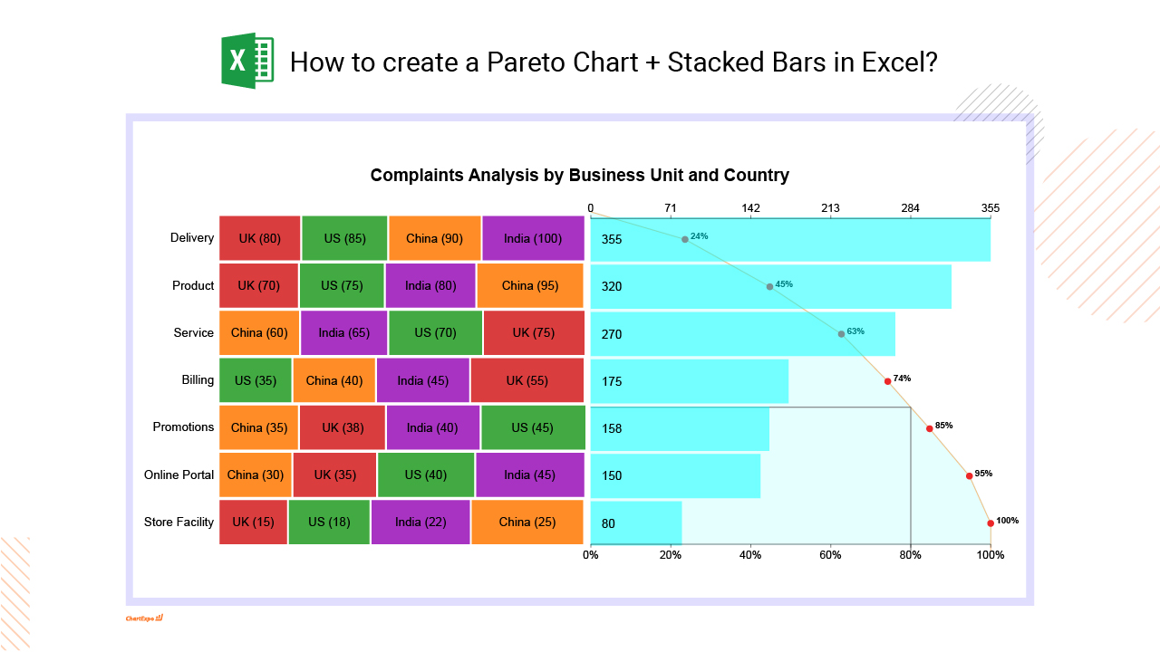
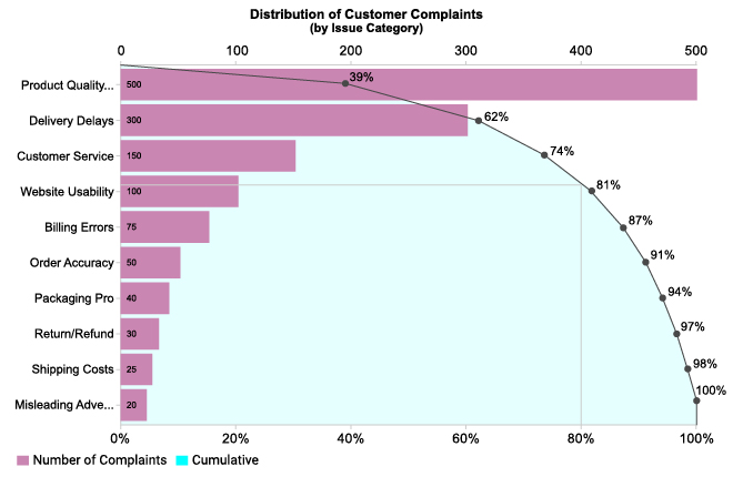
Customer complaints can feel overwhelming. Pareto Charts help by showing which issues are most frequent. By addressing these top concerns, businesses can significantly improve customer satisfaction. It’s about making the biggest impact with the least effort.
Businesses run on processes, and inefficiencies can be costly. Pareto Charts help identify the most problematic areas, allowing businesses to streamline operations. Companies can save time and resources by concentrating on the most critical issues, leading to better overall performance.
In healthcare, small mistakes can have huge consequences. Pareto Charts, when combined with analytics in healthcare, help medical facilities focus on the most common sources of errors, improving patient safety.
They also enhance workplace safety by highlighting the most frequent types of accidents, allowing for targeted interventions.
A Pareto Chart is a simple bar graph that helps identify the most significant factors in a dataset. It ranks items in descending order, clarifying which factors contribute the most to a problem or situation. This chart is crucial for quality control and decision-making processes.
The 80-20 rule, or the Pareto Principle, states that roughly 80% of effects come from 20% of causes. This principle helps focus efforts on the most impactful areas, allowing for more efficient problem-solving and resource allocation.
A Pareto Chart consists of:
Pareto Charts are invaluable for identifying key issues in a process. By focusing on the most frequent problems, organizations can allocate resources more effectively and solve issues with the greatest impact.
Using Pareto Charts helps prioritize efforts where they will have the most significant impact. This approach ensures that time and resources are used efficiently, targeting the “vital few” causes that contribute to the majority of problems.
In real-world scenarios, Pareto Charts are used to:
Using these insights, businesses can make data-driven decisions that improve overall performance and customer satisfaction.
A Pareto Chart is your go-to tool for identifying the biggest factors contributing to a problem. By focusing on the most significant issues, you can effectively target your improvement efforts. Let’s break down the process of creating one.
First, figure out what you’re analyzing. Are you looking at customer complaints, product defects, or delays? Pick categories that have the most impact. This step sets the stage for meaningful data analysis.
Accuracy is key. Use reliable sources to gather data. Surveys, CRM analytics systems, and production logs can be gold mines. Ensure your data is complete and error-free. Garbage in, garbage out!
Once you have your data, organize it. Group similar items together. Count the frequency of each category. This helps visualize which categories stand out.
Start with your data table. List categories and their frequencies. Arrange them in descending order. This makes it easy to see which issues are most significant.
ChartExpo is a handy tool for creating Pareto Charts. It’s user-friendly and integrates well with data visualization software. Simply input your data, and ChartExpo does the rest. It’s a quick way to get professional results.
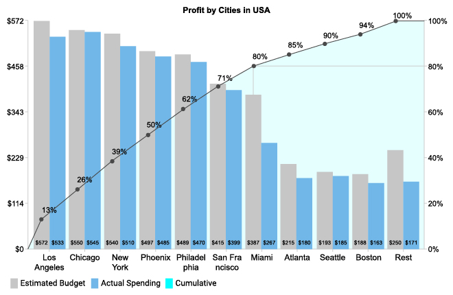
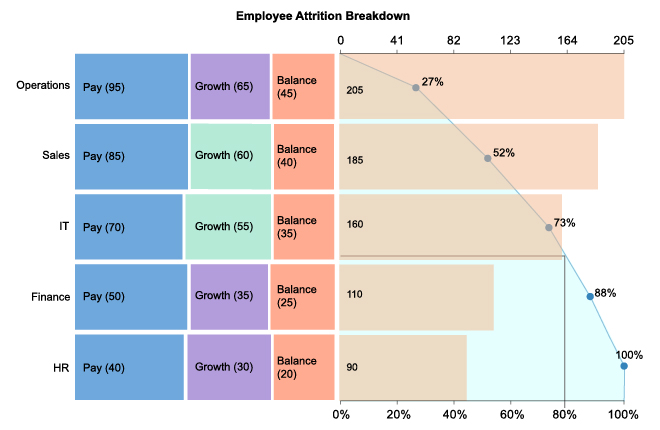
A Pareto Curve adds depth to your chart. It shows cumulative impact. To add this, use your charting tool to overlay a line graph on your bar chart. This visual cue highlights the 80/20 principle.
Make your chart easy to read. Use contrasting colors for bars. Label everything clearly. Add data labels to bars to show exact figures. This helps in quick comprehension.
Watch out for common mistakes. Don’t clutter your chart with too many categories. Stick to the most significant ones. Avoid using hard-to-read fonts or colors that blend. Keep it simple and focused.
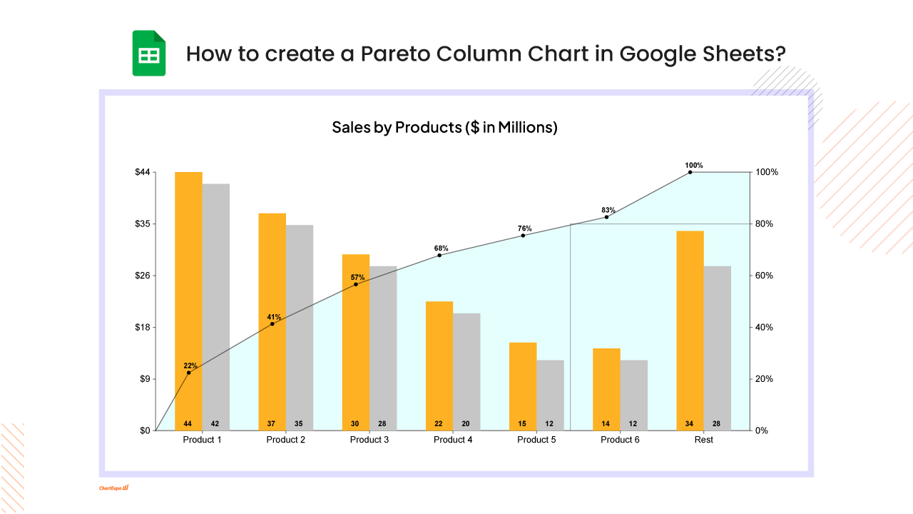
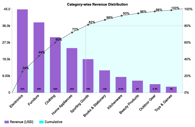
A Pareto Chart uses bars to represent individual values in descending order, with the highest bar on the left and the lowest on the right. Each bar shows the frequency or impact of a specific category. The height of each bar is crucial – it tells you which factors are most significant.
Above the bars, a line chart runs from left to right. This cumulative line shows the total percentage as you move across the bars. It helps you understand the combined effect of the categories. For instance, if the line hits 80% after the first few bars, you know these few categories contribute to the majority of the impact.
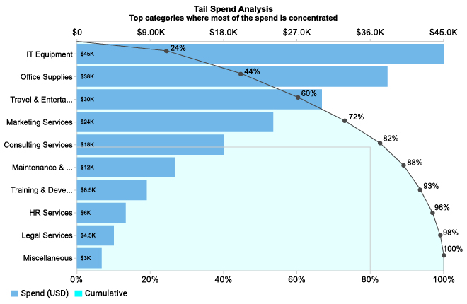
Look at the tallest bars – these represent the most frequent issues or highest impacts. Patterns often emerge, helping you spot the most critical areas needing attention. If you see a few categories dominate, these are your primary focus points.
The Pareto principle, or the 80/20 rule, suggests that 80% of problems come from 20% of causes. Use the chart to identify these vital few causes. By addressing these, you can make significant improvements with less effort.
Use the chart to decide where to allocate resources. Focus on the top bars – these areas need the most attention and will give you the best return on investment. Efficient resource allocation ensures that you tackle the most impactful problems first.
The cumulative line helps in strategic decision-making. If the line plateaus early, you know the major issues are already addressed. If it’s still rising, there are more areas to improve. This visual cue boosts confidence in your decisions, ensuring they are backed by solid data.
Weighted Pareto Charts add another layer by giving different weights to categories based on their importance or cost. This approach provides a more nuanced view, showing not just frequency but the overall impact of each category.
To create a weighted Pareto Chart, multiply the frequency of each category by its assigned weight. This method helps in understanding the true cost or impact, allowing for more targeted and effective problem-solving.
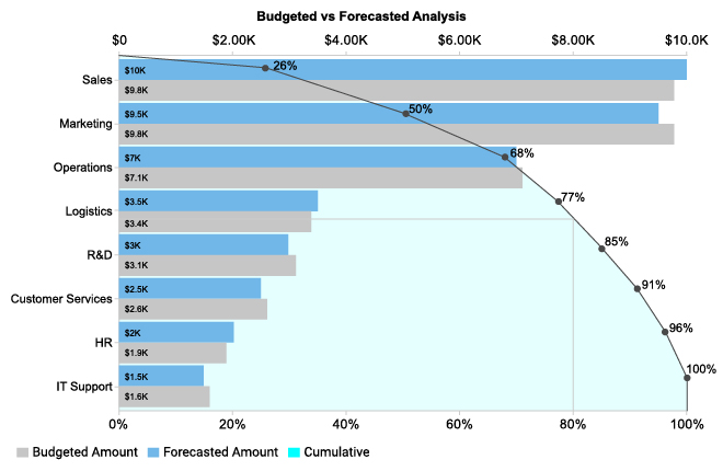
Comparative Pareto Charts allow you to compare different data sets side by side. This is useful for tracking changes over time or comparing different departments or processes. It highlights differences and similarities, guiding you to specific areas needing attention.
By comparing Pareto Charts from different periods, you can see trends and measure the effectiveness of improvements. Continuous tracking ensures that changes have the desired effect and helps adjust strategies as needed.
Sub-Pareto Charts break down the largest categories into more detailed sub-categories. This detailed view helps in understanding the root causes of major issues. It’s like zooming in on a problem to see its finer details.
Nested Pareto Charts involve creating a series of Pareto Charts, each drilling down into a specific category. This comprehensive approach provides a thorough analysis, helping in addressing issues at all levels, from broad categories to specific details.
Quality control is the backbone of manufacturing. A Pareto Chart can pinpoint the 20% of causes leading to 80% of defects. Think about it: instead of chasing every minor issue, focus on the big offenders. This targeted approach can slash defect rates and streamline processes. Imagine a factory where the majority of product flaws come from a few sources. Tackling these first means quicker, more noticeable improvements.
Take a look at Toyota. They used Pareto Charts to identify the top causes of production delays. By addressing these key issues, they not only cut down on delays but also boosted overall efficiency.
Another example is GE, which saw a significant drop in defects after implementing Pareto Analysis in its Six Sigma projects.
Ever feel like customer complaints are endless? Pareto Charts can help. By identifying the most common complaints, businesses can address the issues that affect the most customers.
Imagine a call center: instead of training agents on every possible issue, they focus on the few that cause the most trouble. This approach leads to faster resolutions and happier customers.
Data-driven insights can transform customer service. A retail giant used Pareto Charts to find that most complaints were about a few products. They improved these products, leading to a noticeable drop in complaints and an increase in customer satisfaction.
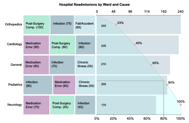
In healthcare, the stakes are high. Healthcare Charts like Pareto Charts can reveal the most common sources of patient complaints and medical errors. Hospitals can then focus their efforts on these areas, leading to better patient outcomes.
For example, a hospital found that most patient complaints were about wait times. By addressing this issue, they improved patient satisfaction and reduced complaints.
Safety is paramount in healthcare. By using Pareto Charts to identify the main causes of accidents and errors, hospitals can implement targeted safety protocols. This focused approach leads to safer environments for both patients and staff.
Businesses are always looking to do more with less. Pareto Charts can help streamline operations by highlighting the most significant inefficiencies.
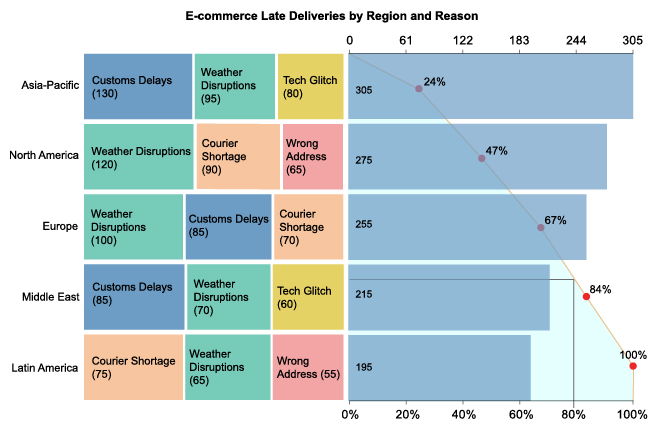
For instance, a logistics company used Pareto Analysis to find that a few routes caused the most delays. By optimizing these routes, they improved overall efficiency and reduced costs.
Consider a major airline that used Pareto Charts to reduce maintenance delays. They found that a small number of issues caused most of the delays. By focusing on these, they cut maintenance time and improved on-time performance.
Accurate data is key to effective Pareto Charts. Let’s look at best practices for reliable data gathering and avoiding common pitfalls in data collection.
A well-designed Pareto Chart speaks volumes. Here are tips for clear and impactful visuals, along with customization options for different audiences.
Establishing regular review processes and leveraging Pareto Charts can drive continuous enhancement. Here’s how to keep improving.
Use these tips to make your Pareto Charts a powerful tool for data analysis and decision-making. Accurate data, effective design, and continuous improvement will drive success.
In a leading automotive company, a significant number of defects were causing delays and increased costs. By applying Pareto analysis, they discovered that 80% of these defects stemmed from just 20% of the processes. By focusing on these key processes, they managed to reduce defects by 50% within six months. This not only streamlined production but also significantly cut costs.
A hospital facing numerous patient safety incidents used Pareto analysis to pinpoint the most frequent issues. They found that a small number of procedures were responsible for most incidents. By targeting these procedures for improvement, the hospital decreased patient safety incidents by 40% in just a year, significantly improving patient care and trust.
A telecom company experienced high volumes of customer complaints, leading to decreased customer satisfaction. Pareto analysis revealed that a few specific issues accounted for the majority of complaints. By addressing these issues, the company reduced complaints by 60% and saw a marked improvement in customer satisfaction scores.
In the electronics industry, a company faced high defect rates in its circuit board production. Using Pareto analysis, they identified that soldering issues were the primary cause. By investing in better soldering equipment and training for staff, defects were reduced by 70%, leading to higher product quality and customer satisfaction.
A retail company struggling with delivery delays applied Pareto analysis and found that a small number of suppliers were causing most delays. By renegotiating terms and improving logistics with these suppliers, the company improved delivery times by 50%, enhancing customer loyalty and retention.
A large healthcare provider used Pareto analysis to reduce medication errors. They discovered that errors were concentrated in a few high-traffic areas of the hospital. By implementing targeted training and better protocols in these areas, they cut medication errors by 45%, significantly improving patient outcomes and reducing liability.
Creating Pareto Charts can be straightforward with the right tools, and ChartExpo is a top choice. This software simplifies the process, offering an intuitive interface that integrates seamlessly with various platforms like Excel and Google Sheets.
With ChartExpo, you can create visually appealing Pareto Charts in just a few clicks, making it an excellent tool for both beginners and experienced users. As a versatile graph maker, the software focuses on ease of use, ensuring that even those with minimal technical skills can produce professional-quality charts.
You can create a Pareto Chart in your favorite spreadsheet. Follow the steps below to create a Pareto Chart.
The following video will help you to create a Pareto Chart in Microsoft Excel.
The following video will help you to create a Pareto Chart in Google Sheets.
Ever started a project only to find your data looks like Swiss cheese? Full of holes and not very appetizing? It’s a common problem. The trick is to plug those gaps.
Gathering data can feel like herding cats. But with the right approach, you can make it manageable.
Sometimes, Pareto Charts don’t turn out as planned. Here’s how to fix them.
Your chart should tell the right story. Here’s how to ensure it does.
Got a mountain of data? Here’s how to climb it without breaking a sweat.
Sometimes, less is more. Here’s how to simplify your charts.
A Pareto Chart can seem basic at first glance, but mastering its use can unlock powerful insights. For advanced users, here are some expert techniques:
By integrating these advanced techniques, your Pareto Charts will not only provide clearer insights but also drive more informed decision-making across all levels of your organization. Keep the energy high, stay direct, and ensure every element adds value.
Pareto Charts are a go-to tool for manufacturers looking to boost efficiency. They help identify the most common defects in production processes. By focusing on the top 20% of problems causing 80% of defects, manufacturers can streamline their quality control efforts. This targeted approach ensures resources are allocated where they’ll make the most impact, reducing waste and increasing overall production quality.
In the realm of lean manufacturing, Pareto Charts play a pivotal role. Consider a factory producing automotive parts. Initially, they faced high defect rates, which slowed down production and increased costs.
By using Pareto Charts, the management identified that most defects stemmed from a few specific areas – mainly machining and assembly errors. Addressing these key issues first led to a significant reduction in defects, boosting overall production efficiency and reducing costs.
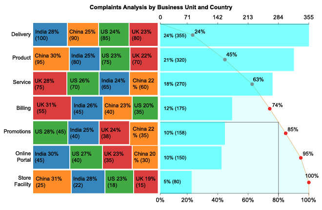
Retailers use Pareto Charts to understand customer complaints and preferences better. By focusing on the most common complaints, they can make changes that significantly enhance the customer experience.
For instance, if the bulk of complaints are about product availability, improving inventory management can lead to higher customer satisfaction and increased sales.
A retail chain noticed a decline in customer loyalty. Using Pareto Charts, they identified that most complaints were about poor customer service and stockouts. By training staff better and optimizing inventory levels, they significantly improved customer satisfaction. This led to a boost in repeat customers and increased overall sales, demonstrating the power of focusing on the most impactful issues.
In software development, Pareto Charts help teams focus on the most critical bugs and system failures. This targeted approach ensures that developers address the issues that most affect user experience and system performance. For example, if the majority of user complaints are due to a few recurring bugs, fixing these first can lead to a more stable and user-friendly product.
A software company faced numerous bug reports from users. By applying Pareto analysis, they found that 80% of the issues were caused by just 20% of the bugs. Prioritizing these key issues led to a significant improvement in software stability and performance. As a result, user satisfaction increased, and support costs decreased, illustrating the effectiveness of using Pareto Charts in software development.
Each sector, from manufacturing to healthcare, retail, and IT, can benefit significantly from using Pareto Charts. By focusing on the vital few rather than the trivial many, organizations can streamline processes, enhance quality, and improve overall efficiency.
When you’re presenting a Pareto Chart, you’re not just showing data. You’re telling a story. Imagine you’re the Sherlock Holmes of your business (but without the deerstalker hat). Highlight the “vital few” from the “trivial many.” Did 20% of your products bring in 80% of your revenue?
Say it clearly. Paint the picture vividly. Make it relatable.
Different folks, different strokes. Your CFO might want the hard numbers. Your marketing team? They love a good story. Be cautious of misleading charts; they can distort the message. Tailor your presentation accordingly. For the boardroom, emphasize impact and ROI. For the team meeting, focus on actionable insights. Keep it simple but meaningful.
Ask questions like, “What can we do with this information?” and “How do we leverage our top performers?”
You’ve got the data. Now what? It’s time to act. Identify your top 20% – those key drivers that make the most difference. Are they your best products? Your most efficient processes? Focus your resources there.
Make changes that matter. Don’t scatter your efforts. Concentrate and conquer.
Pareto Analysis isn’t just a chart. It’s a strategy. Align it with your business goals.
Want to boost sales? Find out which products are top sellers.
Looking to improve customer service? Identify the common complaints. Align your Pareto findings with your goals and make them work together.
The business landscape changes faster than you can say “Pareto.” Stay sharp. Keep learning. New tools and techniques are always emerging. Attend workshops, read the latest blogs, and join webinars. Adapt your Pareto Analysis with these new insights. Stay ahead of the curve.
Your business isn’t static. Your Pareto Analysis shouldn’t be either. Reevaluate and adapt. What was top yesterday might not be top today. Keep your analysis fresh. Update your charts regularly. Be ready to pivot based on new data. Flexibility is your friend.
Pareto Charts improve decision-making by highlighting the most critical areas for improvement. By focusing on the significant few, rather than the trivial many, resources can be allocated more effectively. This leads to quicker, more impactful changes.
Yes, Pareto Charts are versatile. They can be used in education to identify common student errors, in healthcare to track the most frequent causes of patient complaints, or even in personal life to prioritize daily tasks.
While Pareto Charts are powerful, they have limitations. They rely on accurate data and proper categorization. If the data is flawed or the categories are not well-defined, the chart can be misleading. Also, Pareto Charts don’t show the relationships between causes; they only highlight individual impacts.
A Pareto distribution is a statistical distribution that describes a situation where a small number of factors contribute to a large effect.
Using the Pareto Chart isn’t just about creating a pretty graph. It’s about making smarter decisions faster. By zeroing in on the critical few issues that cause most of your problems, you can allocate your resources more effectively and drive impactful changes.
Remember, every business has its bottlenecks. The Pareto Chart helps you see them. It’s like having a flashlight in a dark room – you’ll know exactly where to step to avoid stumbling.
So, get out there, apply what you’ve learned, and watch as your efficiency skyrockets. Your team will thank you, and your bottom line will reflect it.
Keep pushing boundaries, and keep questioning norms. The Pareto Principle isn’t just a theory; it’s your secret weapon for success. Embrace it, use it, and see the difference it makes.