Categories
By ChartExpo Content Team
Everyone nodded. No one agreed.
That’s how most meetings go when a hierarchy chart sets the plan. It looks clear. It feels approved. But when pressure hits, the gaps show fast. Decision speed slows. Influence hides behind dotted lines and empty titles. And everyone asks the same question: Who’s actually in charge?
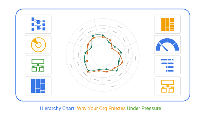


A hierarchy chart works on paper. That’s the problem. It creates comfort in calm moments. Then it falls apart in motion. Deadlines move faster than titles. Crisis makes dotted lines vanish. People freeze or guess their way forward. Structure turns into a guessing game.
The hierarchy chart is supposed to guide. But if it creates more questions than answers, it’s a roadblock. A clean layout won’t fix buried roles, fake consensus, or fake authority. If your hierarchy chart can’t hold up under pressure, it’s time to test what it’s made of.
Hierarchy charts may look perfect during leisurely planning sessions. But when decisions need to be made swiftly, they often fall apart. The structure that seemed sound at first glance quickly reveals its flaws.
In fast-paced situations, the logic behind these charts gets strained. The pressure exposes weak points, causing delays and confusion. That’s why it’s essential to evaluate whether your chart speeds up or slows down processes.
Don’t let a calm sign-off lull you into a false sense of security. Test your hierarchy chart’s ability to handle rapid decision-making. Ensure it’s a tool for guidance, not a roadblock.
The nodding heads during meetings can be deceiving. Just because everyone seems to agree doesn’t mean they do. Hierarchy charts can mask underlying tensions that only surface later.
Shallow consensus is a trap. It creates a facade of unity that crumbles when real challenges arise. The chart might look good, but the agreement it represents is often superficial.
To avoid post-launch eruptions, dig deeper. Ensure that the consensus is genuine and not just a nodding routine. A hierarchy chart should reflect true alignment, not just the illusion of it.
A polished hierarchy chart can be deceiving. It might look right, but that doesn’t mean it’s structurally sound. Visual tidiness doesn’t guarantee operational stability.
The disconnect between appearance and reality can be costly. It leads to wasted time, eroded trust, and compromised outcomes. Don’t be fooled by a chart that seems perfect on the surface.
Audit your hierarchy chart under pressure. Test its resilience in real-world scenarios. Treat “approved” charts as drafts needing refinement to ensure they hold up when it matters most.
It’s funny how something as trivial as box size in a chart can stir up trouble. In the hierarchy world, bigger boxes often get mistaken for bigger roles. Suddenly, everyone’s measuring their worth by the size of their rectangle.
But here’s the catch: influence isn’t about how big your box is. It’s about who you can sway, who listens when you speak. Those tiny boxes with massive influence? They’re the ones who can shift outcomes, yet they remain unnoticed until tensions boil over.
The fallout? Turf wars and silent grudges. People start aligning themselves with box sizes rather than actual influence. And in the end, the chart becomes less about structure and more about ego. It’s not just a diagram; it’s a battleground.
When you flatten a hierarchy chart, you think you’re leveling the playing field. You hope it’ll bring peace, make everyone feel equal. But reality doesn’t work that way. Instead, you’ve just muddied the waters.
Without clear roles, decision-making becomes a guessing game. Who’s really in charge? Who makes the call? You’ve got a chart that looks fair and square, but it’s a mirage. People move in circles, unclear on who holds the reins.
And the aftermath? Decision speed hits the brakes. When everyone’s equal, no one feels empowered to decide. The flat chart that was supposed to soothe tensions ends up being the spark that ignites them. Irony at its finest.
Those dotted lines may look harmless, but they’re ticking time bombs. On paper, they seem to suggest collaboration and shared responsibility. But when push comes to shove, they crumble.
In a crisis, everyone’s looking for accountability. But those dotted lines? They offer none. Suddenly, no one knows who should step up, and everyone is pointing fingers. The clarity you thought you had is nowhere to be found.
As the dust settles, you realize the dotted lines were an illusion. They promised teamwork but delivered confusion. When the stakes are high, those soft boundaries do more harm than good, leaving you with a mess of unresolved roles and missed responsibilities.
Titles like “Lead” or “Advisor” seem straightforward, but they’re loaded with assumptions. People see these titles and expect authority, decision-making power. But sometimes, they’re just words, devoid of real clout.
The issue arises when titles are misread as promises of power. Someone sees “Partner” and assumes they’re in charge, only to find out they’re not. The resentment builds, and before you know it, titles have turned into battlegrounds.
This isn’t just about miscommunication; it’s about managing expectations. When titles don’t match responsibility, they breed discontent. The promises implied by those words become a source of conflict, not clarity, making the hierarchy chart a minefield of unmet expectations.
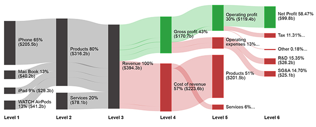
Ever feel like you’re swimming upstream when it comes to getting approvals? That’s where the Sankey Diagram shines. It vividly lays out where decisions and funds hit a standstill. This chart is your go-to when the sign-off process feels like a maze.
Sankey Diagrams don’t just show you where things are stuck; they also reveal why. Is it the bottleneck in decision-making or a funding logjam? Either way, this diagram offers a clear map. It’s particularly useful for spotting where resources are getting clogged and why nothing seems to move.
Stop guessing about the problem areas in your workflow. These charts cut through the confusion, offering a straightforward look at what’s holding you back. It’s not just about seeing the problem, it’s about fixing it. If you need to identify the culprits in your workflow, this is your tool.
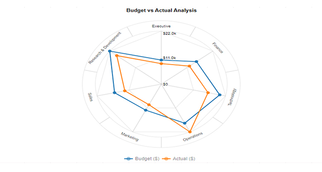
Radar Charts are the unsung heroes for exposing capability gaps in your organization. They spotlight overloaded roles and under-resourced teams in one sweep. If you’ve got a team that’s stretched too thin, this chart will tell you.
These charts don’t just highlight weaknesses; they also bring strengths into focus. They offer a balanced view, showing where your team excels and where it lags. It’s a visual aid that helps you make informed decisions about resource allocation and team adjustments.
When you’re planning a reorganization or just trying to maximize team efficiency, look no further. Radar Charts offer a straightforward, actionable look at what needs to change. It’s not just about identifying gaps; it’s about knowing how to fill them effectively.
Sunburst Charts are your answer to the eternal question: why is everything taking so long? They reveal the deeply nested authority layers that slow decisions down. If your team feels like it’s moving through molasses, this chart will show you why.
These charts highlight the hidden layers of approval and oversight that bog down your processes. They give you a bird’s-eye view of where authority is stacked too high. It’s a reality check that shows why your team can’t move at the speed of light.
If you’ve got layers upon layers of sign-offs, these charts will expose them. They’re the perfect tool for anyone looking to streamline decision-making. They don’t just tell you where the bottleneck is; they show you how to clear it.
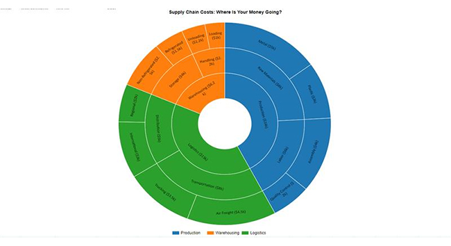
Tree Map Charts are the truth-tellers in your organization. They show you exactly where your resources are going, often revealing that “small” teams are consuming a massive part of the budget. If you think you’re lean, think again.
These charts provide a visual snapshot of resource allocation. They highlight bloated areas and underfunded teams, offering a clear picture of where changes are needed. It’s not just about seeing the numbers, it’s about understanding what they mean for your organization.
These charts make it impossible to ignore resource imbalances. They offer a straightforward, visual way to see where the money goes. If you need to justify budget decisions or make cuts, this chart gives you the data to back it up.
Cross-tab charts bring clarity to complex organizational structures. They lay out dual structures side by side, showing exactly where conflicts exist. If your projects and functions are at odds, this chart makes it plain as day.
These charts are invaluable for identifying areas of overlap and tension. They don’t hide the mess; they showcase it, helping you address it head-on. It’s like having a roadmap for where your organization needs to improve.
When you’re faced with conflicting priorities, these charts offer a clear view of the battlefield. They make it easier to see where alignment is lacking and where compromise is needed. If you want to resolve conflicts, start here.
Tree Diagrams are classics for a reason, but they’re only effective if you mark the exceptions and dotted lines. These charts still work, but you must annotate them clearly. If you ignore the nuances, you’re setting yourself up for confusion.
These diagrams are straightforward but require attention to detail. They provide a clear, hierarchical view of your organization, but need annotations to be truly effective. It’s not just about the structure, it’s about understanding the relationships.
When used correctly, these diagrams offer valuable insights into organizational structure. They work best when you take the time to mark what breaks. If you’re looking to use this traditional format, make sure it reflects reality, not just theory.
Circular Org Charts are often used for optics, not accuracy. They look collaborative and friendly, but can hide underlying tensions. If you’re using one for morale, remember it might not tell the whole story.
These charts are good for calming the waters but lack the precision needed for real decision-making. They offer a balanced view but can obscure power dynamics and reporting lines. It’s a feel-good format that doesn’t always match reality.
If you’re using this chart, be aware of its limitations. It’s excellent for optics but not for accuracy. Keep in mind that while it may look good, it might not reflect the true state of your organization.
Mosaic Plots are the go-to for comparing budget to output. They overlay budget, team size, or delivery scope, highlighting inefficiencies. If you suspect that resources aren’t aligned with results, this chart will confirm it.
These plots expose the difference between what you pay for and what you get. They make it easy to see where money is well spent and where it’s wasted. It’s not just a budget tool; it’s a performance evaluator.
When you need a clear view of financial efficiency, these plots deliver. They show you the real output versus the financial input, making it easier to make informed decisions. If you’re looking to optimize budget allocation, start here.
Stacked Gauge Charts go beyond measuring span; they show emotional load. These charts display capacity and decision stress, offering insights into leadership strain. If you’re worried about burning out your team, this chart will show you where the stress points are.
These charts give you a nuanced view of workload and emotional strain. They highlight areas where leadership is stretched too thin, allowing for proactive adjustments. It’s not just about capacity, it’s about sustainability.
If you’re concerned about the well-being of your leaders, these charts provide a clear picture. They offer a comprehensive view of emotional load, ensuring that you’re not just managing numbers but also people. If you want to keep your team healthy, this chart is your guide.
Hierarchy feels stable until a deadline looms. That’s when cracks appear. Buried approvals become glaring roadblocks. Misaligned access rears its head, causing delays. Dependencies stall progress, turning a simple task into a complicated puzzle. The structure that promised efficiency now feels like a trap, holding back decisions when they’re needed most. Urgency shines a harsh light on flaws that were easy to overlook during calmer times.
When speed is of the essence, the flaws in the hierarchy become glaringly obvious. The chart’s tidy structure didn’t account for real-world complexities. Suddenly, roles and responsibilities blur, and the outlined process turns into a guessing game. Delays mount, and what was once clear becomes murky. The rush to adapt reveals the need for a more flexible, responsive approach. In the heat of the moment, the chart’s limitations become all too real.
Formal authority doesn’t always equate to true influence. Charts often reflect who’s supposed to be in charge. But when push comes to shove, the real decision-makers might be elsewhere. Teams find ways to work around the chart’s hierarchy, bypassing the official lines of command. It’s a workaround that highlights a disconnect between the chart and reality. The hierarchy may dictate command, but influence operates on its terms.
In practice, the chart’s hierarchy can feel more like a suggestion than a rule. The person at the top might hold the title, but the team knows who really pulls the strings. This misalignment can lead to inefficiencies and frustration. People end up working around the system rather than through it. The chart, once a symbol of order, becomes a reminder of the gap between official roles and actual influence.
The chart lists names, but when deadlines loom, accountability fades. Everyone’s name is on it, yet no one steps up to move things forward. It’s a common scenario: the chart implies ownership, but real-world friction reveals the truth. Tasks stall, and fingers point, but progress halts. The illusion of shared responsibility masks the lack of true accountability. It’s a breakdown that surfaces just when you need clarity the most.
In a crunch, the chart’s promise of order crumbles. Ownership is implied, but when push comes to shove, it’s absent. The structure that seemed so solid now feels more like a mirage. Everyone’s involved, but nobody’s in charge. It’s a frustrating dance that highlights the gap between theory and practice. The chart’s neat lines can’t mask the messiness of real-world execution, leaving teams scrambling to find a way forward.
Building a hierarchy is one thing; building trust is another. A chart can be perfect, ticking every box, yet if the people it’s meant to support don’t feel supported, it’s worthless. Trust is fragile. When people don’t believe the structure will hold under pressure, the paper it’s printed on becomes meaningless.
Accuracy in a chart means nothing without buy-in. You can have the most meticulously crafted hierarchy, but if teams don’t believe in it, it won’t work. Trust isn’t just about correctness; it’s about confidence. Without that, even the best-laid plans collapse.
When trust fails, it unravels quicker than any structural fault. It’s not just about losing faith in the chart but in the leadership behind it. The fallout is more than logistical; it’s personal. Teams need to know their leaders have their backs, not just their titles.
Ever dig through layers of paper only to find nothing? That’s what happens when key players are buried in a chart. Leaders end up hidden deep, unseen, and unable to lead effectively. The further they are from visibility, the more disconnected they become, despite carrying the weight of execution.
When execution leads are buried, their influence dwindles. They might be the ones making things happen, but if they’re six levels down, who sees them? Visibility isn’t just about recognition; it’s about effectiveness. If those who steer the ship are hidden, how can they guide?
Stripping away layers isn’t just about simplifying charts; it’s about empowering leaders. Execution leads need to be seen to be effective. When they’re buried, their ability to make decisions swiftly and efficiently is compromised, leading to delays and frustration.
Ever feel like a deer in headlights? That’s what happens when a chart exposes too much. It can make things clear, but also paralyze teams with fear. Instead of guiding, it shines a spotlight, making everyone hesitate. Exposure isn’t always empowering; sometimes it frightens.
When charts highlight accountability, they can trigger fear responses. Suddenly, everyone is aware of who holds the reins, and the pressure mounts. The design meant to clarify ends up causing hesitation. People start second-guessing themselves, unsure of their roles.
Fear isn’t just about what the chart shows; it’s about what it implies. A design that over-exposes can cause teams to freeze, fearing missteps. The spotlight shouldn’t blind, but guide. When people hesitate, it’s a sign the chart is doing more harm than good.
Rolling out a new structure before it’s ready is like opening a restaurant with no food. People panic, scramble, and start to position themselves defensively. The chart gets read as a warning, not a direction. Premature visualization breeds confusion and misinterpretation.
When a change is visualized too soon, it creates ripples of anxiety. Teams see the shifts before they’re implemented and start preparing for the worst. Instead of welcoming the new structure, they brace for impact. The chart becomes a symbol of impending chaos, not progress.
The reaction to early visualization is not just about the chart itself, but the timing. Rolling out a structure before it’s ready leads to panic. People see the chart and prepare for battle rather than collaboration. It’s a lesson in patience and timing, two elements a chart can’t capture alone.
When shifting roles is tricky, start with renaming. It’s a simple move that buys time without causing a stir. Adjusting titles can pave the way for bigger changes down the line.
Renaming can realign expectations subtly. It’s about managing perception while planning for deeper adjustments. This creates a buffer to handle politics and delivery.
Keep the end goal in mind. Use this tactic to prepare for structural changes. It’s a strategic pause, not a permanent fix.
Every organization has its “official” chart. But there’s often another, more practical version. This internal map shows how things really work.
Informal charts highlight the true power dynamics. They’re the navigational tools insiders use to get things done. These maps reveal the real flow of influence and decision-making.
Use these insights to inform the next iteration of the official chart. They’re invaluable for understanding the true state of affairs. They help anticipate needs and avoid future pitfalls.
Inclusion isn’t always beneficial. Sometimes, less is more in hierarchy charts. Excluding certain roles can reduce confusion and power struggles.
Visibility can distort power dynamics. By limiting who appears on the chart, you maintain clarity. This approach helps focus on core roles without unnecessary distractions.
Think of this as decluttering. Keeping the chart streamlined helps maintain order. It’s about clarity, not exclusion for exclusion’s sake.
Forget about who reports to whom. Start with where the tension lives. Identify conflict zones and build the chart around these areas.
This approach addresses the real issues. It’s about finding the friction points and resolving them first. Structure should follow function, not the other way around.
Once you address the tension, the structure will naturally align. It’s a bottom-up approach that prioritizes actual needs. This leads to a more effective and harmonious organization.
Operations and finance often see hierarchy charts through different lenses. Ops is all about the flow, making sure processes run smoothly and efficiently. They look for bottlenecks, aiming for streamlined operations. In contrast, finance is laser-focused on control and accountability. They’re interested in cost centers, budget allocations, and return on investment. This creates a natural tension, as each department pulls the chart in its direction.
This divergence can cause misalignment in organizational goals. Ops might push for quick decisions to maintain momentum, while finance scrutinizes every detail. Without a shared understanding, these priorities clash, leading to stalled projects and frustrated teams. Aligning these views requires open dialogue and mutual respect for each department’s role in the organization’s success.
A well-crafted hierarchy chart should address these differences. It needs to balance the need for operational efficiency with financial accountability. By incorporating elements that satisfy both sides, the chart becomes a unifying tool rather than a point of contention. This alignment can drive the organization forward with purpose and clarity.
Hierarchy charts often fail to answer a critical question: Who do I go to? While they show authority, they rarely indicate the true path to resolution. Employees are left guessing, which leads to delays and confusion. This lack of clarity can stall progress and create frustration within teams.
A chart should clearly outline decision paths and support routes. It’s not just about hierarchy; it’s about accessibility and guidance. By mapping out who to approach for specific issues, the chart becomes a roadmap, not a maze. This precision eliminates guesswork and empowers employees to take action with confidence.
Clarity in the chart helps prevent bottlenecks and empowers employees. When roles and responsibilities are clearly defined, teams can operate more efficiently. This clarity fosters a culture of accountability and collaboration, allowing the organization to move forward with precision and purpose. Empowering employees with the right information is key to organizational success.
A visually balanced chart can mask real power dynamics. Equal-sized boxes might suggest equal authority, but this rarely reflects reality. Such layouts can mislead employees, creating false expectations and hidden tensions. The attempt to present an egalitarian structure often hides deeper imbalances in decision-making power.
This visual equality may give the illusion of fairness, but it doesn’t address underlying authority gaps. Employees might feel empowered on paper but find themselves sidelined in practice. This disconnect leads to frustration and disengagement, undermining team morale. A chart that fails to reflect true power dynamics can be more harmful than helpful.
To address this, charts must accurately represent the organization’s power structure. Transparency in role significance and decision-making authority is crucial. By acknowledging and addressing these gaps, the chart can foster trust and harmony within the organization. A realistic representation of power dynamics helps align expectations and improve collaboration across teams.
A slight move up on a hierarchy chart can say more than an email blast. Elevating a role visually is often perceived as a promotion or increased responsibility, regardless of the actual duties assigned. This perception shift can boost morale or cause envy, depending on how it’s viewed.
Visuals have a powerful way of conveying messages. When a role is elevated, it subtly communicates increased importance and influence. This can motivate employees, but it’s crucial to manage expectations to prevent frustration if the role hasn’t genuinely changed.
While the visual move suggests progress, it’s essential to align it with actual responsibilities. Without this alignment, you risk creating a disconnect between perception and reality, leading to confusion and dissatisfaction within the team.
When change looms, a hierarchy chart can be your best friend in calming nerves. By presenting a structured visual, you offer a sense of order amidst chaos. This can ease anxieties even before you’ve finalized the nitty-gritty details.
Using the chart as a visual pacifier can buy you time. It gives the impression that plans are in place, even if they’re still in development. This can prevent panic and allow you to implement changes at a more manageable pace.
The chart serves as a temporary stabilizer. While it doesn’t solve everything, it provides a momentary sense of security. This strategic pause can be crucial in maintaining morale and preventing unnecessary disruptions during transitions.
Subtle changes in a hierarchy chart can signal shifts in direction without the need for grand announcements. A slight reshuffling or renaming of roles can indicate where the organization is headed. This approach keeps keen observers informed without causing panic.
These quiet adjustments allow for preemptive alignment. By hinting at future changes through visual cues, you prepare the team for what’s to come. It’s a strategic move that minimizes resistance and eases the transition process.
This method of signaling change keeps the organization agile. It allows for smooth transitions by managing expectations gently. By gradually introducing changes, you ensure that the team remains cohesive and ready to adapt when the time comes.
Dual roles are like hidden traps in an organization. One day you’re managing a project, the next you’re buried in administrative tasks. Pretending these roles are the same just leads to burnout. It’s a recipe for confusion when accountability gets blurred.
It’s easy to say, “Just make it work.” But when one person is expected to juggle two hats, clarity takes a hit. Their responsibilities overlap, and soon, no one knows where one role ends and the other begins. The result? Chaos and inefficiency.
By acknowledging dual roles, you can address these overlaps head-on. Clear delineation of duties helps ensure that expectations are realistic. It’s about acknowledging the reality of the work environment and making sure everyone knows who’s responsible for what.
Titles on a chart don’t always match who holds real sway. You might find that the person everyone listens to isn’t the one with the official title. It’s a matrixed world, where influence often comes from unexpected places.
The authority versus influence divide is stark in many organizations. Formal reporting lines might suggest one thing, but the actual flow of influence tells another story. It’s a crucial nuance that, if ignored, can lead to trust issues and communication breakdowns.
To maintain trust, organizations need to acknowledge these informal influence routes. They provide a clearer picture of how decisions are made. Without this transparency, the risk of a disconnect between what the chart says and what happens on the ground remains high.
Don’t let titles fool you. High-impact contributors often guide decisions more than their titles suggest. They’re the ones who, without managing anyone, can drive a team’s direction. It’s their expertise and insight that often lead the charge.
These individuals defy the traditional hierarchy. They’re the go-to people in a crisis, the ones who see the path forward when others don’t. Yet, they might not appear prominently on a hierarchy chart, which can mislead those unfamiliar with the team dynamics.
Recognizing these contributors means honoring real control rather than just what’s on paper. It’s about valuing the impact they have and ensuring their influence is visible. This acknowledgment can be the difference between a chart that merely lists roles and one that truly reflects organizational dynamics.
Projects have a way of reshuffling priorities. Temporary initiatives can flip the hierarchy on its head. Suddenly, the usual reporting lines don’t hold as much weight. The task at hand dictates the flow.
In these scenarios, it’s the project’s gravity that determines who takes the lead. Functional ownership takes a backseat when deadlines loom and deliverables are on the line. It’s a dynamic that traditional charts struggle to capture.
For organizations, it’s crucial to represent this shifting landscape accurately. Understanding which projects override the standard reporting chain can prevent bottlenecks and enhance efficiency. It’s about surfacing delivery gravity and acknowledging the real drivers of progress.
Informal networks move at lightning speed. They cut through red tape and get things done before the hierarchy even blinks. These routes, invisible on a chart, often drive real progress.
While the formal structure might dictate how things “should” happen, informal influence shows how things get done. It’s the unspoken connections and relationships that often bypass the slow gears of bureaucracy.
Mapping these influence routes is essential for any organization. Without acknowledging them, the chart you rely on might not reflect reality. It’s about understanding the pace and flow of influence to ensure the chart serves its purpose.
Don’t seek praise; find the critics. Show your chart to the person who loves poking holes in things. They’ll spot the flaws you missed. It’s not about getting a pat on the back; it’s about discovering vulnerabilities before they become public. Fix those targets, and you’ll have a chart that stands up to scrutiny.
When urgency strikes, does your chart rise to the occasion? Simulate a crisis and see if it guides or stalls. Identify who acts first and who hesitates. These gaps are your risks. Don’t wait for an actual emergency to reveal them. Address them now, and ensure your chart aids, not obstructs.
Turn the tables on your chart. Could someone use it to slow things down? Ambiguity and unclear pathways can be exploited. Find those escape hatches and close them. A chart should clarify, not confuse. Secure it so no one can use it against you.
A hierarchy chart can show structure, but it can also hide tension, delay decisions, and blur real influence. Many look polished on paper, but fall apart the moment urgency hits.
Don’t assume sign-off means alignment. A neat chart with dotted lines, even-sized boxes, and bold titles can give a false sense of control. It may show who reports where, but not who moves work forward.
Teams often work around the chart, not through it. That’s a sign the chart isn’t helping. Flat versions may look fair, but they slow everything down. Titles may signal power, but without clarity, they spark confusion and missed expectations.
Before trusting any hierarchy chart, pressure-test it. Ask hard questions. Who makes the real calls? What breaks when deadlines close in? Where does influence live versus where it’s shown?
You don’t need a hierarchy chart that looks right. You need one that works when things get hard.
How much did you enjoy this article?


Calculate accounts receivable turnover ratio to measure credit collection speed, improve cash flow, and strengthen your financial strategy. Read on!

Change Management KPIs are the key to tracking adoption, performance, and ROI during transitions. Find out which metrics matter. Read on!

Data collection methods and techniques determine the quality of every insight you act on. Explore key approaches for gathering reliable data. Read on!


