Categories
By ChartExpo Content Team
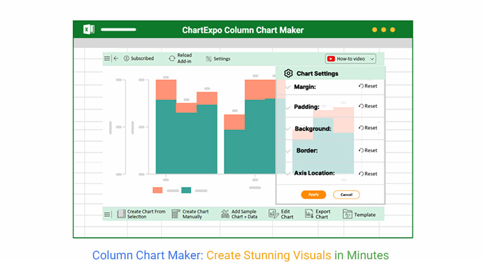
A column chart maker is more than just a tool—it’s your gateway to clearer, smarter decision-making.
You’ve got numbers—lots of them. But how do you make sense of them? How do you turn a massive spreadsheet into something that’s both clear and compelling? This is where the column chart maker steps in.
It’s the solution for transforming your raw data into easily digestible visuals that anyone can understand.
The problem? Data overload. You need a way to show trends, patterns, and insights without overwhelming your audience. The answer? A column chart maker. With just a few clicks, you can create visuals that highlight key points and guide decisions. No more drowning in numbers. Instead, use simple yet effective charts to convey your message.
Column chart makers aren’t just about turning numbers into pictures. They’re about making data work for you. Whether you’re presenting to a team or analyzing market trends, these tools provide clarity. They give you the power to present your findings in a way that speaks directly to your audience.
Ready to turn your data into a story? Take the first step.
Think of raw data as a puzzle scattered on the floor. A column chart maker picks up those pieces and fits them into a picture that tells a story. You might have a bunch of sales numbers. Alone, they’re boring. But with a chart, you see which month was hottest for sales or which product soared to new heights.
Creating visual stories isn’t just for show. It helps in decision-making. When you see data laid out visually, patterns emerge. You can make informed decisions quickly and with confidence. It’s like having a crystal ball for your business, only more reliable. This isn’t just about making charts; it’s about crafting a narrative that guides actions.
Imagine your next presentation. The room is silent, waiting. Instead of dull slides filled with numbers, you present vibrant visuals. A column chart maker transforms your data into visuals that capture attention. It’s like turning a monotone lecture into a lively conversation.
Winning presentations aren’t about dumping data on your audience. They’re about engaging them with visuals that tell a story. With a good chart maker, you can highlight key points, compare data, and show trends. It’s a way to bring your presentations to life, making you look like a pro without breaking a sweat.
Picture this: You’re a chef in a bustling kitchen, and your ingredients are numbers. You need a tool that turns those numbers into a delicious dish everyone can savor. The right choice will align with your business goals, whether that’s boosting sales or enhancing team productivity. Start by listing what you want to achieve, then match those goals with the tool’s capabilities.
Think about your audience. Are you presenting to executives or teaching students? The presentation style might differ. For business strategy, you might want a tool that offers detailed analytics and forecasting. Meanwhile, for educational purposes, simplicity and clarity take the cake. Keep these factors in mind to find a tool that not only fits but also elevates your data storytelling.
It’s like shopping for a car. You need to know what features matter most for your journey. Start with customization options. Can you change colors, fonts, or add annotations? These features help tailor your charts to your brand or specific message. A tool with interactive elements can engage your audience, allowing them to explore data rather than just view it.
Don’t forget about data integration. You want a tool that can import data seamlessly from your existing databases or software. This feature saves you from manual data entry, reducing errors and time spent. Real-time data updates are a bonus, especially if you’re working in fast-paced environments where information changes rapidly. Prioritize these features to enhance your visual storytelling.
Think of customization as adding spices to your dish. It makes your presentation more appealing and memorable. Start by experimenting with colors. Use contrasting shades to highlight key data points. This technique draws the eye and emphasizes important information. You can also play with text and labels. Adding descriptive tags can clarify complex data points, making your chart more understandable.
Animation is another tool in your kit. It can bring your chart to life, guiding your audience through the data journey. Be cautious, though, too much animation can distract rather than inform. Keep it subtle and purposeful. Lastly, explore the possibility of adding interactive elements. A clickable legend or hover-over details can transform your chart into an engaging experience, encouraging your audience to interact with the data.
| Customization Best Practices: How to Make Your Visuals Stand Out | ||
| Customization Option | Recommendation | Why It’s Helpful |
| Color Palette | Choose contrasting colors for each column to differentiate data points. | Makes the visual more appealing and easier to interpret. |
| Axis Titles and Labels | Label both the x-axis and y-axis clearly with appropriate units. | Provides context and clarity to the viewer. |
| Legend Placement | Place the legend in a clear, visible spot, or use color coding within the columns. | Improves readability and legibility of the visual. |
| Font Style and Size | Choose legible fonts and maintain consistency across the visuals. | Ensures readability and a professional appearance. |
| Column Width | Adjust column widths for better balance and spacing. | Prevents overcrowding and improves overall layout. |
| Data Labels | Use clear and concise data labels. | Helps viewers easily identify the value of each column. |
| Gridlines | Use gridlines sparingly, ensuring they do not clutter the visual. | Helps guide the viewer’s eye but should not overpower the data. |
Imagine a marketing team struggling to make sense of their campaign data. They switch to a new tool that offers dynamic visualizations and real-time updates. Suddenly, they’re not just seeing numbers, they’re seeing patterns. The tool’s interactive features allow them to explore different scenarios, helping them spot trends and adjust strategies swiftly.
The team also benefits from the tool’s integration capabilities. They pull data directly from their CRM, reducing manual data entry and errors. The new charts present a clearer picture of customer behavior, boosting the team’s confidence in their campaigns. With better insights, they optimize their efforts, achieving higher engagement and conversion rates. This transformation highlights the power of choosing the right tool for the job.
The following video will help you create a Column Chart in Microsoft Excel.
The following video will help you create a Column Chart in Google Sheets.
Your column chart can be a powerful tool in the boardroom. It’s not just about showing numbers. It’s about influencing decisions. Imagine your chart as a bridge. It connects raw data to strategic choices. The right visual can highlight trends and patterns that lead to smart moves.
Craft visuals that are easy to read. Choose colors that differentiate clearly. Use consistent scales to avoid misleading impressions. A well-designed chart provides clarity. It allows decision-makers to grasp the message quickly. In the fast-paced world of business, this clarity can lead to decisive action. It transforms data into a catalyst for change.
Customization is your secret weapon. It turns basic charts into stunning visuals. Start by experimenting with colors. Choose hues that evoke the right emotions. Blues for trust, reds for urgency. Let colors do the talking.
Next, play with layouts. Adjust the axis, change the direction. Sometimes a simple tweak can make all the difference. Add data labels where necessary. They provide context and precision. Customizations make your chart unique. They allow you to emphasize what matters most.
Colors set the mood. They guide the eye and highlight the important. Choose a palette that complements your message. Avoid too many shades; they can confuse. Stick to three or four main colors. Use contrast to make key data pop.
Layout is your structure. It’s the skeleton of your chart. Keep it organized. Align elements neatly. Consistency is king. It helps the viewer follow the flow. Clarity is the ultimate goal. Clear charts lead to clear understanding. They are the backbone of effective communication.
| Design Best Practices for Effective Visuals | ||
| Design Element | Recommendation | Why It’s Important |
| Color Scheme | Use no more than 3-4 contrasting colors. | Keeps the chart simple and focused, helps differentiate key data points. |
| Data Labels | Always label your columns clearly and use legends sparingly. | Ensures clarity and prevents confusion. |
| Axis Labels | Make sure to use consistent units and clear labeling for both axes. | Helps the audience understand the scale and context of the data. |
| Animation | Use subtle animations for gradual transitions between data points. | Engages the audience without distracting from the data. |
| Column Width | Adjust column widths for better balance and spacing. | Prevents overcrowding and improves overall layout. |
| Font Style | Choose legible fonts and maintain consistency across the chart. | Ensures readability and a professional appearance. |
| Legend Placement | Place the legend in a clear, visible spot, or use color coding within the columns. | Improves the legibility of the chart. |
Make your charts sizzle with dynamic features. Start by adding animations. Watching a chart build itself can be captivating. Animations guide the viewer’s eye, highlighting key data transitions. They create a narrative, turning static graphs into engaging stories.
Interactive elements are another game-changer. Allow users to hover over data points for more details. This feature invites them to explore the data at their own pace. It’s like giving them the keys to a treasure chest. You’ll transform passive viewers into active participants. Their engagement with your data will soar.
Layering data is like peeling an onion, revealing more with each layer. Start by stacking different data sets in one chart. This method shows relationships between variables. It’s a powerful way to convey complex stories in a simple format. Your audience will see connections they might have missed.
Combine different chart types for more depth. Bar and line graphs together can show trends and totals simultaneously. It’s like having two pairs of glasses, each offering a unique view. This approach enriches the analysis. Readers get a fuller picture, making your insights more impactful.
Real-time data adds a pulse to your charts. Connect your chart maker to live data sources. As data flows in, your charts update automatically. This feature keeps your presentations fresh and relevant. Audiences see the latest trends and can act swiftly. It’s like having a news ticker for your data.
Add interactive features to boost engagement. Allow users to drill down into specific data points. They can interact, exploring the data’s layers. This level of interaction invites curiosity. Your audience becomes part of the discovery process. It’s a partnership in understanding, creating a memorable experience.
| Interactive Features for Enhanced Engagement | ||
| Interactive Feature | Description | Benefit |
| Hover-over Details | Display additional information when a user hovers over a column. | Makes the chart more interactive and informative. |
| Clickable Legend | Allows users to click on elements to filter data. | Helps users focus on the data points most relevant to them. |
| Real-Time Data Updates | Automatically updates the chart as new data is fed in. | Keeps the chart current and accurate. |
| Zoom/Drill Down | Enables zooming in on specific data points or categories. | Helps users explore data more deeply. |
| Interactive Filtering | Allows users to filter data by selecting specific elements on the chart. | Gives users control to explore different segments of the data. |
| Data Point Annotation | Allows users to add notes or annotations to specific data points. | Provides a way for users to customize their insights and make data more relatable. |
Imagine a retail company predicting holiday sales with precision. They harness advanced chart features to analyze past trends. By layering historical data, they identify patterns and project future outcomes. This process turns raw numbers into actionable forecasts. It’s like having a crystal ball for business.
Interactive charts let stakeholders explore scenarios. They adjust variables and see potential impacts instantly. This hands-on approach fosters collaboration. Teams can strategize effectively, confident in their data-driven decisions. It’s more than just charts; it’s about empowering decision-makers with foresight.
First pitfall: overloading your chart with data. More isn’t always better. Too many columns can overwhelm your audience. Limit the data points to what’s essential. This keeps your message clear and focused.
Second, avoid inconsistent scales. If one column is miles taller than the others, it might skew perception. Use a consistent scale to maintain balance. This ensures viewers grasp the true significance of each column.
Third, watch out for poor color contrast. Colors should distinguish columns, not confuse. Choose a palette that’s easy on the eyes. This helps in making comparisons straightforward and effective.
Fourth, don’t forget about labeling. Missing or unclear labels can lead to confusion. Make sure each column is clearly identified. This makes your chart accessible and easy to interpret.
Lastly, beware of cluttered legends. A legend should aid understanding, not hinder it. Keep it simple and relevant. This will enhance the overall readability of your chart.
| Common Pitfalls in Column Chart Creation | ||
| Pitfall | How to Recognize It | How to Avoid It |
| Overloading Data | The chart appears cluttered with too many columns. | Limit data to the most essential points. |
| Inconsistent Scales | The columns appear out of proportion with the axis. | Ensure a consistent scale is used across columns. |
| Poor Color Contrast | Colors look too similar or clash. | Choose contrasting colors for better visibility. |
| Missing or Unclear Labels | Data is shown without proper labels, leaving viewers confused. | Add clear, concise labels for each column. |
| Cluttered Legends | The legend has too many items, or it is not placed clearly. | Keep the legend simple and place it in a visible area. |
| Improper Axis Labeling | The axis labels are unclear or use inconsistent units. | Use consistent units and clear labels for both axes. |
| Ignoring Data Order | Columns are arranged in an unclear or inconsistent order. | Arrange data logically, such as in ascending or descending order. |
Scaling issues can be a real thorn in the side. If your columns look wildly disproportionate, your scale might be the culprit. Check your settings. Ensure the scale suits your data range. This small adjustment can bring clarity to your chart.
Another fix lies in proper axis labeling. Clearly label your axes with units and intervals. This helps viewers understand the scale at a glance. Remember, clarity is key.
Consider using a logarithmic scale for wide-ranging data. This can make large differences more manageable. It’s a handy tool for presenting diverse data without distortion.
Complex data can make charts look like a tangled mess. Simplify by grouping similar data points. This reduces clutter and highlights key trends. Grouping can turn chaos into clarity.
Using annotations can also enhance comprehension. Add notes to explain unusual spikes or drops. This gives context to your data and guides your audience.
Consider breaking complex data into multiple charts. Sometimes, less is more. Using separate charts can make intricate information digestible and easier to understand.
Unlocking insights from data can set your career on a new path. Column charts play a big role in this. They help you present data in a way that’s easy to grasp. When you talk through a column chart, you guide your audience through the data. They see what you see, making your insights their own.
Think of your column chart as a spotlight. It highlights what needs attention. This clarity helps stakeholders make informed decisions. Your ability to turn data into action can elevate your role within a team. Being the go-to person for data insights can open countless doors. It shows you as someone who not only understands data but can also translate it into meaningful action.
Creating visuals that capture attention isn’t magic. It’s about clear design and meaningful data. Start with clean lines and distinct colors. This keeps the focus on the data itself, not on unnecessary frills. Use labels wisely to clarify what each bar represents. This makes your chart easy to understand at a glance.
Your audience, especially executives, appreciates clarity and brevity. A well-designed column chart does just that. It speaks volumes without saying a word. When you present data that’s easy to digest, you show respect for your audience’s time. You also demonstrate your understanding of the subject, which can build trust and credibility.
| Step-by-Step Process for Creating Effective Visuals | ||
| Step | Action | Purpose |
| 1. Define Your Data | Gather the data you want to display in your visual. | Ensures you have all the necessary information. |
| 2. Choose the Right Tool | Select the column chart maker that fits your needs. | Helps you work with the most suitable tool for your task. |
| 3. Input Data | Import or manually enter the data into the tool. | Ensures that the correct data is being visualized. |
| 4. Customize Visuals | Adjust colors, labels, and other visual settings. | Makes your visuals more engaging and informative. |
| 5. Review & Adjust | Check the visuals for any inconsistencies or mistakes. | Ensures accuracy and clarity. |
| 6. Save & Share | Export the visuals and share them with stakeholders. | Finalizes the visual for presentation. |
Data analysis can be overwhelming. But with the right tools, it becomes manageable. Column charts help you break down complex data into simpler parts. You can then focus on what matters most. This approach allows you to handle larger datasets with ease.
Reports that include column charts are often more impactful. They provide visual evidence to support your analysis. When stakeholders see a well-crafted chart, they can quickly grasp the data’s implications. This can lead to faster decision-making and more informed choices. Your role in this process can be pivotal, positioning you as an essential asset to your team.
Pull data from different places to make your charts more dynamic. Think of it as giving your chart a power boost. By using data from various sources, you craft a richer visual experience. It’s not just a chart; it’s a picture of your business.
Consider linking your chart tool with a marketing platform. You can visualize campaign performance in a whole new way. This approach not only looks good but also helps you understand what’s working and where to focus your efforts.
Linking your charts with analytics tools can save you loads of time. No more manual updates. When data flows directly into your charts, your reports are always up-to-date. This efficiency is a real game-changer for any business.
Picture this: Your website’s traffic data feeds directly into your charts. You can spot trends quickly and take action. This integration helps you stay ahead of the curve and keep your reporting smooth and efficient.
Mixing different chart types can make data speak louder. Pairing column charts with line graphs or bar charts can provide a fuller picture. It’s like adding different colors to a painting, making it more vibrant and meaningful.
Think about using a heat map alongside your charts. This combination brings out patterns that might be missed otherwise. It’s a way to make complex data easier to understand and more impactful.
Creating a real-time dashboard is like building a control room for your data. You bring together various elements, each with its role and purpose. It’s the hub where all your data stories converge. You can set it up to track sales, monitor website traffic, or even keep an eye on weather patterns.
Once set up, your dashboard keeps you in tune with your data’s rhythm. It’s like having a window into the soul of your business. This setup allows you to spot trends and detect anomalies. The power lies in the ability to see what’s happening right now, not yesterday or last week.
Picture yourself as a detective, piecing together clues to solve a mystery. With this tool, you don’t need to wait for the results. The clues–or rather, insights–are right there, ready to help you make decisions. It’s like having your very own crystal ball, revealing the path ahead.
The real beauty is in the action it inspires. The tool doesn’t just show data; it guides you on what to do next. Decision-makers can act quickly, armed with the knowledge they need. With insights at their fingertips, there’s no hesitation, only forward momentum.
Handling fast-moving data is like catching a train. You must be ready to jump on board as it speeds by. The tool needs to be optimized for performance. You start by ensuring your data is well-organized and efficient. Good data management is like having your train tickets ready in advance.
Next, test your dashboards regularly. This helps to identify any bottlenecks or lags. It’s like tuning an instrument to get the perfect sound. Regular maintenance keeps everything running smoothly, so you can rely on your tool when it counts.
In the high-speed world of e-commerce, time is of the essence. A leading retailer faced challenges with rapid sales data. They needed a quick way to visualize and analyze this information. Enter the column chart maker, which became their secret weapon.
The tool allowed them to track sales in real-time, adjusting strategies on the fly. It was like having a GPS guiding them through the busiest shopping days. With real-time insights, they could tweak promotions and restock popular items instantly. This agility transformed their approach, leading to better results and happier customers.
Artists often need to present their work in a way that’s both engaging and informative. Column charts can help them display data about their art sales, exhibition attendance, or even social media engagement. This helps in making strategic decisions about future projects or marketing tactics.
Designers frequently analyze trends, and a visual chart can be a powerful tool. They might track the popularity of certain design elements or client preferences over time. Writers, on the other hand, can use charts to track themes, character arcs, or even word counts across chapters. This not only aids in organizing their work but also provides a fresh perspective on storytelling.
Marketing is a battlefield where data reigns supreme. Column charts can visualize competitor analysis effortlessly. Imagine comparing product features, prices, or customer ratings. Columns help marketers see where they stand and where they can improve.
These charts also shine in tracking campaign performance. Marketers can plot engagement metrics across different platforms, identifying what works and what doesn’t. It’s like having a visual dashboard that helps steer marketing efforts in the right direction.
Using a column chart maker gives you the power to make your data come to life. Whether you’re tracking trends, comparing metrics, or simply making numbers clearer, this tool is an essential asset in today’s data-driven world. By turning your complex data into easy-to-understand visuals, you’re already one step ahead in communicating your insights effectively.
With the right column chart maker, you can quickly design charts that not only look good but also serve a purpose. From customizing the design to integrating it with other tools, the possibilities are vast. And as you get more comfortable using these features, you’ll find that creating visually appealing, informative charts becomes second nature.
Remember, data is more than just numbers. It tells a story. The column chart maker helps you tell that story clearly and confidently. Don’t let your data get lost in a sea of numbers—let it shine. Ready to take your data visuals to the next level? Start using a column chart maker today and make your data work for you.
How much did you enjoy this article?


Calculate accounts receivable turnover ratio to measure credit collection speed, improve cash flow, and strengthen your financial strategy. Read on!

Change Management KPIs are the key to tracking adoption, performance, and ROI during transitions. Find out which metrics matter. Read on!

Data collection methods and techniques determine the quality of every insight you act on. Explore key approaches for gathering reliable data. Read on!


