Categories
By ChartExpo Content Team
The chart looked safe. That median line sat there calm and quiet. But that calm? It was a mask. The box and whisker plot had already led the room into a false sense of control.
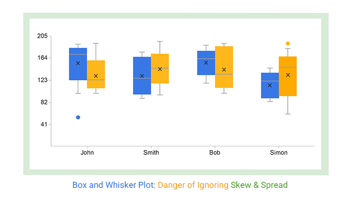
The box and whisker plot is simple on the surface. It shows a box, some whiskers, maybe a few dots. Clean. Precise. Misleading. That’s the problem. People trust it too quickly. They miss what matters. The story behind the lines vanishes. And then the wrong call gets made.
The box and whisker plot hides risk. It hides outliers. It hides movement. The room sees the shape. They nod. They move on. But nothing about that plot says what’s going on. That’s how bad decisions begin. One tidy box. One flat line. One missed signal. The cost? Bigger than you think.
The box and whisker plot isn’t broken. But it demands a warning label. Without one, it’s a trap dressed up as clarity.
You set up your chart, and there it is, the median, looking as calm and reassuring as a summer lake. But still waters run deep. This calm hides the storm beneath, and folks might just sign off without a second thought. The reality? That “average” can be a siren song, luring decision-makers into a false sense of security while volatility lurks beneath.
Let’s face it: numbers can be sneaky. Stakeholders glance at that flat line and breathe easy, but volatility’s hiding in plain sight. They miss the spikes and dips, the drama of data that’s masked by a simple line. It’s not just a misstep; it’s a setup for a gamble they didn’t know they were making. The stakes are high when the median masks the chaos, leading to decisions that crumble when the truth surfaces.
Ever walked into a meeting, and before you say a word, the room’s buzzing about that one dot on your box and whisker plot? Outliers steal the show. They’re bold, they’re loud, and they’re often misunderstood. If you don’t steer the conversation, they’ll derail it. You’ve got to handle them like a pro, or prepare for the political fallout.
The thing about box plot outliers? They’re the wildcards. Everyone sees them, but not everyone gets them. They can either be the elephant in the room or the hero of your story. Frame them right, and they’ll support your message instead of hijacking it. Fail to do so, and you might find yourself scrambling to regain control, explaining away anomalies that shouldn’t have been the focus.
You think you’ve got it all lined up, but mismatched axes can turn your plot into a house of cards. Trust me, if there’s even a hint of inconsistency, that’s what folks will zero in on. It’s like they’ve got radar for this stuff. And once they spot it, any insight you planned to share is tainted.
Axis alignment isn’t just a technicality; it’s the backbone of credibility. Overlook it, and you’re inviting scrutiny that undermines your entire message. Those mismatches stick out like a sore thumb, shifting focus away from your insights to your oversight. To prevent this, meticulous visual checks are essential. Make sure your plot reads like a well-tuned story, not a cautionary tale of mixed signals.
You know that moment in a meeting when someone says “interesting”? It’s a polite way of checking out. They’re not engaged. They’re mentally wandering off. When your visual causes this, it’s time to re-engage. Use stories, not numbers, to bring them back. Share a quick scenario where the data made a crucial difference.
Let’s face it, sometimes numbers alone just don’t cut it. When the eyes glaze over, break the spell with a narrative hook. Paint a picture of impact. How does this data change the game? Talk about the consequences. The stakes. The human side of numbers. People connect with stories, not just stats.
Ever tried to juggle too many things at once? That’s what happens when you throw a bunch of comparisons at your audience. More than three panels and you’re in overload territory. The brain can only handle so much. Simplify. Group similar data. Space them out.
Panels need space to breathe. Too many, and your message drowns. Use clear sequencing. Lead them through the data logically. Highlight key points. Make it digestible. Less is more. You want them to walk away with clarity, not confusion.
You’ve shown the plot. Now what? Silence is dangerous. Fill it with clarity. Own any confusion. Acknowledge the complexity without sounding defensive. Recovery starts with honesty. “I see this raises questions; let’s tackle them head-on.”
Pressure mounts, but stay calm. Use phrases that regain trust. “Let’s break this down together.” Address misreads quickly. Your ability to handle this moment decides if you’re seen as a leader or a liability. Be the voice of reason in the room, not the echo of doubt.
Quartiles can be a quagmire. Instead of drowning in numbers, talk about impact. What does this data mean for the business? Who benefits? Who needs to act? Connect the dots between data points and business decisions.
Trade numbers for narrative. Lead them to the win. “This shift means our strategy is paying off.” Use language that translates stats into stories. Paint the future. Make the data feel relevant. It’s not about quartiles; it’s about what they unlock. Get them excited about the path forward, not bogged down in math.
The following video will help you create a Box and Whisker Plot in Microsoft Excel.
The following video will help you create a box-and-whisker plot in Google Sheets.
Data presentation can be tricky. You’ve built what you believe is a clear representation, only to watch your audience exchange confused glances. That’s the moment you realize the plot might not be working the way you intended. Perhaps the interpretation is more political than statistical. This often happens when the visual fails to communicate its intended message, leaving room for various interpretations.
Your carefully constructed data story can quickly unravel if not framed right. Misread visuals can stir internal friction, leading to misunderstandings among teams. When people read different stories from the same plot, it can create tension. A single plot can ignite debate, with numbers being interpreted to support different agendas. It’s crucial to guide your audience through the data, ensuring everyone sees the same picture.
You know the logic behind the plot, but when your audience starts interpreting it through their political lens, things get complicated. It’s not just numbers; it’s about how those numbers are perceived. In the corporate world, data isn’t just data; it’s a tool for influence. Different stakeholders see different things based on their interests, which can lead to friction.
You’ve got to be prepared for this. Misread visuals can turn into a battleground for internal politics. When a plot is interpreted differently by each person in the room, it can lead to confusion and conflict. This isn’t just about data accuracy; it’s about ensuring everyone is on the same page. Clear communication around the plot is vital to avoid internal friction and set the right course.
Ever seen a graph that makes a situation look more dangerous than it is? That’s the range at work, misleading viewers into thinking there’s more volatility than there actually is. This can derail momentum, creating a defensive posture among stakeholders. When the plot suggests more risk than there is, it can halt progress and spark unnecessary debates.
This is where you step in to clarify. A plot’s range can exaggerate the perception of risk, leading to hasty decisions or cautious stances. It’s important to contextualize the data, explaining why the range looks as it does and what the real story is. By addressing these false alarms, you help keep the focus on actionable insights, not imagined threats.
When the midpoint of a plot doesn’t reflect the overall context, fairness can come into question. People may start to doubt the data’s representation of reality. This can lead to discussions about equity and fairness, especially if the visual midpoint seems skewed. It’s important to address these concerns head-on to maintain trust and clear communication.
In these situations, re-narration becomes key. Guiding the audience through the data, explaining why the midpoint may appear off, and providing context can help dispel doubts. It’s about ensuring everyone understands the nuances behind the plot, maintaining trust, and encouraging productive dialogue. By addressing and clarifying these issues, you ensure the data remains a tool for insight, not division.
You know that feeling when everything looks fine on the surface, but there’s chaos underneath? That’s what these visualizations can do. They present a tidy picture, leading everyone to believe operations are running smoothly. But don’t be fooled. Tight spreads can hide the real issues. It’s like putting a clean bandage over a festering wound. The problem might be out of sight, but it’s still causing damage.
When leadership sees a flat line, they relax. But that false sense of security can backfire. Operations that seem stable might be anything but. You need to dig deeper and question what’s beneath the surface. It’s like a calm sea hiding a raging current below. Don’t let the appearance of stability fool you into complacency. The stakes are high, and missing the underlying issues can lead to bigger problems down the road.
Ever notice how some visuals seem to compress everything into a neat package? It looks nice, but it’s misleading. Important signals get squished into oblivion. You lose sight of the vital data that should be raising alarms. The details that could have driven action are erased, like whispers in a noisy room. It’s not just a minor oversight; it can lead to costly missteps.
Downstream decisions hinge on this clarity. When visuals erase the noise, decision-makers miss the signals that matter. It’s like trying to navigate without a compass. Reframing becomes essential. You need to find ways to highlight what’s important without drowning in data. By adjusting the lens, you can ensure the real issues come to the forefront and guide informed choices.
You know what’s scarier than chaos? Silence. When a visualization suggests that nothing’s happening, it might seem like a relief. But sometimes, that stillness is a warning sign. It’s easy to overlook the absence of activity, yet it can signal potential risks lurking in the background. Like a ticking bomb under a calm exterior, the lack of movement should make you sit up and take notice.
Narrating this absence is tricky, but crucial. You need to convey that what appears to be a peaceful landscape might conceal underlying threats. It’s not about creating panic but ensuring vigilance. You have to guide stakeholders to see that “nothing” can be as telling as “something.” By pointing out these silent signals, you prepare them to act before the storm hits.
You’re in that room, right? Everyone’s eyes are on the screen. The VP nods at the chart, says, “Okay.” But that nod? It’s a trap. It’s the nod of a leader who thinks they’ve got the full story, yet they’ve missed the crucial twist. Box and whisker visuals can be the sneaky culprits, lulling us into a false sense of clarity. They often bury the real movement, the shifts that matter.
When everyone sees those neat lines and tidy boxes, they assume stability. But hidden in those whiskers and boxes is the movement. The subtle shifts that don’t scream for attention but whisper critical change. If you don’t call them out, they get lost. And when movement is hidden, decisions are based on incomplete stories. You may think you’ve communicated everything, but you’ve only shown the surface.
Directionality can slip right past you. With these plots, the main shape is often what catches the eye. But the real story? It’s in the small movements that get buried under the apparent stability. If everyone’s only seeing the shape, they’re missing the underlying shifts.
Highlighting changes is your job. Point out where things are moving, even if the format doesn’t. Direct attention to those slight drifts that indicate a trend, up or down. It’s like pointing out the iceberg below the waterline. If they don’t see it, they’ll steer right into it.
Outliers. Those pesky dots that sit in the corners of your visuals. Easy to dismiss, right? But sometimes, they’re the whole story. That one dot can be the business-critical point that changes everything. It’s not about the majority. It’s about that one unique case that shifts the narrative.
Finding it is half the battle. The other half is making sure it doesn’t hijack the entire conversation. Surface it without letting it dominate. It’s about balance. Showing why that outlier matters without letting it overshadow the rest of the data. You’re not just moving dots around. You’re navigating the narrative.
Silence can be your worst enemy. When you don’t fill in the gaps after showing these visuals, fear and doubt slip in. They start framing the risk for you, and trust me, it’s never in your favor. The room fills with whispered questions and rising anxiety.
The trick? Preemptive narrative control. Step in with clarity and confidence. Define the risk before they do. You have the power to steer the conversation. Use it to calm the storm before it starts. Don’t let silence be the loudest voice in the room.
It’s the line you didn’t say that matters most. That one sentence that could’ve changed everything. The summary statement that ties it all together. It’s what they’re waiting for, what secures budgets and wins trust. Sometimes, the pause costs more than you think.
Real-world examples are gold. Learn from them. Where a well-placed sentence saved the day, or where silence cost the win. That’s the power of words. They’re not just fillers. They’re tools. Use them to craft your narrative and secure your position.
You thought you had it all figured out. The weekly report showed everything in perfect harmony, with no bumps in the road. But while you were busy admiring those neat lines, your operations were screaming for help. The chart can be as misleading as a calm sea that hides a storm underneath. Stability can be deceptive, and those seemingly flat medians can hide a world of trouble. When the lines aren’t adding up to what you see on the ground, it’s time to dig deeper.
So, how do you fix this? Annotations are your new best friend. Add notes, highlight changes, and point out trends that aren’t obvious. It’s like adding subtitles to a foreign film; suddenly, everything makes sense. Don’t let the clean visuals lull you into a false sense of security. Bring the story to life with clear annotations. It’s about making sure everyone’s on the same page.
The team felt it before they saw it. You know that moment when everyone’s whispering about things going south, but the charts still look like a rose garden? That’s the trap. The visual cues often lag behind the action, missing the early signs of trouble. Remember, charts don’t have intuition, but your team does. They might notice a dip in morale or a sudden shift in productivity long before the numbers catch up.
Reconcile this gap by fostering open communication. Tap into those team instincts and use them to guide the narrative. Make it a habit to regularly compare the lived experience with what the data says. Have a quick huddle, gather insights, and align your visuals with what’s happening. This way, you transform the chart from a silent observer into a reliable guide.
Ever noticed how a slow drift barely raises an eyebrow until you’re off course? It’s sneaky, like a lazy river that suddenly turns into rapids. Those tiny shifts in data can sneak right past you if you’re not vigilant. By the time you realize something’s off, it’s often too late. Slow doesn’t mean safe. It requires constant attention.
To catch these subtle shifts, set up detection layers. It’s like having a security system for your charts. Regular checks, alerts, and comparisons can save you from nasty surprises. Use color coding or alerts to highlight gradual changes. These tools help you spot the drift before it becomes an emergency. Stay proactive, and keep the data aligned with reality. The goal is to avoid being blindsided by what was right in front of you.
When you throw a chart on the screen and expect it to do the talking, you’re setting yourself up for a misinterpretation disaster. You think the data speaks for itself. But in reality, it just whispers, and often in the wrong language. The room fills with silence and sideways glances because, without guidance, everyone sees what they want to see. It’s like a silent auction, everyone bidding on their interpretation.
Instead of letting the plot wander off without you, take control of its narrative. Guide the audience through it. Frame the data with context, purpose, and direction. Imagine the plot as a script, and you’re the director. Without your cues, the actors might start ad-libbing. So, give it a storyline that aligns with your objectives and keeps everyone on the same page.
Ever been in a meeting where one chart led to three different conclusions? That’s the chaos of leaving a plot open to interpretation. One person sees success, another sees danger, and someone else sees nothing at all. This chaos is what happens when you assume clarity in simplicity. The plot might look straightforward to you, but it’s a Rorschach test to others.
To steer clear of this, set the direction early. Highlight what matters most. Direct attention to the key movements or changes. This isn’t about manipulating data; it’s about ensuring clarity. By framing the narrative right from the start, you ensure that everyone walks away with the same understanding, not their version of it.
A plot without guidance is like a movie without a director. Eyes wander, attention drifts, and the message gets lost. Your job? Keep those eyes focused. Use visual cues to steer interpretation. Annotations, highlights, and a well-thought-out layout can guide viewers to see what you need them to see.
Remember, you’re the tour guide through this data landscape. If you don’t point out the landmarks, everyone will just gaze out the window, missing the important bits. Use sequencing to build a story, creating a visual path that leads to the insight you want them to grasp.
Sometimes, the best way to make a point is to say nothing at all. After revealing your plot, a deliberate pause can be powerful. It gives the data a moment to breathe and the viewers a moment to digest. Silence signals confidence, and it shows that the data stands strong on its own merits.
In these moments of pause, you’re allowing the weight of the information to settle. It’s like letting a good wine breathe; it can enhance the flavor of your data. Resist the urge to fill the silence with nervous chatter. Sometimes, the quiet speaks volumes.
It’s easy to get fixated on the median, the safe middle ground. But that’s not where the story lives. The real action is in the movement, the shifts, the changes, the trends. Direct attention there. Point out the fluctuations and what they mean for the bigger picture.
By anchoring the narrative to movement, you align the plot with strategic goals. It’s not just about showing data; it’s about showing direction. This approach helps in making informed decisions that are forward-looking, not just reflecting the past.
Box plots can be a lifesaver or a landmine. Before you show one, there’s a checklist you should run through. First, look at whether the whiskers of your plot are doing more harm than good. Whiskers can trip up folks who aren’t number-savvy. A quick logic check tells you if your plot’s saying what you mean. You want people’s eyes on the right data, not wandering to the furthest points and getting lost there.
Now, think about your audience. Not everyone’s a data geek. Stakeholders might see the whiskers and go, “What’s happening there?” They don’t see the overall picture; they’re fixated on outliers. And when they do, your credibility’s on the line. Make sure that doesn’t happen. Frame your plot so it tells a story that even your grandma would get.
Whiskers can be tricky. They could mislead if not handled correctly. Make sure they show the correct spread and aren’t just dangling points inviting misreads. The plot’s layout must help people see what matters. You want a plot that screams clarity, not confusion.
For the non-data folks, whiskers can be a maze. They could think every outlier is a crisis. You need to guide them. Say, “Here’s the range, but let’s focus on the bulk of the data.” Point them where they should look. Be the guide in the room, not the person who loses them at the first turn.
Your plot might have ghosts, hidden risks that don’t scream at you. Skewed data, messed-up scales, and silent shifts can all hide in plain sight. They’re silent snipers that could kill your presentation. You have to identify them before they become a problem.
Check for skew. If your plot leans more to one side, it might seem like the data is biased. Scale alignment is another ninja. If scales don’t match, the plot’s like a funhouse mirror, distorting what you see. These are the things that, if missed, make you look unprepared. Get them right to keep your plot from becoming an unintended comedy show.
Before you step away from that plot, think: Are you letting them leave with the wrong idea? A pre-mortem test can save you. Check for ambiguity. If your plot’s open to misinterpretation, you’ve got a problem.
You want your plot to be a conversation starter, not a confusion starter. Equip yourself with clear phrases to guide interpretation. Something like, “Look here, this is what matters.” Don’t let silence fill with wrong conclusions. Fill it with clarity.
Ever been in a meeting where you needed to light a fire, but the charts were saying “all’s well”? That’s the trap. When visuals signal serenity, yet the reality is a storm brewing. It’s like showing a serene lake while a hurricane looms behind. So, what’s the move? Ditch the plot when urgency is paramount. Throw in a dynamic line graph or heat map to spotlight the brewing storm. The goal is to wake everyone up, not lull them to sleep.
What about the times you absolutely must convey urgency? Consider using visuals that scream instead of whisper. Think color-coded indicators that highlight the danger zones. Or even a simple bullet list that grabs attention. When urgency is non-negotiable, your visuals should be your loudest ally.
Time is a tricky beast. Box and whisker plots? They flatten it. They strip away the pulse, the rhythm, the flow. You end up with a snapshot when you needed a timeline. When the story is about change over time, consider line graphs or bar charts. They stretch out the narrative, showing dips and peaks without losing the plot.
Ever tried explaining a trend with a static plot? It’s like showing only the punchline without the joke. The audience misses the buildup, the context, the why. When time matters, your visuals should be a timeline, not a Polaroid. Embrace formats that capture shifts and movements. This way, the story unfolds naturally, and the audience stays hooked.
Outliers often get a bad rap, but sometimes, they hold the secret sauce. They’re not just noise; they can be the story. Filtering them out can mean filtering out the business case itself. The challenge? Highlighting them without letting them hijack the narrative. Use annotations or callouts to spotlight these dots, giving them context and meaning.
Think of those outliers as plot twists in a thriller. Unexpected, yes, but crucial to the story. Instead of shoving them aside, weave them into the narrative. Explain why they matter, what they reveal. The aim isn’t to avoid them; it’s to narrate them effectively. When done right, those dots become your strongest talking points.
The box and whisker plot isn’t wrong. It’s risky. It can look clean and still hide what matters. That’s the problem.
People trust the median. They see a calm line and miss the storm underneath. They see a flat box and miss the shift in performance. They see outliers and jump to conclusions. And when they focus on the wrong part, the conversation goes off track.
Before you show a box and whisker plot, ask yourself what story it tells. Then ask what story it hides. Are the axes fair? Are the whiskers pulling attention away? Is the silence in the data the real signal?
Add a note. Use a highlight. Guide the eyes. Don’t leave the plot alone to speak. It won’t.
The box and whisker plot needs your voice. Without it, you risk getting misunderstood. With it, you guide the message and stay in control.
The chart won’t lose trust. Silence will.
How much did you enjoy this article?


MySQL ODBC connector bridges MySQL databases and BI tools for secure, reliable data access across platforms. Set up yours today. Read on!
A ranking chart maker helps turn data into clear rankings for fast comparison. Learn Excel steps, examples, and tools to improve data visualization.
Vanity metrics can mislead teams into tracking numbers that never drive results. Discover what makes a metric truly actionable. Read on!