Categories
By ChartExpo Content Team
One wrong bar can break the whole story. A Waterfall chart can make or ruin the message before you say a word.
A Waterfall chart isn’t about color and bars. It’s about control. If you let the default settings decide the flow, order, or labels, you’ve already lost the room. That chart starts telling a story that isn’t yours.
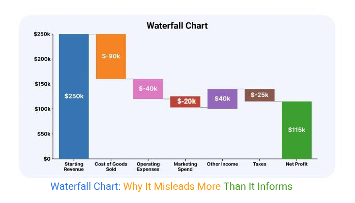
A Waterfall chart must be clear, clean, and honest. Miss the baseline? Trust drops. Skip a key driver? People start guessing. Stack too many subtotals? Your message gets cut into pieces. When done right, a Waterfall chart shows what matters and hides what doesn’t. It brings logic to the noise. It gives you the first word in every meeting.
This guide will help you take back control. You’ll learn how to make your Waterfall chart work for you, not against you. You’ll fix the flow, pick the right order, and keep every number honest.
Relying on automatic settings in business intelligence tools is like letting someone else steer your car. Sure, it might get you there, but the route and the story it tells could be way off. Default settings often decide the sequence, grouping, and colors, changing the story without you even realizing. In a meeting full of executives, that can mean the difference between being understood and being questioned.
Taking control means deciding the order of drivers and how categories are defined. It’s about making sure the pace of the story matches what you need to convey. When you don’t, the chart can distort the truth, and you lose the chance to guide the interpretation. In high-stakes settings, the risk isn’t just about looking unprepared; it’s about losing credibility.
Imagine starting a race from the wrong line. That’s what happens when your chart’s baseline isn’t aligned. Misaligned starting values or hidden adjustments can throw off the whole story. Stakeholders start seeing ghosts in the numbers, and your credibility takes a hit.
Locking down a continuous baseline is a trust move. It shows stakeholders there’s no funny business with the numbers, just straight facts. Sometimes a reset is needed, and that’s okay. Just make sure it’s documented so everyone knows the math is solid. When the numbers are clear, the trust follows.
When every bar in your chart is the same height, it’s like telling a story in monotone. No ups, no downs, just flat. It kills the narrative energy and leaves your audience yawning. The goal is to make the chart a visual journey, full of peaks and valleys that keep engagement high.
To add tension and release, scale or cluster the drivers. It’s about creating visual interest that supports your message. A well-paced chart doesn’t just show numbers; it tells a story. The right visual dynamics can turn a boring chart into a compelling narrative that captures attention and drives home your point.
Skipping over the real contributors in your analysis? That’s like throwing a mystery novel at your audience and expecting them to solve it. When key factors are missing, people start filling in the blanks with their assumptions, which can throw off your whole narrative. It’s like leaving the villain out of a detective story and letting readers decide who’s guilty.
To avoid this chaos, run each factor through a “must-include” filter. Ask yourself: Is it politically sensitive? Messy? Essential for understanding the whole picture? If it’s a yes, it belongs in the chart. This way, you control the story, not the audience’s imagination. Keep your narrative intact by making sure the real drivers are front and center, leaving no room for wild guesses.
Ever tried reading a book with random chapters missing? That’s what a chart feels like with too many subtotals. They disrupt the flow, leaving your audience scratching their heads instead of understanding the progression. It’s like trying to watch a movie with constant commercial breaks.
To keep things smooth, think of subtotals as speedbumps. Use them sparingly. Combine smaller, related items into single rollups or shift them to where they enhance, not hinder, the story. Your aim? A seamless journey from start to end that respects the audience’s time and patience.
Overloading your chart with tiny details is like cramming a novel into a tweet. It buries the key message under a pile of minutiae. Viewers quickly lose interest and turn away, missing the point entirely. It’s like trying to enjoy a concert when you’re focused on every single instrument instead of the symphony.
To keep attention where it matters, group minor elements into broader themes. Preserve the ability to drill back if needed, but keep the main view digestible. This keeps your work engaging and ensures your audience stays focused on the story you’re trying to tell.
Colors have a powerful way of setting the mood, even before you say a word. A chart splashed with red might scream “disaster,” while gray can dull the impact like static on an old TV. These hues can prime emotions and set narratives without your audience even realizing.
To harness this power, stick to a simple color scheme tied to the type of variance. This neutralizes pre-bias and keeps the focus on the data, not the drama. By scripting your color choices, you guide the viewer’s response, ensuring the message lands as intended.
The following video will help you create a Waterfall Chart in Microsoft Excel.
The following video will help you create a Waterfall Chart in Google Sheets.
Ever felt like Excel is out to get you? Yeah, me too. It’s that moment when you’re ready to present, and Excel decides to auto-sort by value, throwing your perfect sequence into chaos. Suddenly, your story’s lost. You need to step up and override these default behaviors. Start by manually setting your category order. This gives you back control. Tweak the axis scaling to ensure nothing looks exaggerated or shrunk. And those labels? Make sure they’re all visible. A truncated label can turn clarity into confusion.
It’s the little things that trip us up. Like that weird axis scaling. You set everything, and then Excel decides to play with your numbers, making some variances look bigger or smaller than they are. Don’t let it. Fix your axis range manually. Ensure labels aren’t cut off. It’s all about ensuring your audience gets the right message without distractions. It’s the difference between a nod of approval and a raised eyebrow questioning your competence.
We’ve all been there. You reorder drivers to make your chart flow better, and suddenly, your formulas are throwing errors like confetti. But there’s a trick. Instead of rearranging directly on the chart, adjust the order in the underlying table. This keeps your calculations intact while giving you the flexibility to tell your story how you want.
A smooth narrative doesn’t mean broken math. Carefully manage linked ranges and totals. It’s about maintaining harmony between your data and presentation. Think of it as arranging a puzzle where every piece fits perfectly, without disturbing the picture. Preserve those refresh hooks, too. You want things to update seamlessly when new data rolls in. It’s all about keeping your chart as sharp as your analysis.
Need to create a pause in your chart without messing up the data? That’s where spacer rows and dummy bars come in. They’re like the unsung heroes of charting. By inserting zero or helper rows, you can create visual gaps that highlight transitions or key steps. It’s a way to guide your audience through the narrative without overwhelming them.
These tricks are lifesavers when you can’t restructure the raw data. They allow you to add emphasis where needed and create natural breaks. It’s like adding a breath between sentences in a speech, allowing your key points to shine. Spacer rows and dummy bars ensure your message isn’t lost in the clutter, keeping your audience focused on what truly matters.
Before you hit send, pause. Your chart might look perfect on your screen, but what about when it lands on someone else’s? Fonts might not render correctly, labels might overflow, and colors might drift. Run a quick pre-share inspection. Ensure everything looks good, not just on your screen, but on any screen it might land on.
Think of it as prepping your chart for a long journey. Check if total bars are still visible after export. These little checks ensure your hard work doesn’t unravel when it reaches leadership. By hardening your chart before sending, you safeguard your credibility and ensure your message is received as intended. It’s like packing a suitcase, making sure everything stays in place until you reach your destination.
When your final numbers don’t match up, it’s like showing up to a potluck without your dish. Everyone’s staring, and you’re scrambling for a quick fix. Start with a comparison of your chart’s end total against the ledger or forecast. Identify discrepancies that might have slipped in during data input or calculations. A quick way to patch this is to introduce adjustment lines. They’re like sticky notes, quick, visible, and they let everyone know you’re on top of things.
Next up, be transparent. If you’ve made adjustments, call them out. Use annotations to explain any shifts or corrections. This approach not only shows you’ve got nothing to hide but also builds trust with your audience. It’s all about maintaining integrity while keeping the flow smooth. Nobody wants to be caught off guard in a meeting, especially when the numbers are under scrutiny.
Auto-scaling can be sneaky. It might stretch your data like a funhouse mirror, making some variances look way more dramatic than they are. To keep things honest, manually set the bounds. This keeps the visual story proportional and genuine. You want your data to speak for itself, not exaggerate its highs and lows.
When adjusting the axis, aim for clarity. Your audience should quickly grasp the picture you’re painting. Avoid extremes that might hide important details or amplify minor ones. Consistent manual scaling ensures that your data remains trustworthy. The last thing you need is someone questioning the integrity of your presentation because of visual tricks.
Charts with too much clutter are like trying to listen to a symphony where every instrument plays at once. The key is to simplify without losing the essential notes. Collapse those immaterial drivers that just add to the chaos. Group them into thematic clusters and keep a separate log of what you’ve bundled together.
Traceability is your ally here. Document these groupings so that if questions arise, you have a clear trail to follow. It reassures stakeholders that while you’ve streamlined the presentation, you haven’t hidden anything. This balance of simplicity and transparency keeps everyone on the same page and makes your data digestible and credible.
A waterfall chart doesn’t just display data; it tells a story. It’s like the opening act of a play, setting the scene before a word is spoken. The order of the bars can imply causality, leading the audience to conclusions that might not align with the intended narrative. To control this visual story, align the sequence of the bars with the outcome you want to communicate. For example, if you’re trying to highlight a positive trend, structure the bars to gradually build up to a peak. This way, the chart acts as your silent advocate, reinforcing the message you’re about to deliver.
But don’t get too cozy with the idea of letting the chart speak for itself. It sets the stage, but your voice provides the nuance. Consider rearranging bars to emphasize key drivers and downplay less significant ones. This isn’t about manipulation; it’s about clarity. By directing the viewer’s focus, you ensure the right story is perceived, minimizing misinterpretation. The chart is your visual assistant; use it to set the right tone before you even begin speaking.
Operations often create these charts, focusing on accurate data representation. But raw data lacks context. Strategic priorities must guide how the information is presented. Imagine an ops team hands you a chart that looks more like a data dump than a narrative. It’s your job to refactor it so it aligns with the meeting’s objectives. This might mean re-labeling or regrouping bars to match strategic goals.
Think of it as taking a rough draft and polishing it into a final presentation. By doing this, you ensure that the chart supports strategic discussions rather than just displaying numbers. This doesn’t mean altering data; it means prioritizing what matters most for the audience. This strategic reshaping is essential to ensure that the chart doesn’t just inform but also persuades and aligns with broader business goals.
The rhythm of your presentation is closely tied to how the chart is structured. Just like music, where rhythm guides the flow, the clustering of bars can dictate the pacing of your talk. A series of rapid, small bars might suggest quick points, while larger, spaced-out bars call for a deeper dive. Knowing where to pause and where to accelerate can make your presentation more engaging and easier to follow.
Imagine walking through a chart in front of leadership. If the bars are clustered effectively, you can build momentum, then slow down to emphasize critical insights. This approach not only keeps the audience engaged but also ensures they grasp the message. By aligning your spoken rhythm with the visual rhythm of the chart, you create a seamless experience that resonates with your audience.
In practice, this means rehearsing your delivery alongside the chart. Identify key points where you need to slow down and provide additional context. Conversely, know where you can quickly glide over the data. This strategic use of pacing ensures that your message hits home and leaves a lasting impact on your audience.
Ever looked at a chart and thought, “This tells me nothing?” Yeah, we’ve all been there. Variance analysis with these charts can feel like staring at a flatline when there’s a storm brewing underneath. The trick is to expose those sneaky movements that hide behind stable totals. By tweaking how you display the data, you can reveal the real story happening inside.
When totals hide the drama, it’s time to dig deeper. You need to make those underlying shifts visible. Think of it like peeling back layers; each one tells a part of the story. By doing this, you’ll show stakeholders exactly what’s going on, rather than just giving them a surface-level view. Your job is to make sure they see the full picture, not just the stuff that looks pretty on the outside.
Changing the order of events can flip the whole narrative. When you sequence by event date instead of category, you shift the perception of volatility. Suddenly, the same data tells a different story. It’s like watching a movie in reverse; everything looks different.
In a variance bridge style chart, this sequencing can make or break how stakeholders interpret volatility. Imagine showing revenue hits before cost savings; the impact feels immediate and urgent. The order of drivers shifts focus and urgency, which can be crucial when you’re presenting to decision-makers who need to act fast.
The “Other” category can be your friend or your foe. It’s tempting to lump all minor drivers into one bucket. But that can either keep your chart clean or raise eyebrows. Transparency is key here. Set clear thresholds for what gets bundled into “Other.”
Disclose what’s in that bucket to avoid speculation. A well-defined “Other” can streamline your chart while still keeping the audience informed. Just make sure you’re not burying anything important. The goal is to strike a balance between simplicity and transparency, while keeping trust intact.
A chart with a flat net result might scream “nothing happened,” but don’t be fooled. Inside those totals, there are often big swings that are worth highlighting. By using color pairings and grouped clusters, you can reveal these offsetting movements.
These techniques help you break down the components that cancel each other out. When start and end totals match, it’s easy to overlook the individual shifts. By highlighting these, you give a clearer picture of what’s really driving the numbers, making sure nothing significant gets lost in the shuffle.
Sometimes, flipping the direction of your data is the move. For scenarios like cost builds or unit cost rollups, an inverted chart can make more sense. It might feel counterintuitive at first, but it can clarify complex scenarios.
Defending this choice involves showing how it aligns better with the logic of the data. When the usual flow doesn’t fit, don’t be afraid to switch it up. This unconventional approach can be the key to making your data tell the right story, even if it means going against the grain.
Navigating the politics of a meeting can be like walking into a minefield. You might be presenting the most accurate data, but if it doesn’t align with preconceived notions, you’re in for a rough ride. Recognizing the biases that people carry into the room is your first step. Everyone sees what they want to see, and sometimes, that’s not what’s actually there. This is where understanding and tweaking the layout of your data comes into play.
Bias is a tricky beast. People often interpret data in a way that aligns with what they already believe. This can derail your story before you’ve even started. Subtle framing changes can make a world of difference. Adjusting the order or grouping of your data can guide the narrative more effectively. The goal is to ensure that the data speaks for itself, not the biases of the audience.
Highlight the need for clarity and the importance of structure to avoid the narrative being hijacked. By taking control of the narrative, you prevent misinterpretations that stem from bias. With the right adjustments, the data becomes a reflection of the truth, not someone’s preconceived ideas.
There’s always that one person, the skeptic. They didn’t build the numbers, so they’re naturally suspicious. They question everything. To address their doubts, anticipate objections. Embed answers within your labels and notes. Make your data bulletproof, leaving no room for doubt or misinterpretation.
Skeptics often focus on inconsistencies. By preparing with detailed notes and clear labels, you can preempt their questions. This not only helps you present with confidence but also ensures that your data withstands scrutiny. When the skeptic has nothing to question, the rest of the room follows suit.
Sometimes, less is more. But if you choose to exclude a driver, be transparent about it. A footnote or summary can explain why certain data points were omitted. This way, the chart doesn’t seem like it’s hiding something. It’s all about maintaining trust.
Transparency is key. By disclosing omissions upfront, you avoid the impression of bad-faith editing. This strategy keeps the narrative clean and honest, ensuring that the audience trusts the data they see. Remember, people appreciate honesty, even in data presentation.
Waterfall charts tell a story, but if that story’s jumbled, trust wobbles. It’s like trying to follow a plot where chapters are out of order. When you lead with what you control and end with external noise, you create a clear narrative. Accountability becomes visible. For instance, start with internal actions like cost-cutting, then end with market shifts. This approach frames management effectiveness. It shows stakeholders, “Here’s what we did, and here’s what we couldn’t control.”
Think of it like a conversation with your boss. You wouldn’t start with the weather before discussing sales strategies. Sequencing matters. A clean order makes the cause-and-effect chain easy to follow. It’s all about knowing your audience and what needs highlighting. When you’re clear, your message lands. No room for misinterpretation.
In the world of charts, leading with what you control is like putting your best foot forward. Start with actions you own. Maybe it’s improved efficiency, maybe it’s a strategic investment. These are the elements you can speak about confidently. It’s your chance to showcase what your team has achieved. Once that’s clear, bring in the external factors. These are the wildcards, the market trends, or unforeseen regulations.
By ordering this way, you’re painting a picture that’s not just accurate but also fair. It’s about showing your proactive side before acknowledging the uncontrollable. It keeps the narrative strong and focused. When you set up your chart in this manner, it automatically aligns with how most of us think. We want to see effort before excuses.
Symmetrical grouping in charts might seem neat, but it muddles the waters. Imagine stacking books evenly on a shelf without considering their genres. You end up with a mix that doesn’t tell any story. The same goes for charts. Balancing the middle just for aesthetics confuses the cause chain. It hides the real drivers of change.
Instead, embrace linear ordering. Line up your bars in a way that clearly shows progression. You’re not here to please everyone with symmetry. You’re here to communicate effectively. A straight path from cause to effect creates clarity. It’s like walking through a hallway versus a maze. One is straightforward, the other is just a headache.
Certain elements in your data are too big or too controversial to be lumped together. Imagine trying to hide an elephant in a petting zoo. It’s going to stand out no matter what. These are the drivers that need to be isolated. They deserve their spotlight. It preserves the chart’s integrity and ensures nothing important gets lost in a cluster.
When a driver stands alone, it’s easier to address its impact directly. Don’t be afraid to pull one element out of the mix. It’s about protecting the narrative and preventing misinterpretation. A standalone driver is like a headline. It gets the attention it deserves and communicates its significance without noise. It’s the smart move when clarity is on the line.
Ever been in a meeting where the labels on a chart were so cramped you couldn’t tell what was what? It’s like trying to read a book in the dark. Space matters. When labels collide, they confuse instead of clarifying. Adjust spacing so each label stands out. Rotate them if you must. Just ensure they’re readable at a glance. No one wants to squint at a chart when they should be focusing on the message.
Truncation is another villain. When numbers get cut off, it looks unprofessional. Keep it clean. Use abbreviations wisely, and make sure they’re consistent. A little attention to detail here saves time in the long run. No more explaining what’s missing when the labels do their job right.
Colors speak before you do. A red bar screams “problem,” while green whispers “success.” But too much color can overwhelm. Stick to a minimal palette tied to your message. Let colors guide the viewer through the story you’re telling. Keep it simple and intentional.
Establish a palette across all your outputs. This consistency builds familiarity and trust. It’s like wearing your brand on your sleeve. When viewers know what to expect, they focus on the insights, not the decoration. A well-chosen color scheme becomes part of the narrative itself.
Nothing says “rookie” like inconsistent bar widths. It’s like wearing mismatched socks to a formal event. Keep those categories even. Equal width and gap spacing create a harmonious look. Emphasize total bars to highlight key points. This uniformity makes your chart look deliberate and professional.
A chart that reads well speaks volumes. It shows you’ve put thought into how information is presented. This attention to detail reassures viewers and enhances credibility. A chart that looks right feels right. And that’s half the battle won.
Suppressing totals might seem sneaky, but sometimes it’s necessary. Just make sure you’re upfront about it. If you hide a total, disclose why nearby. A footnote or a side note keeps transparency intact. It’s all about trust. People need to know they’re getting the full picture.
Clarity in communication builds confidence. When viewers know you’re not hiding anything, they’re more likely to trust your insights. It’s about maintaining integrity in your presentation. Be open about what’s missing and why. This honesty supports the credibility of your work.
Ever tried presenting a chart on a low-res projector? It’s a nightmare. Test your charts in the worst conditions. Grayscale print, mobile screens, old projectors. If it survives these, you’re good to go. This stress test ensures your chart is bulletproof in any situation.
Anticipate worst-case scenarios. When your chart looks good everywhere, you save yourself embarrassment. It’s like having insurance for your presentation. You’re ready for anything, and that confidence shows. Your audience will notice, and they’ll appreciate your preparation.
A waterfall chart looks simple. Bars go up, bars go down, totals settle. But behind that clean view, things can fall apart fast.
Misordered drivers change the meaning. Flat bars erase the story. Subtotals stop the flow. Colors mislead. Baselines shift. Labels fight for space. Every small miss makes the chart harder to trust.
This isn’t about design tricks. It’s about control. You decide the sequence. You group what matters. You show what changed and why. That’s what makes a waterfall chart work.
Fix what distracts. Name what matters. Let the numbers show what really moved.
Your waterfall chart tells the story before you speak, make sure it tells the right one.
How much did you enjoy this article?


Best tools for data visualization help avoid errors, improve clarity, and align teams for accurate decisions. Read on to choose the right one.

Public relations KPIs measure PR performance. This blog explains key metrics, tracking methods, and benefits to optimize your communications strategy.
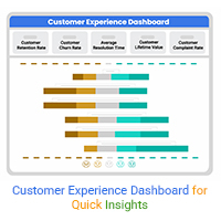
This guide explores the importance and features of a customer experience (CX) dashboard.