Categories
By ChartExpo Content Team
A donut chart is a powerful tool when used correctly. It brings clarity to complex data by showing proportions and part-to-whole relationships in a visually appealing way.
Whether you’re tracking a project’s progress, visualizing revenue breakdowns, or making quick comparisons, a donut chart can help make your data instantly understandable.
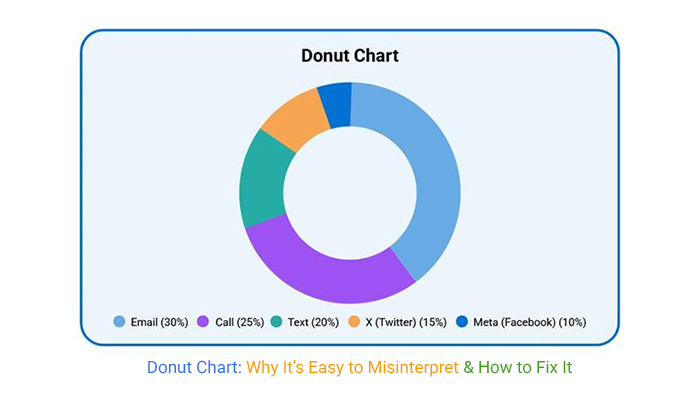
However, like all charts, it’s important to use them the right way. Too many segments or unclear labeling can make your donut chart more confusing than helpful. Keep your design clean, use consistent colors, and label slices directly to avoid any confusion. And remember, it’s best for showing general proportions, not precise details.
If you stick to these best practices, your donut chart will quickly become a go-to visual tool for anyone looking to understand data at a glance. Data doesn’t have to be complicated, and a well-crafted donut chart proves just that.
| Misuse of Donut Charts and How to Fix It | ||
| Misuse | Issue in Donut Chart | Fix Using a Table |
| Overloading with Data | Too many data points can make a donut chart difficult to interpret. | Limit the number of categories and display detailed data in a table to enhance clarity. |
| Using for Precise Data | Donut charts are not suitable for precise comparisons and data points. | Present precise data in a table, using exact numbers and percentages for clear analysis. |
| Inconsistent Colors | Different colors across charts or in the same chart can confuse viewers. | Maintain a consistent color scheme and provide a table explaining the color meaning. |
| Overuse of ‘Other’ | The ‘Other’ category can obfuscate meaningful data. | Break down the ‘Other’ category into subcategories in a table to improve transparency. |
| Lack of Direct Labels | Donut charts that don’t label slices directly can confuse viewers. | Use a table to label all data points explicitly, ensuring no need for legend references. |
Donuts excel at showing how parts stack up against the whole. They break data into bite-sized pieces. This visual tool reduces the need for lengthy explanations. It’s like having a shortcut to understanding.
Imagine explaining a company’s revenue sources. A donut chart can show each segment’s contribution in a flash. This saves time and keeps the audience engaged. They won’t get lost in a sea of numbers. Everything stays clear and concise.
In tight spaces, showing progress can be tough. Donut charts solve this problem. They are compact and efficient. Think of them as the tiny house of data visuals. They pack a punch without taking up room.
Tracking a single metric over time becomes simple. Picture a project’s completion percentage. A donut chart updates stakeholders quickly. It conveys progress without overwhelming. This keeps everyone on the same page and informed.
Quick recognition is crucial in fast-paced environments. Donut visuals deliver this with style. Their design immediately draws eyes. They highlight what’s important at first glance.
Consider a dashboard with multiple indicators. A donut chart can spotlight key performance metrics. This guides viewers to crucial data points. It’s like a beacon in a storm, ensuring nothing gets missed.
Binary and ternary outcomes often need clarity. A donut chart provides this in spades. It presents results with zero ambiguity. No need for head-scratching or second-guessing.
Take a voting outcome, for example. A donut chart can show yes, no, and maybe votes clearly. It eliminates confusion and presents a straightforward picture. This aids in making informed decisions swiftly.
Executives value concise, impactful visuals. Donut charts fit this bill perfectly. They highlight key data without clutter. This makes them ideal for high-level presentations.
When pitching ideas or strategies, clarity is key. A donut chart can show budget allocations effortlessly. It keeps the focus on essential figures. This helps in gaining approval and moving projects forward.
Imagine trying to guess the size of a slice of pie, but the pie’s missing a chunk in the middle. This is the challenge with comparing arcs in a donut visual. Even if the percentages are right, judging the arcs can lead people astray. The gaps between segments and the missing center create confusion.
This confusion can make even the sharpest minds question their understanding. It’s like watching a magic trick and trying to figure out the secret. People see the arcs but may not grasp their true size. Accurate data deserves a clear presentation, not a guessing game.
Stress changes how we see things. When you’re under pressure, ranking data becomes tough. Donut segments can add to this challenge. They often twist our sense of priority, making it hard to see what’s truly important.
Imagine being in a high-stakes meeting. The segments can lead you to focus on less important areas. It’s like focusing on the wrong player in a sports game, missing the one who scores. When every second counts, clarity in data is vital. This lack of clarity can cost you precious decision-making time.
Shapes can trick the eye, and donuts are no exception. The balance in these visuals can lead to false equivalence. Segments may look equal when they’re not. This illusion can make different data points appear similar, which isn’t helpful.
Think of it as an optical illusion, where two lines seem the same length but aren’t. This false balance can lead to wrong conclusions. It’s like picking the wrong road on a map, thinking it’s the shortest. Accurate data presentation should guide, not mislead.
| Data Transparency and the ‘Other’ Category | ||
| Category | Issue in Donut Chart | Fix Using a Table |
| Ambiguity in ‘Other’ | The ‘Other’ category hides important data, making it unclear what is truly being represented. | Use a table to break down the ‘Other’ category into subcategories for better transparency. |
| Overuse of ‘Other’ | The ‘Other’ category is used too often, leading to confusion and a lack of visibility. | Avoid overusing ‘Other’ by specifying all data categories clearly in a table. |
| Lack of Detail | The ‘Other’ category can gloss over valuable data points that deserve attention. | Provide a detailed breakdown of the ‘Other’ category in a table format to enhance clarity. |
Catch-all groupings can be a sneaky way to sweep details under the rug. These segments can hide significant trends and insights that deserve attention. It’s like putting various flavors of ice cream into one generic tub labeled “Other.” You miss out on knowing which flavors are popular.
When you lump diverse data together, you risk losing valuable insights. Analysts and decision-makers need clear, precise information. If they can’t see the full picture, they might miss emerging opportunities or potential risks. Keeping data transparent helps everyone make better, more informed choices.
When important categories vanish into the “Other” section, confidence takes a hit. Stakeholders rely on clear visibility to understand trends and make informed decisions. It’s like trying to solve a puzzle with missing pieces. Frustration quickly sets in when you can’t see the full picture.
Missing categories lead to uncertainty. Decisions based on incomplete data might not align with business goals. This can result in missed opportunities or costly mistakes. Keeping data clear and complete helps maintain trust and ensures everyone is on the same page. A well-detailed chart keeps the business ship sailing smoothly.
| Providing a Clearer Overview for Stakeholders | ||
| Risk | Problem with Donut Chart | Fix Using a Table |
| Loss of Clarity | Donut charts can become confusing in high-stakes situations. | Provide data in a table, with no ambiguity or need for additional explanation. |
| Misleading Simplicity | Donut charts may oversimplify the data, losing essential details. | Use a table to present the exact values and subtotals to maintain clarity. |
| Unnecessary Complexity | Overuse of the ‘Other’ category or too many segments can confuse viewers. | Break down the data, showing exact figures and categories in a detailed table. |
| Failure to Prioritize | Donut charts may fail to prioritize the most important data points. | Rank data in a table, ensuring that the most crucial information is highlighted for decision-makers. |
Operational blind spots become a real danger when “Other” dominates. Important details can slip through the cracks, unnoticed and neglected. It’s like driving with a foggy windshield; you can’t see the roadblocks ahead. In business, this means missed opportunities and overlooked risks.
Overloading “Other” can lead to poor decision-making. Without clear data, teams might prioritize the wrong initiatives. This can waste resources and time. Ensuring each data point is visible helps teams focus on what’s truly important. It keeps operations running smoothly and effectively.
Placement is powerful. When segments aren’t in size order, it changes the narrative. Smaller sections at the top can seem more critical. This is due to how our eyes travel. We start at the top and work our way around. It gives the illusion that the first things we see matter more.
Even the space between sections can alter perception. Wider spaces might suggest separation or lack of connection. This can mislead viewers into thinking segments aren’t related. This subtle shift can change how we interpret the data.
| Fixing the Problem of Segment Order in Donut Charts | ||
| Issue | Problem with Donut Chart | Fix Using a Table |
| Misleading Order | Donut charts can give the impression that smaller segments are more important based on their position. | Organize the data in descending order in a table, emphasizing key categories based on actual values. |
| Perception Based on Placement | Placement at the top or center can make certain segments seem more important. | A table allows for ranking or ordering data, ensuring that viewers understand the true significance of each part. |
| Visual Misinterpretation | The position of segments can influence the perception of their relevance. | Rank and display segments in a table format, eliminating the need for any placement-based assumptions. |
| False Prioritization | Positioning can lead viewers to prioritize less important segments due to their placement. | Use a table to rank and display data in a logical order, highlighting the most significant segments first. |
Color consistency matters. Using different colors for the same categories in various charts confuses readers. It’s like changing traffic light colors every day. People wouldn’t know when to stop or go. Consistency helps build understanding and trust.
Color changes can also suggest changes in data, even if none exist. This leads to misinterpretations. If a segment was blue yesterday and is red today, viewers might think something significant happened. Consistent color schemes prevent this confusion.
| Improving Color Consistency Across Donut Charts | ||
| Issue | Problem with Donut Chart | Fix Using a Table |
| Inconsistent Color Use | Donut charts may use different colors for the same categories in different charts, leading to confusion. | Standardize colors across all charts and use a table to clearly label each segment with its respective color. |
| Misleading Color Association | Changing colors in donut charts may cause viewers to assume that the data has changed. | Maintain consistent color schemes across charts and provide a table with color-coded segments for clarity. |
| Color Misinterpretation | Colors might conflict with the viewer’s interpretation of the data. | Use a table that provides a key or legend to explain the meaning of each color, ensuring no ambiguity. |
| Inconsistent Color Schemes | Donut charts with inconsistent colors between different charts or segments can confuse viewers. | Ensure color consistency across donut charts and use a table for a clear mapping of each category to its color. |
Order conveys meaning. Placing smaller slices at the start can create a false sense of importance. Our brains are wired to assign importance to the first things we see. This means the order of slices can mislead viewers.
Chronological or logical order helps. When slices follow a logical sequence, it provides clarity. It tells a story that aligns with our expectations. This order helps viewers understand the data without jumping to false conclusions.
| Reducing the Risk of Misleading Comparisons | ||
| Weakness | Issue in Donut Chart | Fix Using a Table |
| Misleading Comparisons | Donut charts distort visual comparison between segments due to the arc sizes. | Use a table to present the exact numerical values along with percentages for each segment. |
| Visual Bias | The positioning and size of segments can mislead viewers into thinking certain data is more significant. | Rank segments in a table, displaying them in descending order of importance. |
| Ambiguity in Segment Size | Donut charts can create a false equivalence between segments that are visually similar but numerically different. | Use a table to display the exact values and percentages, making comparisons clearer. |
| Lack of Precise Comparison | Arc size can distort the actual proportion of each segment, making precise comparison difficult. | Use a table to show values and percentages directly, eliminating the need for visual approximation. |
Imagine two donut charts, each looking deliciously similar. But wait, there’s a catch. The totals they represent aren’t the same. This unshared total creates a visual misalignment. The viewer assumes each section of the donut is comparable, but that’s not the case. It’s like comparing a small pizza to a large one, slice by slice. They might look similar, but their sizes are vastly different.
This misalignment can cause havoc in data interpretation. The viewer assumes the sections are equal, leading to misconceptions. The data’s true meaning gets lost in translation. The visual balance shifts, and the impact of the data presentation weakens. Instead of providing clear insights, this misalignment results in confusion and misjudgment.
Now, let’s talk radius and scale. Two donut charts might show identical percentages, yet they look different. Why? Because the radius or scale has shifted. Imagine comparing two donuts of the same flavor, but one has a wider hole. The taste is the same, but visually, they appear different. The same happens with charts.
These shifts create a visual illusion. Identical data points take on different appearances. The viewer might think there’s a significant difference when there isn’t one. The visual representation becomes misleading. Instead of providing clarity, it offers confusion. Consistency in scale and radius is key to accurate data presentation.
Ever tried skimming through a book and missed key details? Scanning can lead to misconceptions. When viewers scan charts instead of analyzing them, they might assume equivalence where there isn’t any. Imagine glancing at two donuts and assuming they’re the same size, but one is a mini donut. The quick scan leads to a wrong judgment.
This scanning habit causes data misinterpretation. Users might equate different datasets, thinking they’re similar. This assumption can lead to incorrect conclusions. The data’s true message gets lost in a quick glance. Instead of assisting in decision-making, it creates false assurances. Proper analysis, not scanning, is essential for accurate data understanding.
| Addressing Donut Chart Design Failures | ||
| Design Issue | Problem with Donut Chart | Fix Using a Table |
| Overly Simplified Design | A donut chart may present overly simplified data, missing out on crucial details. | Use a table to present detailed data in full, without glossing over important aspects. |
| Cluttered Visual | Too many segments or colors can clutter the donut chart, making it hard to discern key information. | Simplify the chart and present the data in a clear, concise table format. |
| Hidden Relationships | Donut charts may fail to show the relationships between data points effectively. | Provide clear relationships between data in a table, making it easy to understand how items connect. |
| Inconsistent Labeling | Inconsistent or missing labels can confuse viewers. | Ensure all data points are clearly labeled in a table to avoid relying on legends or hover information. |
| Visual Bias | The position, size, and color of segments can create visual bias, misdirecting focus. | Use a table to rank segments or provide a consistent order of data to eliminate bias. |
Pretty charts can hide risks. The neat appearance can gloss over details. Important data might be missed. This is a problem when decisions depend on the chart. Pretty colors and shapes can distract from what’s critical.
A donut might show a risk as smaller than it is. This happens when the segments are too similar in size. It creates a false sense of security. Understanding the chart’s limits is key to making informed decisions. Remember, a pleasant design should never come at the cost of accuracy.
Branding can influence design choices. Sometimes, this leads to inconsistent messages. A donut chart might follow brand colors. However, these colors might not suit the data. This can make it hard to tell segments apart.
When brand colors clash with data clarity, the message gets lost. The focus should always be on clear communication. Brands need to prioritize readability over aesthetics. The chart’s job is to inform, not confuse.
Simplicity can hide problems. A clean design might ignore important issues. This is especially true with donut charts. They can simplify data too much. This leaves out key details that need attention.
Friction points can provide insights. Ignoring them can lead to poor decisions. A chart that looks too simple might be ignoring these points. It’s important to dig deeper and ask questions. The real story often lies beneath the surface.
Hover-only labels, those sneaky text boxes, disappear in screenshots. This creates a problem for anyone needing a snapshot. Vital data vanishes into thin air. Printouts lose context, leaving people scratching their heads. The chart loses its storytelling power. Information stored in hover labels becomes like a secret whisper, heard by only a few.
Those missing labels mean the chart can’t stand alone anymore. Users who rely on printouts or screenshots get half the story. They miss key details that provide depth. This problem challenges the usefulness of charts in reports. Designers must rethink how to display data. They should ensure labels remain visible, even when printed or captured.
Mobile interfaces can be tricky with interactive charts. Features may collapse, hiding crucial data. Users on small screens get a different experience. They might miss the chance to interact fully with the chart. The compact design often sacrifices functionality for size.
This can lead to data misinterpretation. Without full interaction, users can’t explore all the insights. They might make decisions based on incomplete information. Designers must find a balance between space and function. They need to think of ways to keep interactivity alive, even on the smallest screens.
Charts often assume users will be curious. They think people will dig for information. But what if users don’t have the time or patience? The chart then becomes a puzzle rather than a tool. Viewers need clear, direct data without extra effort.
Assuming curiosity can lead to confusion, Users might gloss over important data points. They need clarity, not a scavenger hunt. Designers should present information upfront. This ensures users get the full picture right away. It requires a shift in how data is displayed, prioritizing clarity over curiosity.
A donut chart can sometimes act like sunglasses on a cloudy day. By reducing detail, it might shield underperformance from view. People might not notice when something is not doing well because it looks like everything is in order.
Think of it as a magic trick. What you don’t see is as important as what you do see. In this case, the missing details can hide where improvement is needed. So, while the chart looks balanced, it might be covering up areas that deserve attention.
These charts can appear neutral, presenting data in a way that seems fair and balanced. However, they might hide disparities lurking beneath the surface. The smooth appearance can create a false sense of equality among the segments.
It’s like a painting with only one color. It looks uniform, but it lacks depth. The diversity of data gets lost. The viewer might miss out on understanding the true differences between the segments. This can lead to misinterpretations.
Clean visuals might seem appealing, but they can avoid telling the real story. A donut chart’s tidy design can focus attention on aesthetics rather than information. People might get distracted by how nice it looks and not ask the right questions.
Picture a book with a beautiful cover but a bland story inside. The chart might hold back the narrative that needs to be told. By focusing on beauty, we might miss the essence of what the data is trying to communicate.
| Enhancing Clarity in High-Stakes Situations | ||
| Limitation | Issue in Donut Chart | Fix Using a Table |
| Limited for Complex Data | Donut charts simplify data too much and may overlook complexities. | Break down complex data into categories in a table for a more detailed view. |
| Difficult to Compare | Comparing arcs and segments can be misleading. | Use a table to display exact numerical values and percentages for easy comparison. |
| Not Ideal for High-Stakes Decisions | Donut charts may lead to confusion in high-pressure situations where clarity is vital. | Provide data in a table format, with exact numbers and no ambiguity. |
| Visual Bias | The position, size, and color can create visual bias, misdirecting focus. | Use a table to rank segments or provide a consistent order of data to eliminate bias. |
Sharing screens can feel like a lottery. Will the chart make sense? Or will it look like a toddler’s crayon drawing? Labels that overlap are the chief culprit. They pile up like cars in a traffic jam. Viewers squint, trying to decipher the text. The outcome? Important data points get lost in the shuffle.
In shared settings, clear labels are a lifeline. They anchor the data, providing clarity. Without them, the chart becomes a riddle. Imagine explaining a joke where the punchline is missing. Frustration mounts. The audience tunes out. Legibility is key. It’s the difference between a smooth presentation and an awkward silence.
Mobile screens are notorious for making things disappear. Small chart segments? Gone in a flash. They’re like socks in a dryer, swallowed by the abyss. These segments hold crucial insights. On mobile, they become mere slivers, easily overlooked.
Zooming in helps, but isn’t ideal. It’s a band-aid solution. Each time a piece vanishes, so does the viewer’s confidence. They question the data’s accuracy. The chart should be a map, not a maze. On small screens, clarity means everything. It guides the viewer through the data landscape, ensuring no detail is lost.
| Enhancing Readability for Small Segments | ||
| Weakness | Issue in Donut Chart | Fix Using a Table |
| Small Segments Not Visible | Small segments may become too tiny to read or disappear, especially on mobile or zoomed-out views. | A table will ensure that even small segments are clearly visible with exact values. |
| Inaccurate Representation | Small segments can be difficult to read and may lead to misinterpretation. | Provide the exact numerical data in a table to ensure every segment, no matter how small, is clearly represented. |
| Misleading Comparisons | Small donut chart segments make it hard to compare smaller data points. | Use a table to clearly compare values and percentages of all segments, regardless of their size. |
| Disappearing on Mobile | Small segments can disappear or become illegible on smaller screens. | A table will ensure that small segments are readable and properly visible on all screen sizes. |
Screenshots are the currency of today’s meetings. But what happens when a chart doesn’t translate well? Design choices that look brilliant in person might fail in a screenshot. Colors can blend. Details can blur. The chart’s message gets muddled in the process.
A poorly designed chart becomes a punchline. It circulates, but for the wrong reasons. It’s like a viral meme, but it spreads confusion, not laughter. A screenshot should be a snapshot of clarity. Instead, it often captures chaos. Thoughtful design helps the chart survive this journey, conveying its message with precision.
Bar charts are the unsung heroes of data. They take your information and arrange it in a way that’s easy to digest. Imagine a lineup of soldiers, each standing tall to show their rank. That’s what a bar chart does for your data. It helps viewers see hierarchy instantly without needing a legend.
These charts don’t mess around with colors or hovers. They get straight to the point. They let you stack and group data for added depth, too. This makes them versatile and efficient, fitting snugly into any presentation. Simplicity is their strength, and clarity their mission.
| Improving Clarity with Hierarchical Data | ||
| Issue | Problem with Donut Chart | Fix Using a Table |
| Confusing Data Hierarchy | Donut charts make it difficult to interpret the significance of segments. | Use a table with hierarchical ranking to clarify which segments are more significant based on actual data. |
| Data Priority | Donut charts may prioritize data visually in a confusing way. | Display data in a ranked order in a table to ensure a clear understanding of each segment’s importance. |
| Overloaded Information | Too many segments lead to confusion about which data to prioritize. | Organize data into a ranked table, reducing clutter and focusing on key segments. |
| Inconsistent Representation | Donut charts may represent segments in an order that misleads viewers about importance. | Rank data in a table, ensuring a logical order that aligns with viewer expectations and true significance. |
Waffle graphs march in with precision. They keep your data proportional, like a perfectly sliced pie. But unlike a pie, they don’t warp your figures. Each square in a waffle graph equals a percentage, making it easy to see exactly what you’re working with. There’s no guessing or squinting involved.
These grids bring order to chaos. They’re perfect for showing parts of a whole, without the fuss. Waffle graphs don’t need bright colors to make a statement. They rely on structure and simplicity. This makes them a go-to for clear communication.
Sometimes less is more, especially in visuals. Simplified charts strip away the extras. They don’t rely on hovers, colors, or legends to do the talking. They focus on the essentials, making data easy to understand at a glance. Imagine a clean slate, where every piece of information stands out without distraction.
These visuals are like a breath of fresh air. They guide the viewer’s eye, telling a story without clutter. They let the data speak for itself, making complex information accessible. This approach keeps your audience engaged and informed, without needing to decode layers of information.
Why make people guess? Direct labels on each slice are a must. They cut out the middleman, which is the legend in this case. Legends force users to jump back and forth between the chart and the key. This wastes time and can confuse. Direct labeling keeps everything front and center.
When the label is on the slice, the data speaks directly to the viewer. This directness makes the information easy to digest. It’s like having a conversation without any interruptions. Your audience stays engaged and informed. So, wave goodbye to legends and let your labels do the talking.
Too many categories spoil the chart. Keep them to a minimum to maintain focus. If “Other” is unavoidable, be kind and show what’s inside. Breaking down “Other” ensures no data gets lost in the shuffle. This transparency builds trust with your audience.
Consider “Other” a mysterious box. People want to know what’s inside. By revealing its contents, you remove the mystery. This openness helps in making informed decisions. It’s all about being clear and precise with your data. Less guesswork means more understanding.
Colors do more than just brighten up charts. They guide the viewer’s eye and convey messages. Consistency in color usage across charts is key. It helps in avoiding confusion and maintains a seamless experience. When colors stay consistent, they reinforce the data’s story.
Imagine a roadmap where colors suddenly change. You’d be lost, right? The same goes for charts. Consistent colors lead viewers smoothly through your data. They don’t have to pause and rethink what each color means. It’s about creating a visual language that everyone understands.
The hole in the middle of a donut chart isn’t just empty space. It’s prime real estate for key information. Use it wisely to highlight critical totals or key performance indicators (KPIs). This central spot draws the eye, making it perfect for important numbers.
Think of the center as a spotlight. It highlights what truly matters while the slices provide context. By using this space effectively, you enhance the clarity of your chart. Your audience gets a quick grasp of the big picture, all without any extra effort. It’s about making every part of your chart work for you.
When precision is the goal, it’s crucial to pick the right tool. Donuts aren’t the best for tasks needing exact numbers or comparisons. They shine with general proportions, but fall short with precise data points.
Consider the task’s demands. If it’s about precision, other tools might fit better. Bar charts or line graphs offer clarity where donuts falter. Opting for a sharper tool ensures the data speaks clearly.
| Precision Problems in Data Representation | ||
| Reason | Issue in Donut Chart | Fix Using a Table |
| Precision Issues | Donut charts are not suitable for precise data. | Use a table to display exact values and percentages, ensuring precise data comparison. |
| Too Many Segments | Donut charts become cluttered with too many segments. | Limit the number of segments or use a table to break down detailed data clearly. |
| Distorted Visual Perception | The arc size can create misperceptions about the data’s significance. | Present values in a table where exact figures and percentages are shown, avoiding visual distortion. |
Feeling uneasy about defending a choice is a sign. Donut charts can be tricky. If the data isn’t crystal clear, it might not be the right fit. Being unsure about explaining it means the audience might be confused too.
Choose confidence over complexity. If the chart’s message isn’t strong, it might not be worth the risk. It’s about making the message clear and the choice easy to defend.
Donuts are great for setting the stage. They can offer a quick glance at data, showing broad trends or proportions. However, they’re not ideal for detailed analysis. When the task is about intricate details, another approach might be better.
Framing the data quickly is their strength. But for deep insights, it’s best to look elsewhere. A chart should match the task. Donuts are about the big picture, not the nitty-gritty.
Each segment should tell a part of the story. A chart shouldn’t rely on a legend or hover text. If a viewer needs to hover over a section for context, the chart is incomplete.
Think of each slice as a character in a novel. Each one should contribute to the plot. A well-designed chart doesn’t need extra help. It stands on its own, confident and clear.
Before you say a word, the chart should communicate its message. A visual should be the storyteller, not the sidekick. If someone needs to hear your explanation first, the visual needs work.
Imagine your viewer has only a moment to spare. The story should unfold with a glance. A well-crafted chart leaves no room for doubt. It whispers its tale in silence.
Time is limited, and patience can be thin. Design each chart assuming the viewer is in a rush. They should grasp the message in seconds. There’s no room for confusion or complication.
Picture a viewer with skepticism in their eyes. The chart should ease their doubt with clarity and precision. Craft it to win over even the toughest critics.
The donut chart proves to be a handy tool when used properly. It’s excellent for displaying part-to-whole relationships and offering a quick, clear visual representation of how different elements make up a total. Whether you’re tracking a project’s progress or comparing revenue sources, a donut chart can simplify things at a glance.
However, it’s not without its flaws. Too many slices or unclear labels can turn what’s supposed to be a simple graphic into a confusing mess. It’s crucial to avoid misleading colors, distorted proportions, or hidden details, especially in high-stakes situations where clarity is key.
As with any tool, knowing when to use the donut chart and when to choose something else makes all the difference. It’s perfect for broad, simple visualizations but doesn’t stand up well when precision or complex analysis is required. Keep your design clean, ensure the data is clear, and avoid overcomplicating things.
How much did you enjoy this article?


Calculate accounts receivable turnover ratio to measure credit collection speed, improve cash flow, and strengthen your financial strategy. Read on!

Change Management KPIs are the key to tracking adoption, performance, and ROI during transitions. Find out which metrics matter. Read on!

Data collection methods and techniques determine the quality of every insight you act on. Explore key approaches for gathering reliable data. Read on!


