• Home
  • Tools dropdown img
    • Spreadsheet Charts

      • ChartExpo for Google Sheets
      • ChartExpo for Microsoft Excel
    • Power BI Charts

      • Power BI Custom Visuals by ChartExpo
    • Word Cloud

  • Charts dropdown img
    • Chart Category

      • Bar Charts
      • Circle Graphs
      • Column Charts
      • Combo Charts
      • Comparison Charts
      • Line Graphs
      • PPC Charts
      • Sentiment Analysis Charts
      • Survey Charts
    • Chart Type

      • Box and Whisker Plot
      • Clustered Bar Chart
      • Clustered Column Chart
      • Comparison Bar Chart
      • Control Chart
      • CSAT Survey Bar Chart
      • CSAT Survey Chart
      • Dot Plot Chart
      • Double Bar Graph
      • Funnel Chart
      • Gauge Chart
      • Likert Scale Chart
      • Matrix Chart
      • Multi Axis Line Chart
      • Overlapping Bar Chart
      • Pareto Chart
      • Radar Chart
      • Radial Bar Chart
      • Sankey Diagram
      • Scatter Plot Chart
      • Slope Chart
      • Sunburst Chart
      • Tornado Chart
      • Waterfall Chart
      • Word Cloud
    • Google Sheets
      Microsoft Excel
  • Services
  • Pricing
  • Contact us
  • Blog
  • Support dropdown img
      • Gallery
      • Videos
      • Contact us
      • FAQs
      • Resources
    • Please feel free to contact us

      atsupport@chartexpo.com

Categories
All Data Visualizations Data Analytics Surveys
Add-ons/
  • Google Sheets
  • Microsoft Excel
  • Power BI
All Data Visualizations Data Analytics Surveys
Add-ons
  • Google Sheets
  • Microsoft Excel
  • Power BI

We use cookies

This website uses cookies to provide better user experience and user's session management.
By continuing visiting this website you consent the use of these cookies.

Ok

Ideas, insights, and inspiration on
how to make insightful charts.

Charts tips & tricks, how-to and step-by-step guides that will help you save time and money.
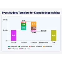
Data Analytics8 min read

MySQL ODBC Connector: Connect, Analyze, and Visualize

MySQL ODBC connector bridges MySQL databases and BI tools for secure, reliable data access across platforms. Set up yours today. Read on!

Power BI6 min read

KPI Visual in Power BI: From Data Chaos to Clear Insights

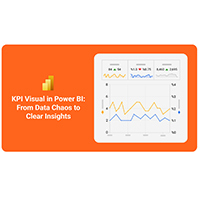
Learn how to use KPI visuals in Power BI to track performance against targets, understand trends, and make faster, data-driven decisions.

Power BI9 min read

Power BI Calculated Columns: A Quick Start Guide

Power BI Calculated Columns transform raw data into structured DAX-driven insights. Learn to create, apply, and optimize them. Read on!

Power BI8 min read

Power BI Dashboard vs Report: A Comprehensive Guide

Power BI Dashboards vs Reports: key differences, use cases, and when to use each for monitoring KPIs and analyzing data in depth.

Google Sheets9 min read

SUMPRODUCT in Google Sheets: How It Works

SUMPRODUCT in Google Sheets handles multi-condition calculations without extra columns. Master its syntax, uses, and errors. Read on!

Data Visualization7 min read

Ranking Chart Maker for Better Insights

A ranking chart maker helps turn data into clear rankings for fast comparison. Learn Excel steps, examples, and tools to improve data visualization.

Power BI8 min read

How to Build a Power BI Sales Dashboard (Step-by-Step)

Learn how to create a Power BI sales dashboard to monitor revenue, sales KPIs, and trends with real-time interactive visuals and insights.

Data Analytics8 min read

Vanity Metrics: From Data Noise to Clear Insights

Vanity metrics can mislead teams into tracking numbers that never drive results. Discover what makes a metric truly actionable. Read on!

Microsoft Excel11 min read

How to Create Control Chart in Excel?

Learn how to create a Control chart in Excel to track process stability, detect unusual variation early, and improve data-driven decision-making.

ChartExpo logo

Turn Data into Visual
Stories

CHARTEXPO

  • Home
  • Gallery
  • Videos
  • Services
  • Pricing
  • Contact us
  • FAQs
  • Privacy policy
  • Terms of Service
  • Sitemap

TOOLS

  • ChartExpo for Google Sheets
  • ChartExpo for Microsoft Excel
  • Power BI Custom Visuals by ChartExpo
  • Word Cloud

CATEGORIES

  • Bar Charts
  • Circle Graphs
  • Column Charts
  • Combo Charts
  • Comparison Charts
  • Line Graphs
  • PPC Charts
  • Sentiment Analysis Charts
  • Survey Charts

TOP CHARTS

  • Sankey Diagram
  • Likert Scale Chart
  • Comparison Bar Chart
  • Pareto Chart
  • Funnel Chart
  • Gauge Chart
  • Radar Chart
  • Radial Bar Chart
  • Sunburst Chart
  • see more
  • Scatter Plot Chart
  • CSAT Survey Bar Chart
  • CSAT Survey Chart
  • Dot Plot Chart
  • Double Bar Graph
  • Matrix Chart
  • Multi Axis Line Chart
  • Overlapping Bar Chart
  • Control Chart
  • Slope Chart
  • Clustered Bar Chart
  • Clustered Column Chart
  • Box and Whisker Plot
  • Tornado Chart
  • Waterfall Chart
  • Word Cloud
  • see less

RESOURCES

  • Blog
  • Resources
  • YouTube
SIGN UP FOR UPDATES

We wouldn't dream of spamming you or selling your info.

© 2026 ChartExpo, all rights reserved.