Categories


Charts tips & tricks, how-to and step-by-step guides that will help you save time and money.
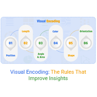
Visual encoding converts complex data into visuals that are simple to read. It uses color, size, shape, and position to reveal trends, comparisons, and insights.
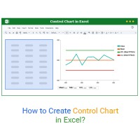
Build Control charts in Excel with a simple and user-friendly setup. Track process stability without advanced statistical skills.
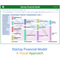
A startup financial model helps founders plan revenue, expenses, and cash flow. This guide shows how to create, analyze, and visualize your model.